The network for creativity
Join 1.25M professional creatives like you
Connect with clients, get discovered, and run your business 100% commission-free
Creatives on Contra have earned over $150M and we are just getting started
Back to feedPost

Most appointment-booking systems are built with the solo business owner in mind.
But what happens when you have a team?
A customer wants to book, and suddenly the owner has to figure out which staff member is available, whether they can take the appointment, what happens if someone else is already booked, and how to handle the inevitable reschedule or cancellation.
That was the problem I wanted to explore for the Lovable Challenge.
So I created Lumi Glam Studio, a makeup studio in Lagos. I designed it as a realistic business scenario for an owner managing multiple makeup artists.
The goal was simple: turn “Can I book?” into “You’re booked.” without making the owner coordinate every step manually.
The customer can check availability, choose a service and artist, select studio or home service, make a 50% deposit, receive confirmation, add the appointment to their calendar, and manage the booking afterwards.
Behind the scenes, the system coordinates artist availability, scheduling rules, deposits, calendar updates, reminders, cancellations, rescheduling and waitlists.
So instead of the owner spending their day checking calendars and moving information between conversations, the routine work is handled by the system leaving the owner to step in when something actually needs their attention.
I wasn't trying to build another pretty booking page.
I wanted to explore what appointment booking could look like when there's a team behind the business.
Built with Lovable.
Take a look at the build - https://lumiglamstudio.lovable.app/
I'll share the process behind the build next.

The network for creativity
Join 1.25M professional creatives like you
Connect with clients, get discovered, and run your business 100% commission-free
Creatives on Contra have earned over $150M and we are just getting started





Related posts

Designed Oculus, a crypto dashboard where every tile is double-outlined, flat and unapologetically colorful.
Warm paper canvas, ink black anchors, mono micro-type, and an eye that follows your cursor.
Built with GSAP + Framer Motion. Light mode only, on purpose.
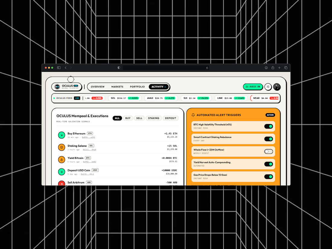
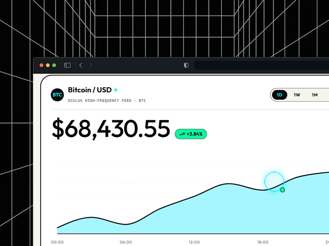
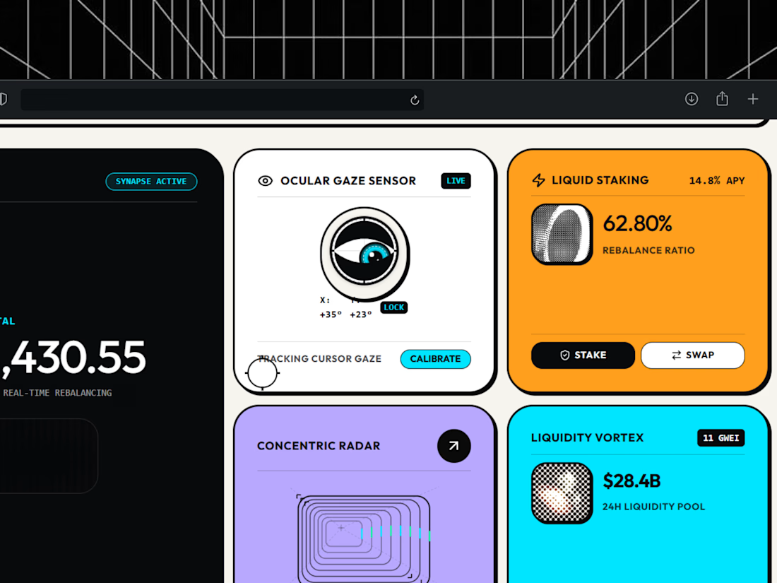

light mode only, on purpose. respect.


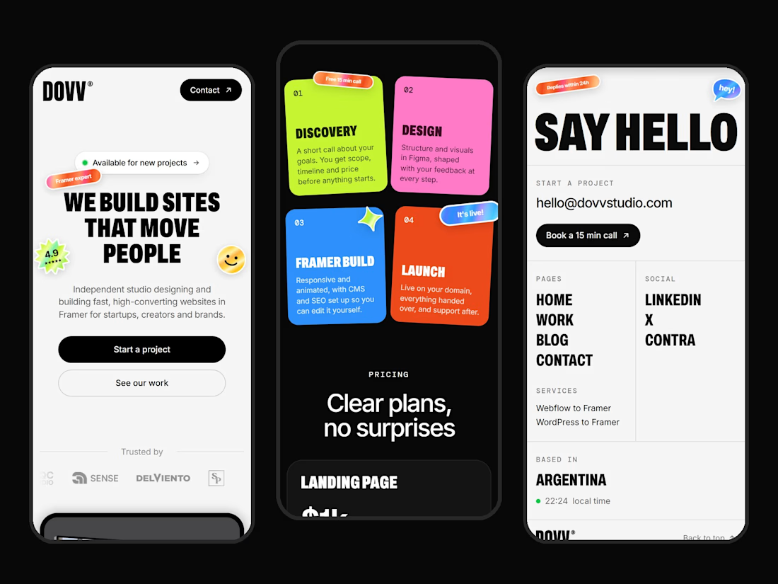

Clean mobile execution Dario! 📱 Love how bold DOVV's identity stays even on small screens. "WE BUILD SITES THAT MOVE PEOPLE" hits hard, and those sticky note cards in the middle for Discovery / Design / Framer Build / Launch are such a fun, scannable touch. That SAY HELLO page is super minimal and direct. Great Framer build!


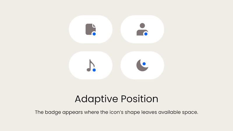
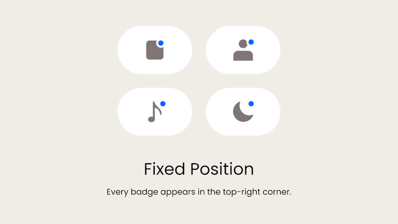
Badge Placement: Consistency or Visual Balance?
Even a small indicator can change how the entire interface feels
Adaptive Position
The badge placement changes depending on the icon’s shape and available space. The result feels more visually balanced but requires individual adjustments.
Fixed Position
The badge always appears in the top-right corner. This creates a consistent and predictable system, but on some icons it may feel disconnected or awkwardly placed.
What matters more in a design system: consistency or optical balance?
17 voted
43%
23 voted
57%
40 votes
Closed

Fixed for me. In a system, people learn where to look. I'd tweak the odd icons before breaking the rule.