The network for creativity
Join 1.25M professional creatives like you
Connect with clients, get discovered, and run your business 100% commission-free
Creatives on Contra have earned over $150M and we are just getting started
Back to feedPost

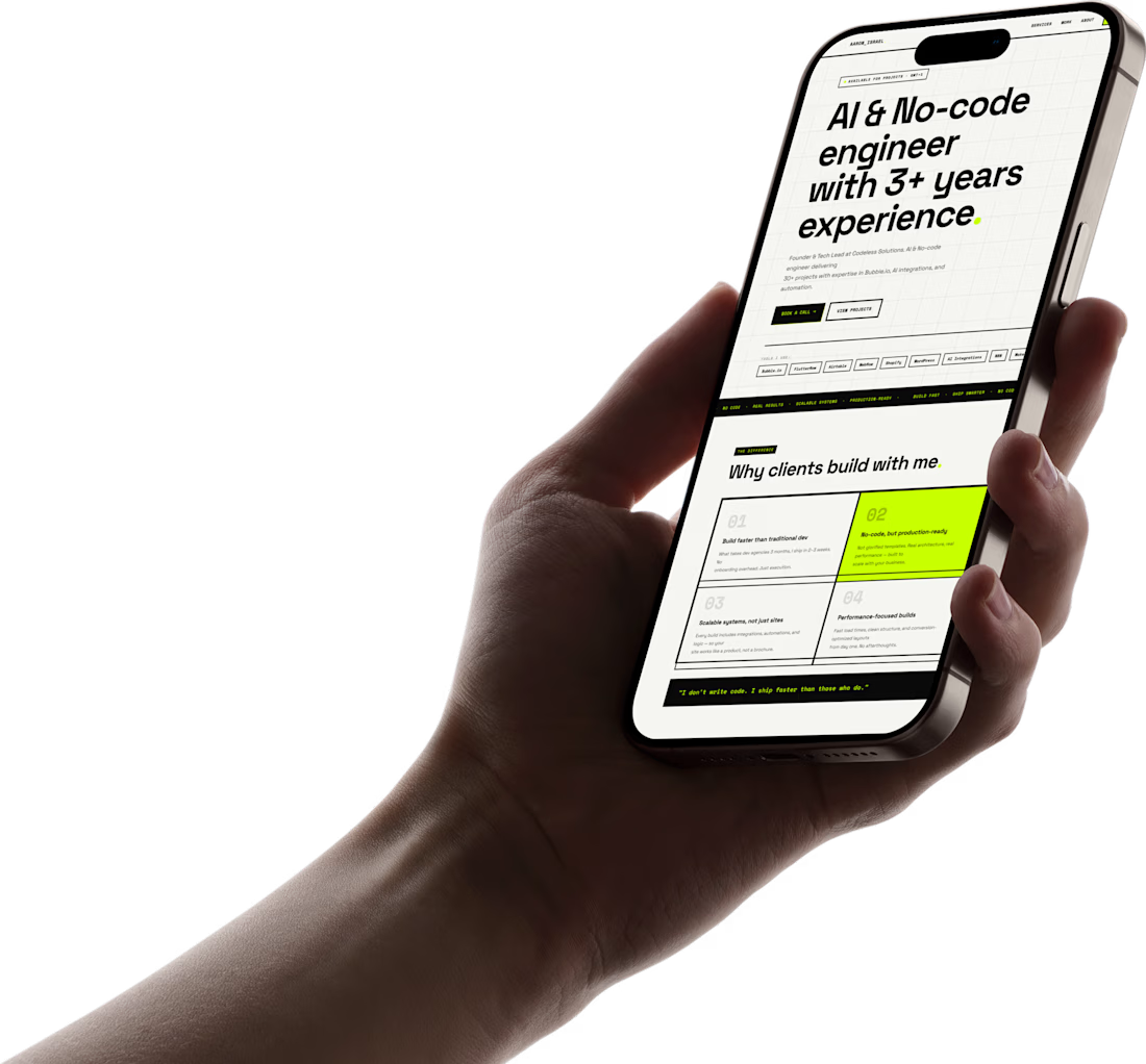
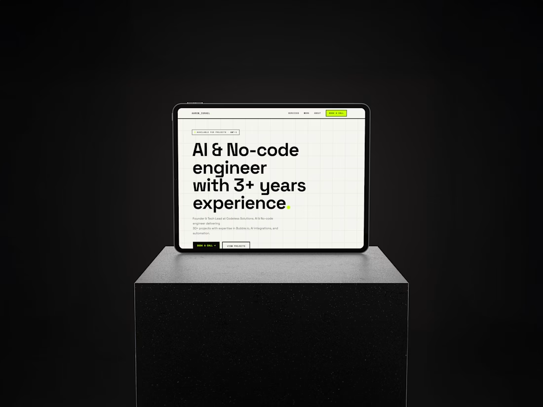
I recently designed and built this portfolio for Aaron Israel — fully from scratch using Figma for Design, and HTML & CSS.
No frameworks. No shortcuts. Just structure, spacing, and intentional design.
The goal wasn’t to make something flashy.
It was to create a portfolio that feels effortless to use and lets the work speak immediately.
A few things I focused on:
• Clean visual hierarchy so nothing competes for attention
• Thoughtful spacing and typography to guide the eye
• Performance — fast, lightweight, no unnecessary bloat
• A structure that reflects real product thinking, not just visuals
Sometimes the best design is the one you don’t notice… because everything just makes sense.
Would love to hear your thoughts 👇🏾
https://aaron.pxxl.click/
The network for creativity
Join 1.25M professional creatives like you
Connect with clients, get discovered, and run your business 100% commission-free
Creatives on Contra have earned over $150M and we are just getting started





Related posts

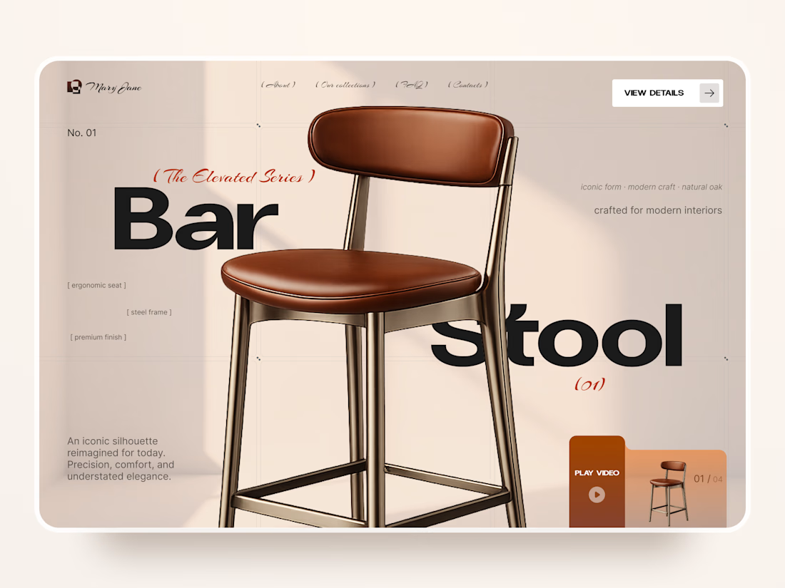
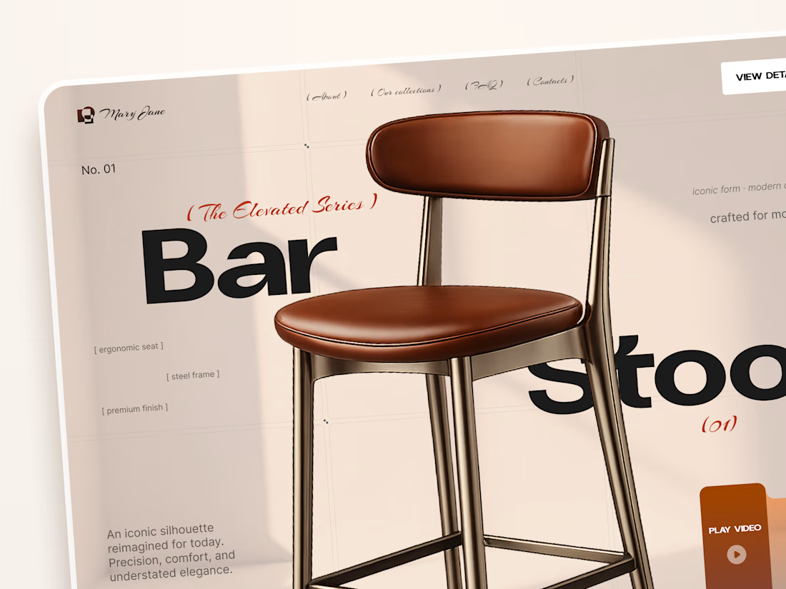
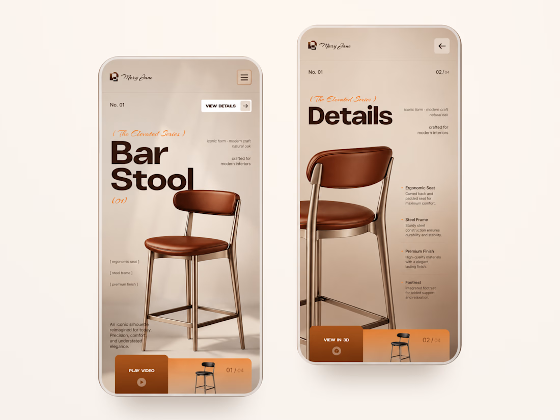
Mary Jane — Bar Stool Product Landing Page 🪑✨
A refined product landing page concept for a modern furniture brand, built around one statement piece
The design combines warm neutral tones, oversized typography, and editorial layouts to give the bar stool a premium, design-focused feel
Special attention was given to:
• Product-first composition
• Clean editorial typography
• Warm premium aesthetic
• Product details and features
• Video and 3D presentation
• Responsive mobile layout
The result is a simple, elegant experience that keeps the product at the center while giving the brand a distinctive visual character 🤎



Nice work


All of them are 🤌🤌🤌


Another successful launch 🚀
For MindAbility, we went from Figma design to a fully built Kajabi experience – website pages, course design, offers, forms, and automations.
The result is a clean, connected platform that’s easy to manage and ready to grow into new regions.


The interaction between the typography, imagery, and spacing works really well.


