The network for creativity
Join 1.25M professional creatives like you
Connect with clients, get discovered, and run your business 100% commission-free
Creatives on Contra have earned over $150M and we are just getting started
Back to feedPost

If everything on your website looks important, nothing feels important.
Most sites don't need more sections, more buttons or more colour.
They need fewer things competing for attention.
→ One clear CTA, not four
→ Real hierarchy, not bold everywhere
→ Whitespace, not filler
→ A strong heading, not a wall of text
→ Your boldest colour saved for the action that matters
Good design isn't about adding more.
It's about deciding what deserves attention.
Save this for your next project.
#WebDesign #UXDesign #UIDesign #DesignTips


Clear hierarchy turns attention into direction.
The network for creativity
Join 1.25M professional creatives like you
Connect with clients, get discovered, and run your business 100% commission-free
Creatives on Contra have earned over $150M and we are just getting started







Related posts

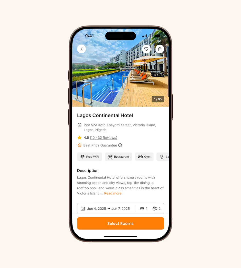
Hotel details screen for a booking app I’ve been designing.
Focused on clear information hierarchy, visual comfort, and helping users make quick booking decisions.
Excited to start sharing my work here 🚀


It's basic design but it's great❤️


Love this! 🤝

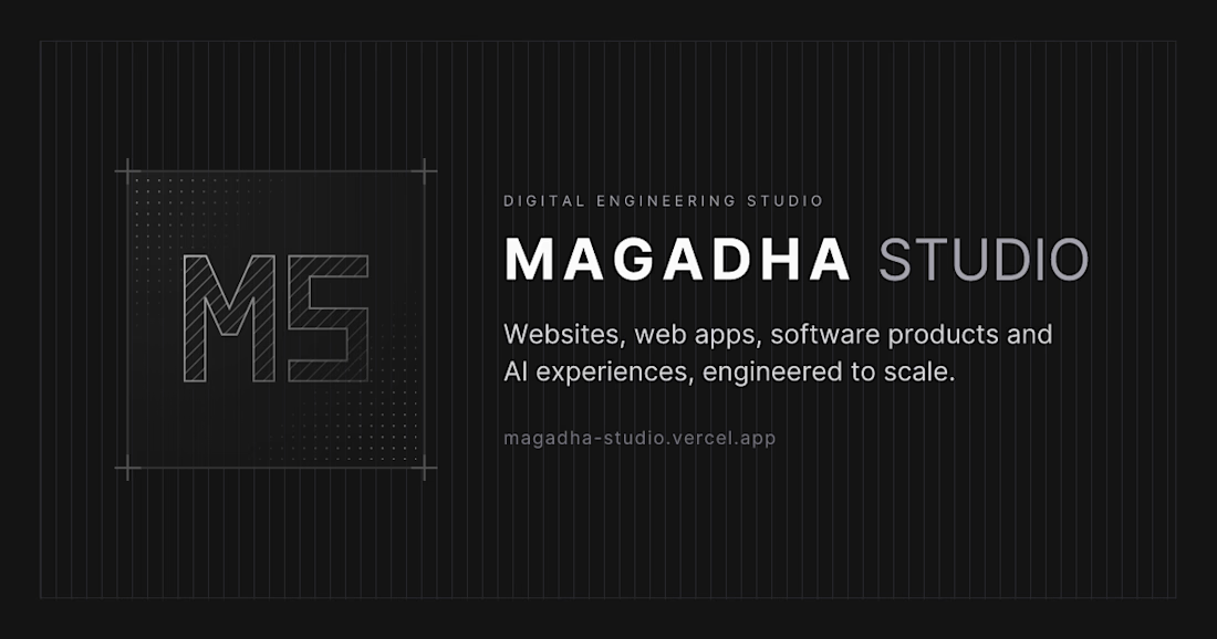
Our new Magadha Studio website is live 🚀
We redesigned our home on the web to reflect how we work: clean, fast and engineering-first.
✦ Minimal, structured layout with bold, simple type
✦ Clear sections for what we build, our selected work, services, process and pricing
✦ Five case studies covering web development, headless CMS, EdTech, GenAI and product engineering
✦ Built on a modern, typed stack, made to load fast, rank well and scale
We design, build and scale digital products: websites, web apps, software products and AI applications.
See the full project here 👇
https://contra.com/p/gYPAgEEL-magadha-studio-website-design
Visit the site: https://magadha-studio.vercel.app/
Have an idea you want to ship? Let's talk. 👋
#WebDesign #NextJS #DigitalProducts #MagadhaStudio


Introducing the new Magadha Studio website 🚀
We redesigned our home on the web to reflect how we work: clean, fast and engineering-first.

I'd keep the case-study text server-rendered and load interactive demos separately, so one heavier project doesn't slow the whole page. Are the five case studies managed in a CMS or in the site code?