The network for creativity
Join 1.25M professional creatives like you
Connect with clients, get discovered, and run your business 100% commission-free
Creatives on Contra have earned over $150M and we are just getting started
Back to feedPost

Case Study: Rebuilding Trust Into a Bali E-Commerce Site, One Broken Assumption at a Time
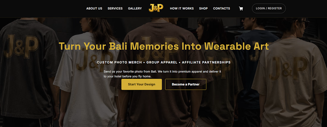
Client: J&P Bali — custom apparel & wearable art from travel photos
Role: Lead UI/UX Designer & WordPress/WooCommerce Developer
Stack: WordPress, WooCommerce, Elementor, custom design system
The brief
J&P Bali had a genuinely good idea already live on WordPress: send a photo from your Bali trip, get it turned into a premium custom tee or hoodie, delivered to your hotel before you fly home. The concept was strong. The site wasn't converting on it.
They didn't need a rebuild. They needed someone to find out exactly where visitors were dropping off — and why — then fix it without throwing away the working infrastructure underneath.
Starting with the user, not the code
Before touching a single template, I ran the site through the lens of the actual buyer: a tourist with two or three days left in Bali, a phone full of photos, and zero patience for friction. That audit surfaced problems a purely visual review would have missed entirely:
The homepage lied about the order of operations. It promised "upload your photo" as step one. The real flow — set by the checkout and confirmed in the FAQ — required payment first. A visitor following the homepage's own instructions would hit a wall.
Every product showed a $0.01 price. Technically a placeholder. Functionally, a trust-killer — nothing reads "abandoned project" faster than a store that looks like it forgot to finish pricing itself.
Payment information contradicted itself across three surfaces — the footer said bank transfer, the product page said PayPal, the shop page said "confirm via WhatsApp." Three answers to one question is the same as no answer.
The primary buying path was buried under B2B content. Affiliate programs and corporate kits were competing for the same navigation real estate as the core tourist offer, diluting the one message that actually drives revenue.
None of these were design problems in the visual sense. They were trust problems wearing a design costume — and they're exactly the kind of thing that tanks conversion rate while looking, at a glance, like a perfectly normal website.
Turning findings into a system, not a patch list
Rather than fixing these as isolated tickets, I used them to define a design system built for one job: remove hesitation at every step between "I want this" and "I bought this."
A single, honest four-step flow — choose product & pay, upload photo, approve design, delivered to hotel — replacing two contradictory versions of the same journey.
A premium visual language (near-black backgrounds, gold accent, Space Grotesk headings, Inter body copy) that signals the product is worth the price being asked for it, instead of undercutting it.
Content converted from paragraphs into scannable structure — feature cards, step timelines, and comparison-ready product cards — because a tourist deciding between a tee and a hoodie on their phone will not read a wall of text to get there.
One consistent payment and pricing story, stated once, correctly, everywhere it appears.
Why this approach, not a full rebuild
The existing WordPress/WooCommerce setup wasn't the problem — the client's investment in it was worth protecting. The instinct to gut and rebuild a site because it "feels dated" is usually the expensive, slower path to the same outcome a focused audit gets you in a fraction of the time. Most conversion problems live in clarity and trust, not in the CMS underneath them.
What this demonstrates
This project is a good example of the kind of work I do for e-commerce clients whose core offer is strong but whose execution is quietly costing them customers: a structured UX audit grounded in an actual buyer's journey, a design system that carries brand premium-ness through every page rather than just the homepage, and WordPress/WooCommerce implementation that respects what's already working instead of starting over.
If your site has a good product behind a confusing checkout, that's usually fixable faster — and cheaper — than it looks.
Want a second pair of eyes on where your own site is losing people? [Get in touch →]😊


The network for creativity
Join 1.25M professional creatives like you
Connect with clients, get discovered, and run your business 100% commission-free
Creatives on Contra have earned over $150M and we are just getting started





Related posts


Marlowe Mobile Detailing
Solo-owner mobile car detailer, Austin, TX (serving Round Rock, Cedar Park, and Lakeway)
Marlowe Mobile Detailing was losing about 1 in 5 bookings to no-shows and running behind on nearly every job. This build replaces a vague "can you detail my car?" text with a fully scoped, weather-aware booking flow that sets an accurate time and price upfront, captures access instructions before he arrives, and automates rain-day rescheduling so he never has to chase a customer again.
He works alone and travels to the customer. Rain cancels outdoor jobs. Customers under-describe how dirty their cars are, so jobs run long. About 20% of bookings were no-shows because people forgot he was coming to them.


Which Kajabi pricing section would you ship?
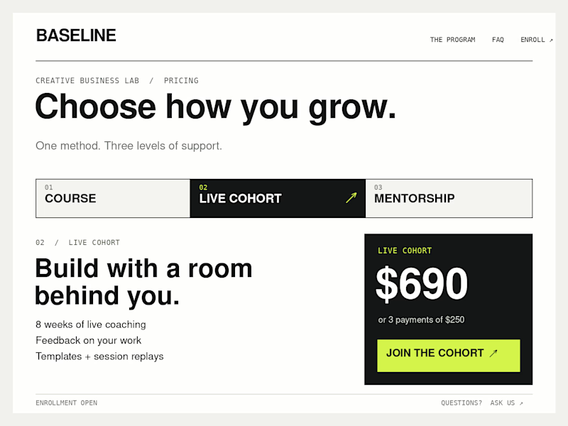
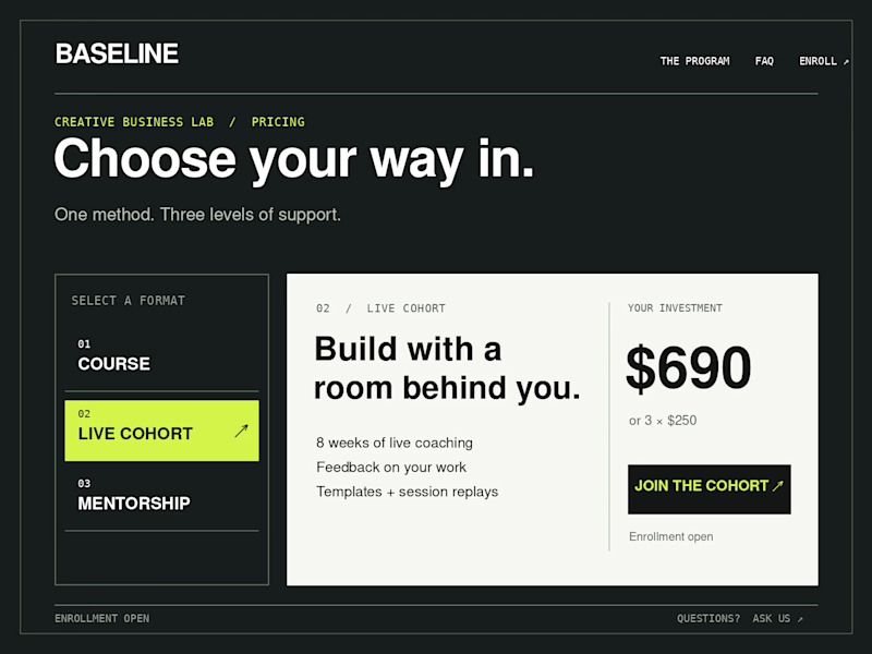
Creative Business Lab has three paths: Course, Live Cohort, and Mentorship. Both designs show the same $690 Live Cohort with the same benefits. Only the presentation changes.
Vote Horizontal tabs or Side tabs, then tell me the one thing you’d improve before launch. Have a stronger third approach? Show it in the replies.

21 voted
50%
21 voted
50%
42 votes
Closed

Horizontal. side tabs read as nav, people skip them. though the stronger third option is no tabs at all, three cards side by side. both of these hide two prices behind a click and comparison is the one job a pricing section has.

My feed on X is full of impressive motion videos made with Claude, so I decided to try Opus 5.5 for the FTCG project. I asked it to create a dynamic video inspired by the FTCG game. The initial prompt was incredibly simple, and it took only an hour or two of experimentation to refine the result and add sound as the finishing touch. Not bad at all.

Great work