The network for creativity
Join 1.25M professional creatives like you
Connect with clients, get discovered, and run your business 100% commission-free
Creatives on Contra have earned over $150M and we are just getting started
Back to feedPost
Built a brand from scratch. Here's the one decision that changed everything. 👇
When I named this hair serum Gloe , a blend of glow and aloe , suddenly every design decision had a direction. The deep green, the warm cream, the golden tones. It all came from the name.
That's what brand identity does. One strong idea and everything clicks into place.
What's the first thing you nail down when starting a brand project — the name, the visuals, or the feeling?


This work is clean and the product designs are amazing

Thank you so much, really appreciate that! 🙏 The product design was one of my favorite parts of this project.
The network for creativity
Join 1.25M professional creatives like you
Connect with clients, get discovered, and run your business 100% commission-free
Creatives on Contra have earned over $150M and we are just getting started



Related posts

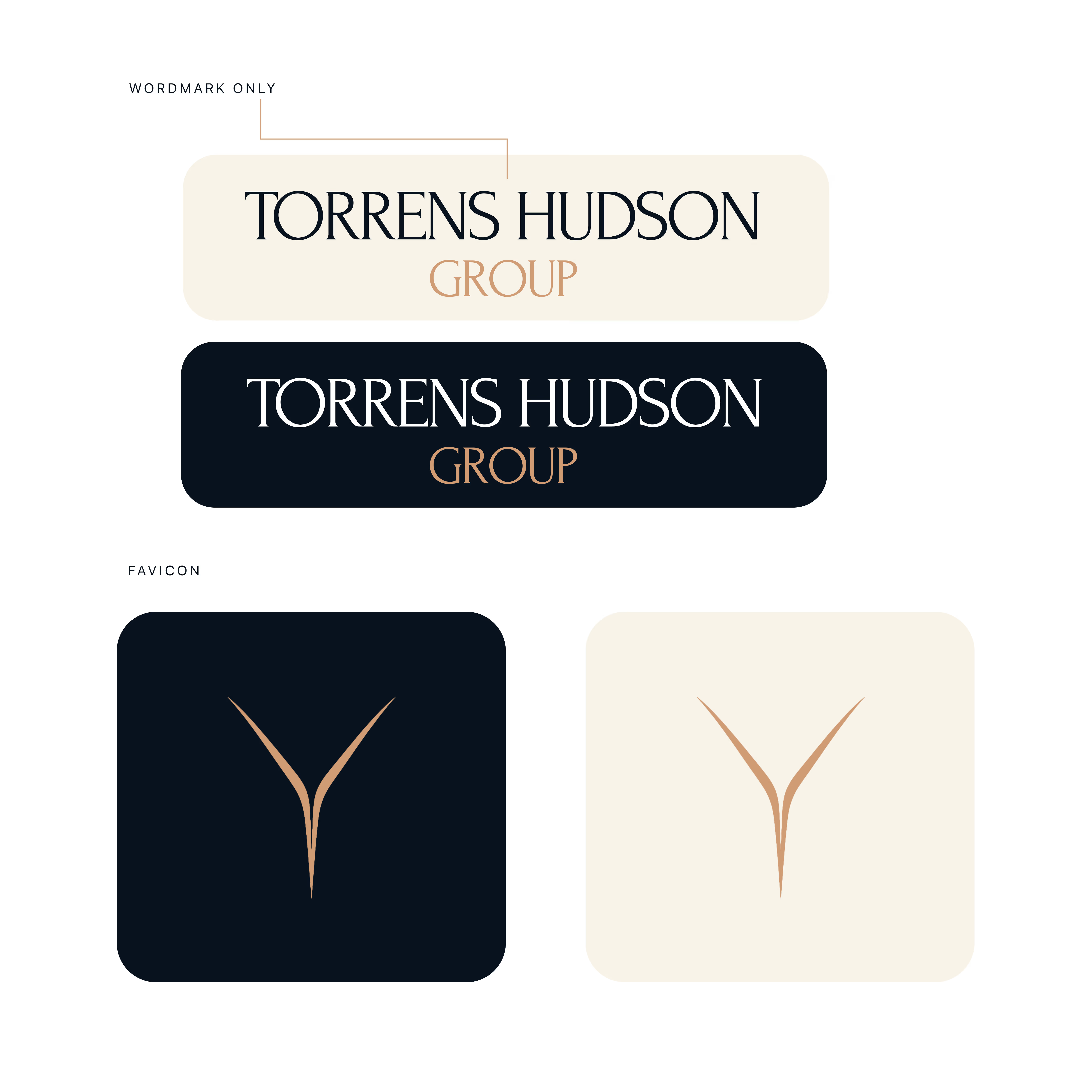
Torrens & Hudson - Brand Identity
Brand identity concept with an editorial serif wordmark, a minimal converging-rivers mark, and a navy, cream and bronze palette.



Nice work 🎉🎉

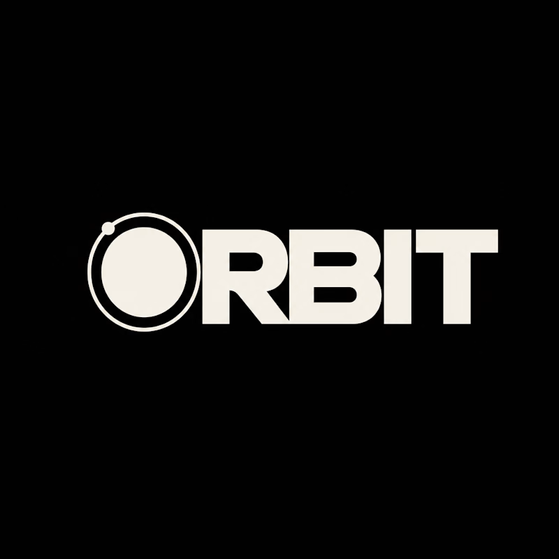
Which ORBIT pulls you in: the quiet one or the loud one? ✨
One name, two directions. Same idea, an object in motion around a center.
A → Heavy extended sans on black. The orbit is built into the O, a ring with a single satellite. Compact, graphic, impossible to ignore.
B → Light, high-contrast serif with a hairline arc and a tiny spark. The orbit is a gesture, a trail you almost miss. Elegant, airy, a little mysterious.
If you ask me, I'd pick A.

36 voted
80%
9 voted
20%
45 votes
Closed


Follow for More Job posts!

wow Dada, Please do share for accountants as well😊


