The network for creativity
Join 1.25M professional creatives like you
Connect with clients, get discovered, and run your business 100% commission-free
Creatives on Contra have earned over $150M and we are just getting started
Back to feedPost

A practical brief for founders and marketing teams planning a SaaS website redesign, with a copyable template, page inventory and responsibility matrix.
gestures.design
SaaS Website Redesign Brief Template | Gestures Studio
Plan your SaaS website redesign with a copyable brief, page inventory and responsibility matrix. Clarify content, design, development and launch scope.
The network for creativity
Join 1.25M professional creatives like you
Connect with clients, get discovered, and run your business 100% commission-free
Creatives on Contra have earned over $150M and we are just getting started



Related posts

Smart Glasses Landing Page
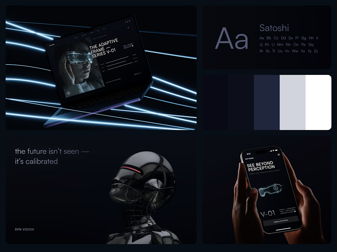
"See beyond perception." Three words on the phone, and the whole page had to earn them.
On desktop, the headline starts over the edge of a tall portrait of the glasses being worn, so the product name and the product in use read as one image. Next to it, reaction, light and depth sit as three thin gauge lines, each with a one-word reading. Specs, without a spec table.
On mobile, a 3D render of the frame sits between the headline and a single Explore the Series button. One image, one next step.
The palette stays in deep navy and soft gray, so the cool light on the frame stands out on every screen.
Designed by the Hue & Machine team.
#WebDesign #LandingPage #ProductDesign #WearableTech #DarkUI #UIDesign #TechProduct #ResponsiveDesign #UXDesign #FigmaDesign



Good work


Can too much free content hurt your sales?
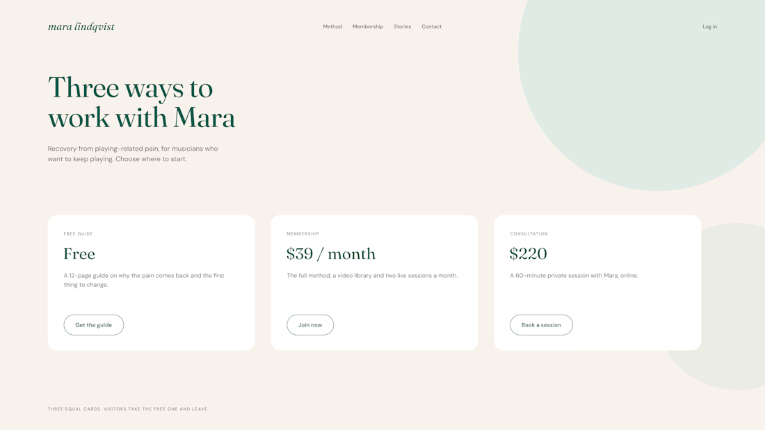
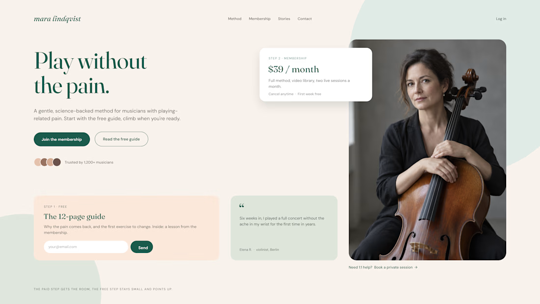
One of our clients had three offers on the same page: a free guide, a paid membership, and a private consultation.
All three looked equally important. Guess what? Visitors downloaded the free guide and left.
So we changed the layout:
Keep the free offer simple. A small card with a clear description and one email field.
Make the paid offer stand out. More space, a clear price, and a strong CTA.
Connect free to paid. Show how the free guide is just a first step toward the membership.
The goal isn't to remove free content. It's to make sure it leads somewhere.
Free content should open the door, not replace what's inside.
Do you offer free resources on your sales pages?


Three offers with equal weight on one page is such a common trap. Making the free guide a step toward the paid offer instead of a competitor for attention makes a lot of sense.

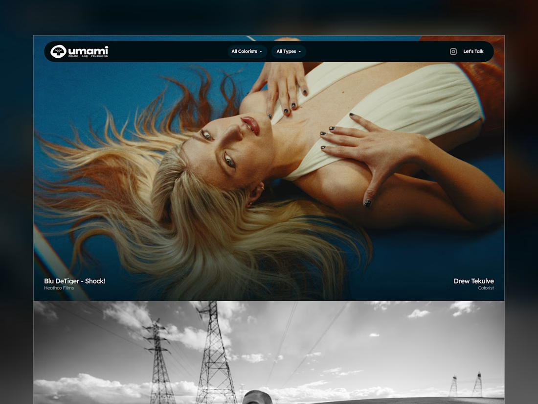
Umami Color & Finishing is an established color-grading studio in LA. Its work and reputation had outgrown its old site, and the studio was ready for one at the level of its work.
I designed and built it around the work itself: every project filterable by type and colorist, and every view with its own link, so the team can send a lead exactly what fits.
Case study
Live site: umamicolor.com

this is amazing work