The network for creativity
Join 1.25M professional creatives like you
Connect with clients, get discovered, and run your business 100% commission-free
Creatives on Contra have earned over $150M and we are just getting started
Back to feedPost

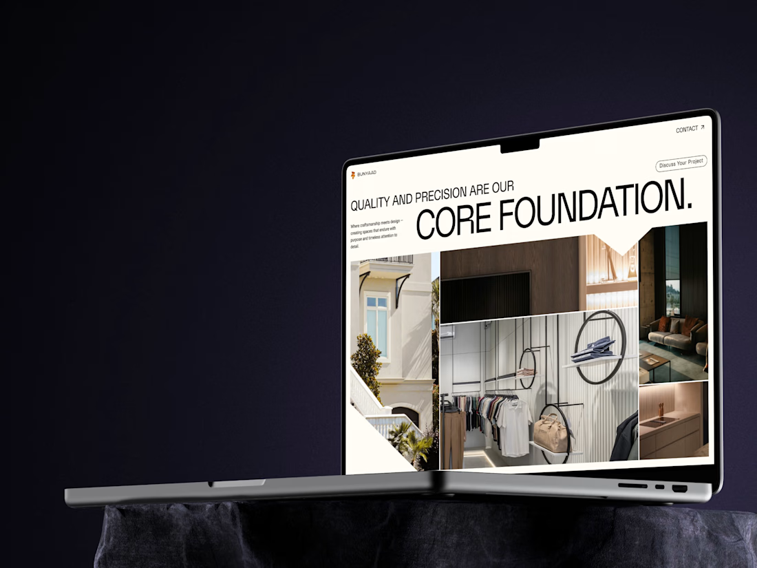
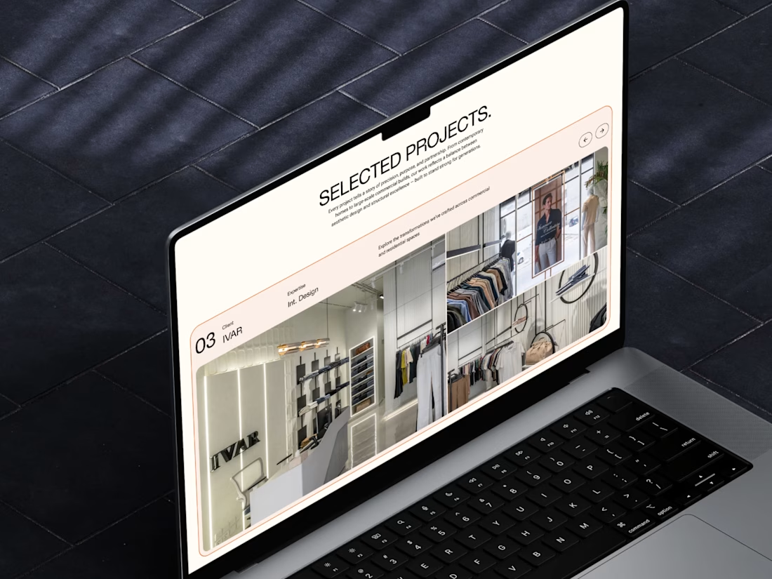
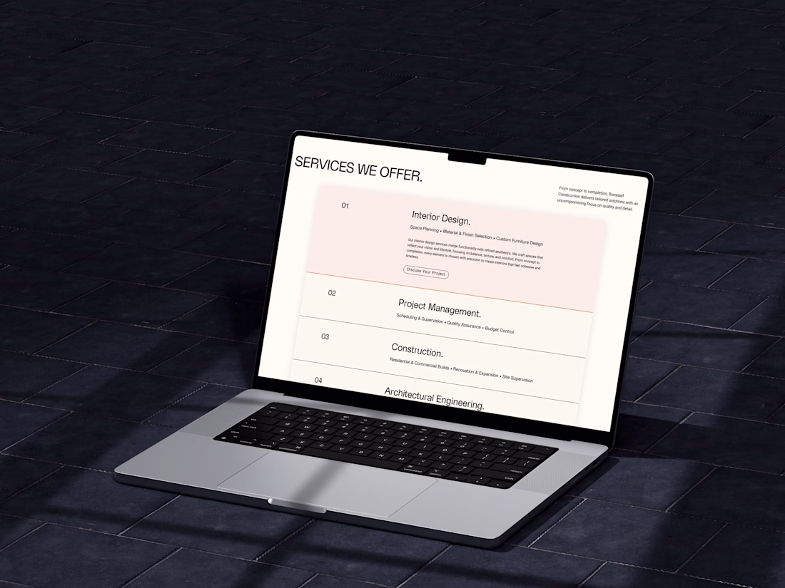
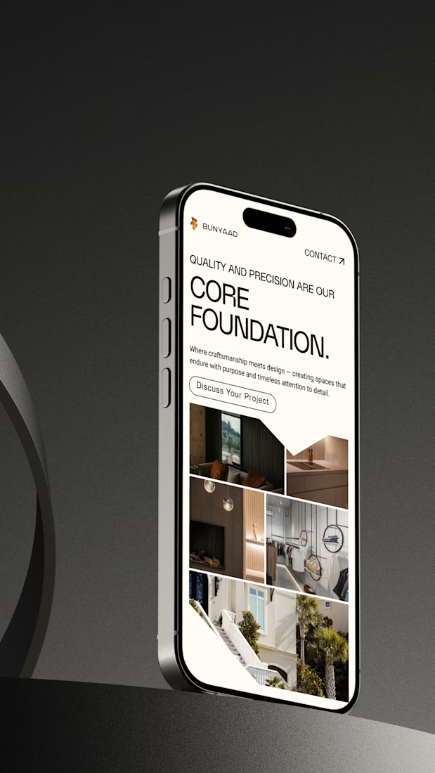
Built a website for a construction company — this one was a bit of a challenge since they hadn’t really built a strong brand identity yet.
I went with a minimal, structured design to reflect their work — clean lines, clear hierarchy, and lots of breathing space. The hero uses bold typography to communicate their values and goals right away.
Grids and geometric shapes bring an architectural, modern feel, while the neutral color palette ties it back to the materials and tone of their projects.
I also added custom loading and scroll animations to make the site feel dynamic without losing that professional edge — and made sure it looks just as solid on mobile.
Really happy with how this one came together.


The network for creativity
Join 1.25M professional creatives like you
Connect with clients, get discovered, and run your business 100% commission-free
Creatives on Contra have earned over $150M and we are just getting started


Trending


Notion
Notion isn’t just where you work, it’s starting to work for you. What agents are you building?
portfolioreview
The best portfolios tell a story, not just show a grid. Share yours for feedback.
brandguidelines
Brand guidelines are becoming living systems, not static documents. What are you building for your clients?
aivideo
AI video tools are moving at warp speed. Which ones are you experimenting with?
freelancerlife
Freelancer life is wins, pivots, and everything in between. What’s yours right now?