The network for creativity
Join 1.25M professional creatives like you
Connect with clients, get discovered, and run your business 100% commission-free
Creatives on Contra have earned over $150M and we are just getting started
Back to feedPost
Hey Buddies! 👋
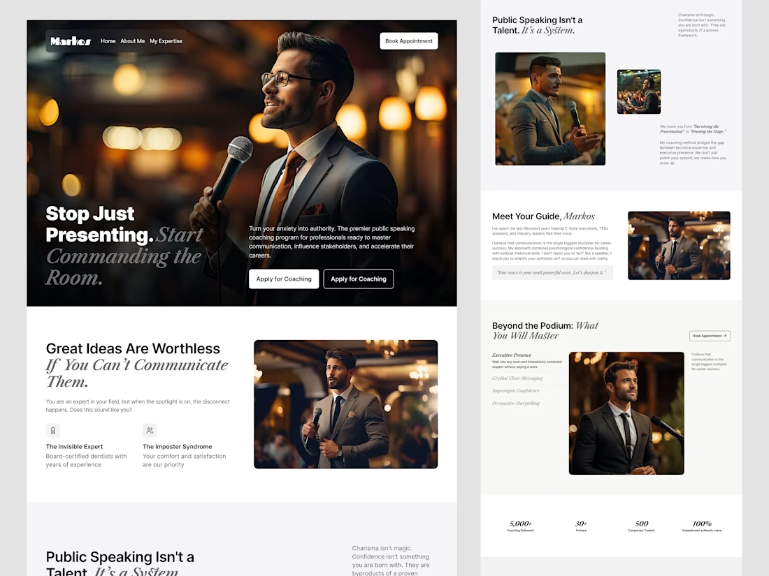
Excited to share a recent exploration for a Public Speaking Coaching website.
The Challenge: The client needed to move away from the "stuffy academic" look and create a brand that felt modern, authoritative, and results-driven. The goal was to bridge the gap between a user’s internal anxiety and their potential executive presence.
Design Decisions: Agitation vs. Solution: We used a high-contrast layout to visually separate the "Problem" (imposter syndrome, ramping) from the "Solution" (the 3-step framework).
Visual Hierarchy: A clean, vertical rhythm guides the eye from the emotional hook in the Hero section down to the logical "Methodology" timeline.
The Result: A clean, scannable layout that balances professional trust with bold, high-conversion copy.
The network for creativity
Join 1.25M professional creatives like you
Connect with clients, get discovered, and run your business 100% commission-free
Creatives on Contra have earned over $150M and we are just getting started
Related posts
Logo explorations for a Korean pop-up store 🇰🇷🧋
Stunning!
Working on different moodboards and logo directions for a men's fashion brand right now.
Three completely different routes, three very different attitudes.
Curious to see how people read them…
Which one would you choose? 👀
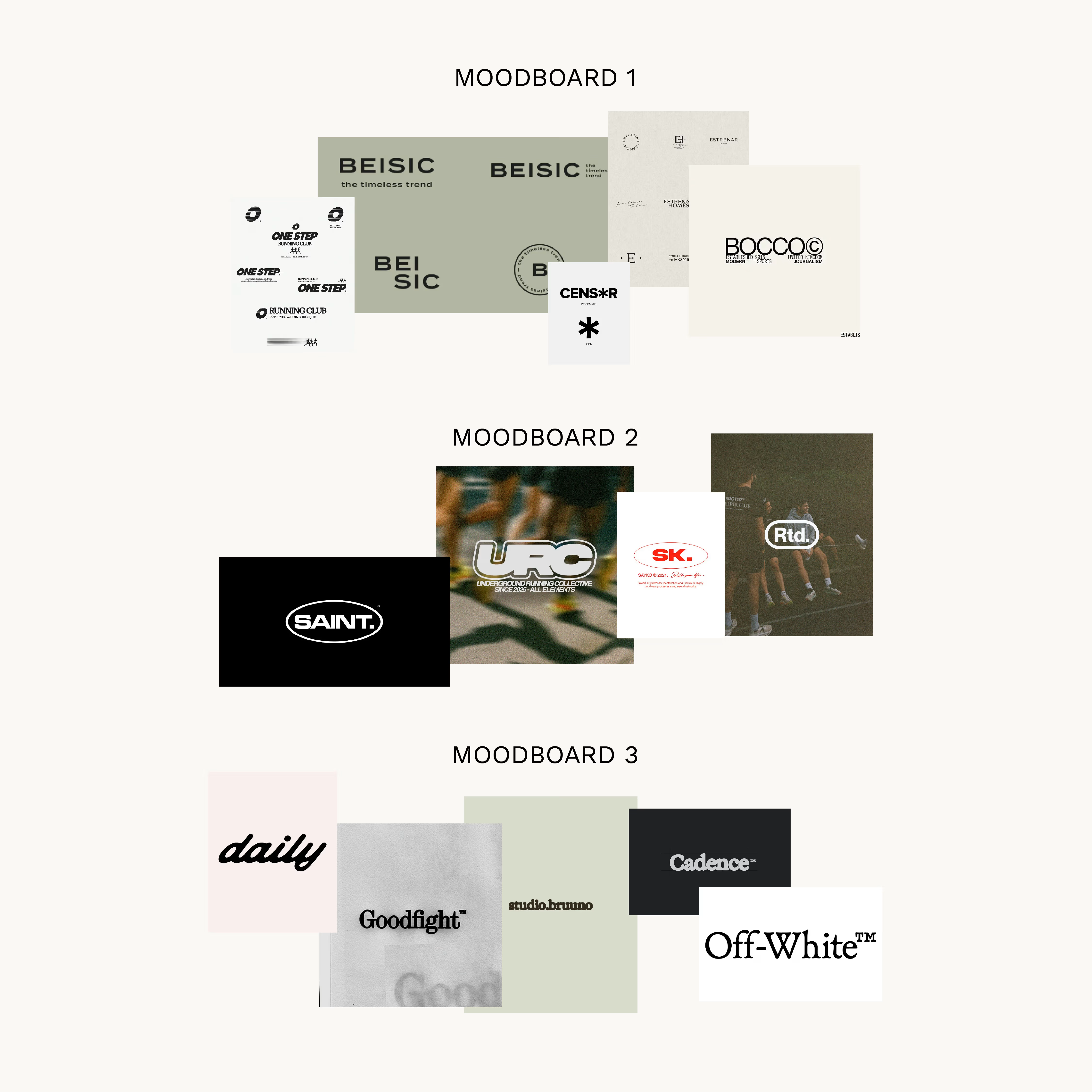
All are sick but I love the second one the most
I’m currently building a hairstylist discovery platform (web app) focused on making it easier to find and book hairstylists without relying on social media.
The platform includes search, stylist profiles, portfolios, and a structured booking request system.
I already have a full product outline, wireframes, and user flows prepared. I’m now looking for a UI/UX designer to bring this to life in Figma with a clean, modern, and intuitive SaaS-style design.
Scope (Phase 1):
Landing page
Search & filtering experience (with optional map view)
Stylist profile & portfolio
Booking flow (structured request system)
Basic dashboard views
Looking for:
Strong experience in web app / SaaS design
Ability to think through user flows and structure, not just visuals
Clean, modern, minimal design style
Experience creating interactive Figma prototypes
I’ll share full wireframes, diagrams, and detailed product logic with shortlisted designers.
Please share relevant web app or platform work when applying.
I can refer someone for this project.
Trending
Runway
AI video generation is exploding. What are you dreaming up in Runway?
Contra University
Learn from expert creatives how to earn more using next-gen AI tools.
creativeaiflow
Creative AI workflows are evolving. What tools do you use, and what are their strengths and weaknesses?
portfolioreview
The best portfolios tell a story, not just show a grid. Share yours for feedback.
freelancerlife
Freelancer life is wins, pivots, and everything in between. What’s yours right now?