The network for creativity
Join 1.25M professional creatives like you
Connect with clients, get discovered, and run your business 100% commission-free
Creatives on Contra have earned over $150M and we are just getting started
Back to feedPost

Hi! I’d like to share my work. This is my first time creating a project on the Lovable platform!
About the Project: PawStudio is a small grooming salon for dogs and cats in Austin, Texas.
Target Audience: Cat and dog owners who deeply care about their pets.
Problem: Although the business is small, it already has its loyal clients. They often text or call to inquire about pricing and check available time slots. The salon owner cannot always answer immediately (as they are busy grooming animals), causing potential clients to leave for competitors.
Solution:
To relieve the owner’s workload, an easy-to-use booking modal with date and time selection was built.
An admin dashboard was created so the owner can easily view client appointments and scheduled time slots.
To effectively attract new clients and turn them into confirmed bookings, a conversion-focused landing page funnel was carefully crafted — leading visitors seamlessly from service discovery to a quick appointment in just 2 clicks.
Workflow & Design Process:
UX Research: Before starting the design, I conducted a UX research analysis of competing businesses in similar niches.
Figma UI Layout: Next, I crafted the initial UI/UX layout and visual hierarchy in Figma.
Lovable Development: The final step was bringing the layout to life on the Lovable platform, where I used clear engineering prompts to build, style, optimize, and publish the fully functional web application.Typography & Color Palette:
Typography: I chose the Alan Sans font family because its friendly, playful character perfectly aligns with the positive mood of the brand.
Color Palette: Special attention was given to the color scheme (#360F1E, #FDFBF7, #53182E) — combining deep burgundy tones with warm cream backgrounds to highlight the cozy, high-end atmosphere of the grooming salon.


The network for creativity
Join 1.25M professional creatives like you
Connect with clients, get discovered, and run your business 100% commission-free
Creatives on Contra have earned over $150M and we are just getting started











Related posts

Santa Monica Tile & Stone E-Commerce Design, 2025.
Buying tile online is mostly guesswork, so I designed a concept store where every page answers one buyer question. Shoppable rooms show how it looks, a coverage calculator tells you how much you need, and free samples let you see it first. Deep green, warm gold, and an AI tile scan that turns inspiration photos into products. Open for e-commerce and web design projects.
Full case study on my Contra Profile

TOP!!

The only glow on the Kestra page is the reflective strip on the jacket. It comes from the image itself, so the Framer layers on top stay flat: grey, white and mono text, no glow effects on buttons or headings. That keeps the page easy to edit, because nothing in the UI depends on one lighting setup. If you swap the photo, the glow goes with it. Would you add a glow effect in Framer or keep it in the image?


wow, nothing but top notch

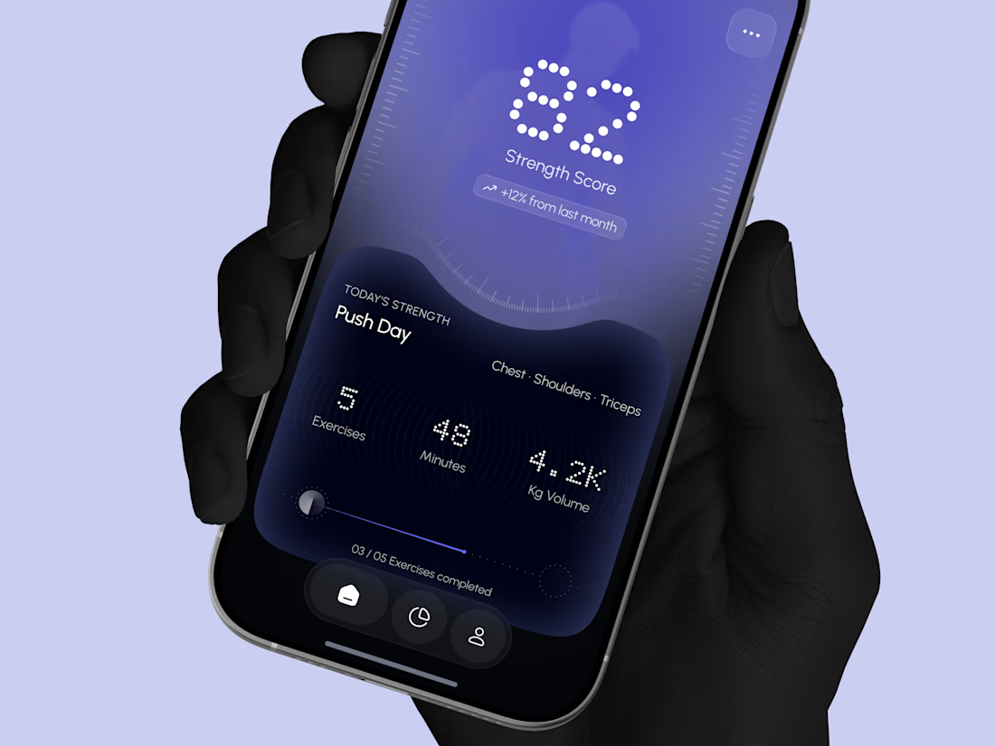
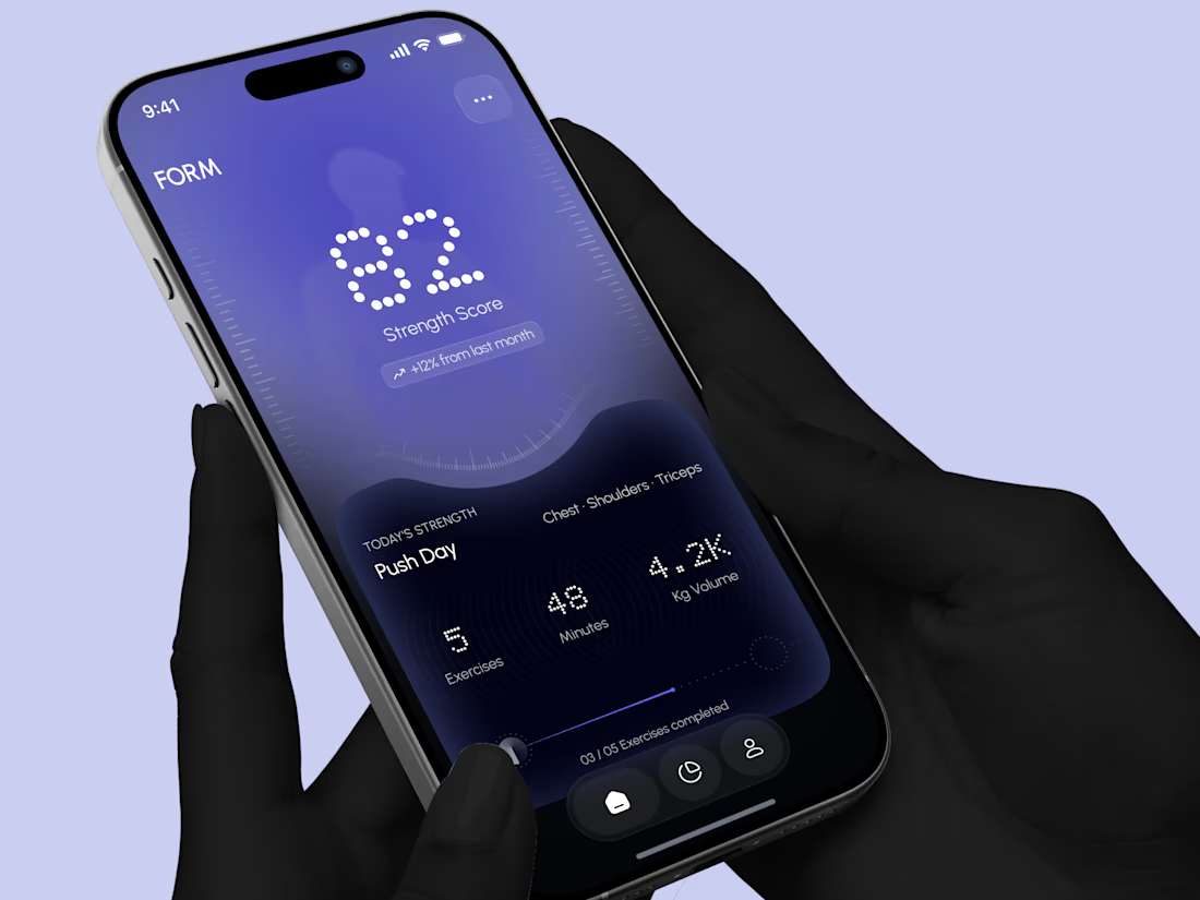
Designed a modern Strength Training Mobile App.
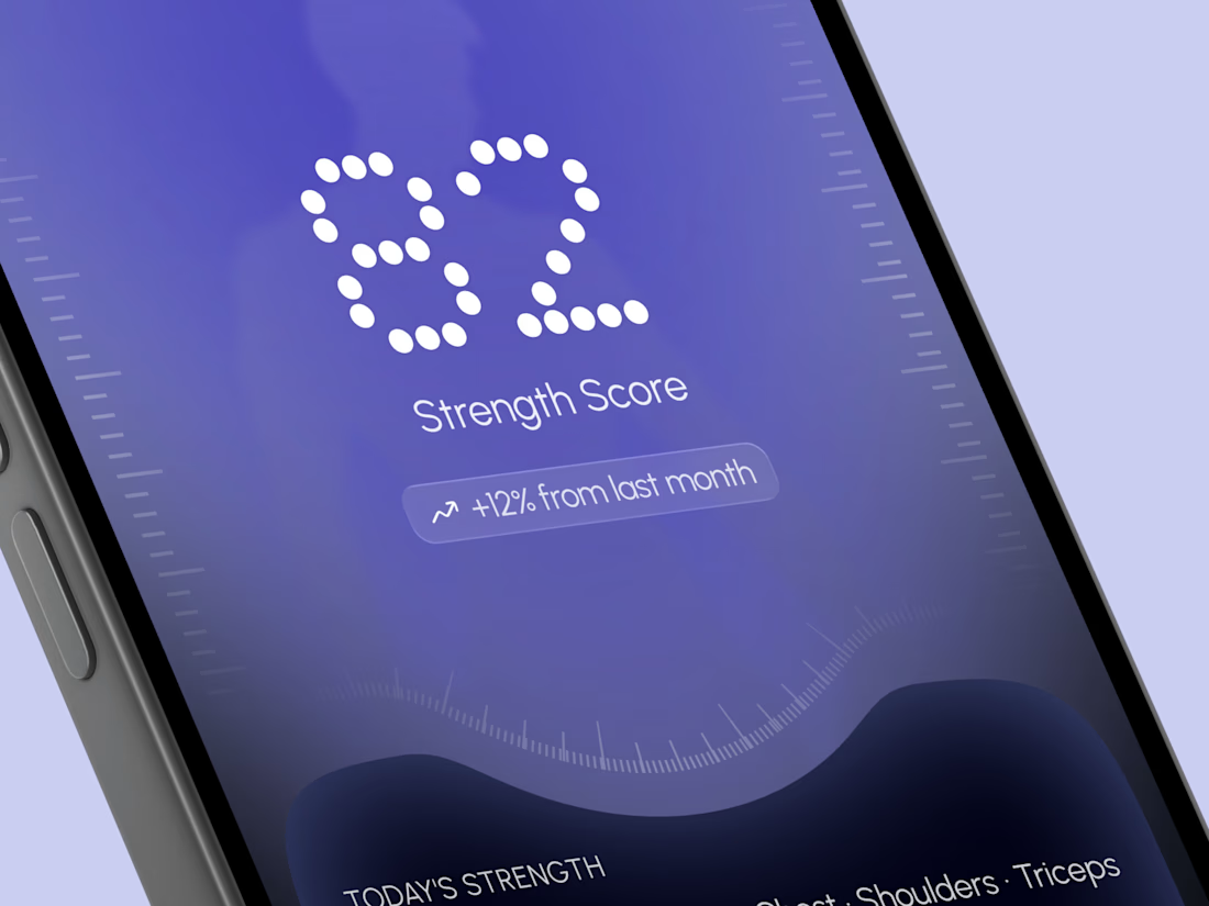
A deep indigo and violet gradient with a soft body silhouette and dotted display numbers for a bold and focused first impression.
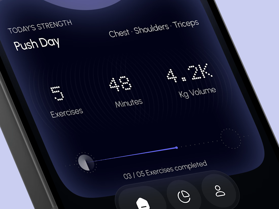
A glowing strength score, a clear workout card with exercises, minutes, and volume, plus a simple progress bar make every training session easy to follow. A curved dark panel, fine tick marks, and a floating tab bar keep the whole app sleek, modern, and easy to use.

High end execution