The network for creativity
Join 1.25M professional creatives like you
Connect with clients, get discovered, and run your business 100% commission-free
Creatives on Contra have earned over $150M and we are just getting started
Back to feedPost


Built Onsale Mart — a modern e-commerce experience focused on clean product discovery, smooth navigation, and a fast, responsive shopping journey.
Designed and developed with real-world scalability and conversion-focused UX in mind.
#Ecommerce #WebDevelopment #Frontend #UIUX #ProductDesign

The network for creativity
Join 1.25M professional creatives like you
Connect with clients, get discovered, and run your business 100% commission-free
Creatives on Contra have earned over $150M and we are just getting started





Related posts


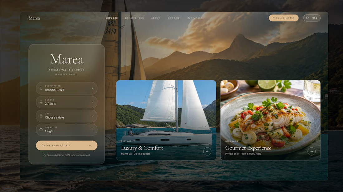
Marea — Private Yacht Charter
Booking a yacht sounds simple.
Until a guest wants a sunset dinner for six.
Now someone has to check availability, coordinate the yacht and chef, confirm the menu, collect dietary requirements, arrange the extras, and keep an eye on the weather.
For a small charter business, that can mean a lot of back-and-forth before a booking is actually confirmed.
So I built Marea around a simple idea:
The guest should choose the experience. Marea should handle the coordination.
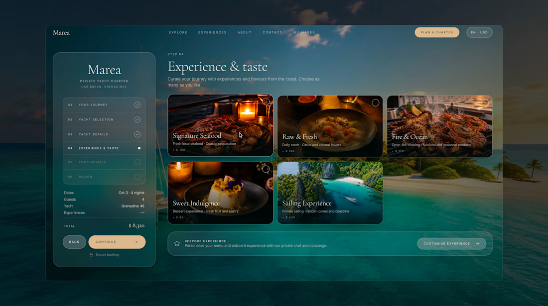
Instead of starting with a long inquiry form, guests can build their trip visually, choosing the destination, date, yacht, experience, dining options, and preferences through one guided flow.
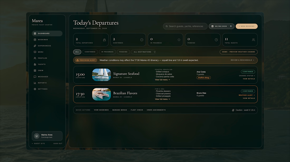
Behind the scenes, the concierge gets everything they need in one place: guest details, preferences, special requests, payment, and trip status.
And because sailing doesn't always go according to plan, Marea also brings weather and rescheduling into the booking experience.
One booking. Boat, chef, dinner, and everything in between.


This is stunning, sign me up, where do I book?! 😅


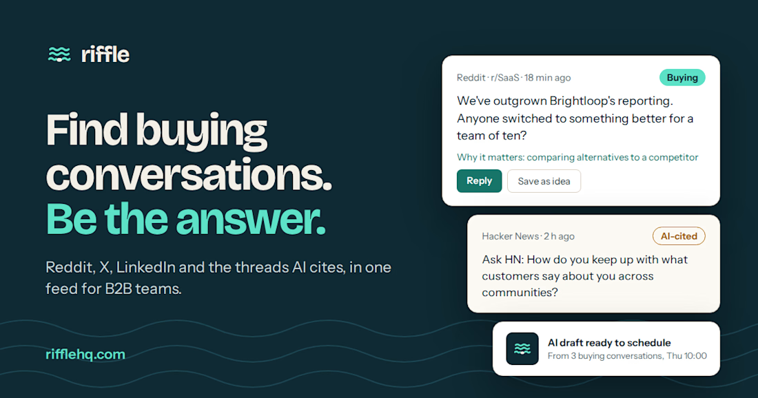
Someone asked for a tool like yours on Reddit an hour ago. Did you see it?
Riffle finds buying conversations so you can be the answer.
Waitlist open: rifflehq.com

Nice design


Consistency means every touchpoint feels like it belongs to the same brand. Uniformity means every touchpoint looks identical. The first builds trust. The second kills flexibility.


Your shot is exceptional. I'm overwhelmed with the quality of work!