The network for creativity
Join 1.25M professional creatives like you
Connect with clients, get discovered, and run your business 100% commission-free
Creatives on Contra have earned over $150M and we are just getting started
Back to feedPost

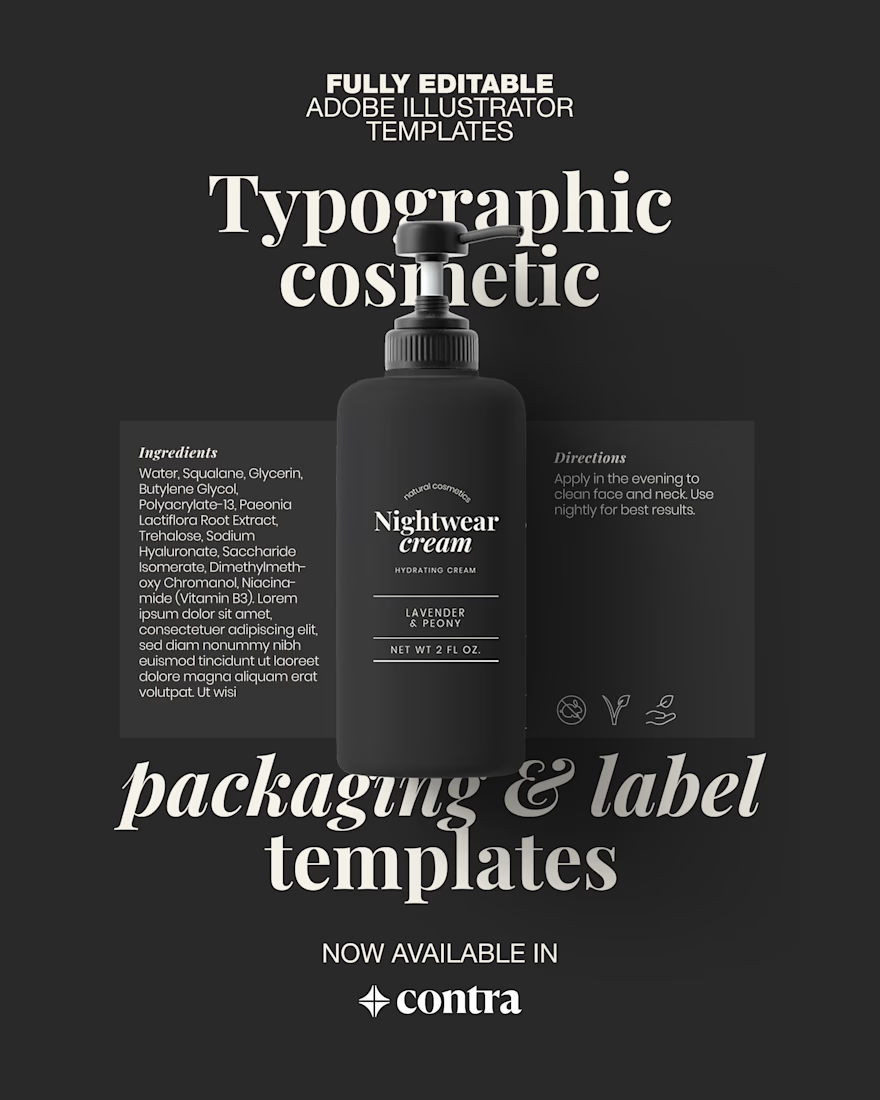
Think of these as a base layer. Not a final answer.
Use the layouts, then change the typography. Adjust the rhythm. Test weight, spacing, contrast. Make mistakes. That’s how good packaging happens.
I use this exact approach in client work. Now it’s available as editable Illustrator templates.
See what a retail ready foundation actually looks like: 🔗 get the templates here


The network for creativity
Join 1.25M professional creatives like you
Connect with clients, get discovered, and run your business 100% commission-free
Creatives on Contra have earned over $150M and we are just getting started
Related posts

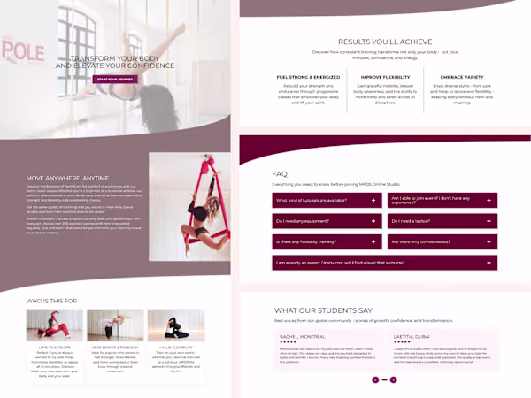
Sharing one of our recent Kajabi projects ✨
What I love about this one is how it started from one of our own sales page templates and evolved into something that feels completely aligned with the client’s brand.
At Inweba, we design our templates strategically – but the real work begins in customization. Once we step into brand alignment, typography, layout refinement, and visual direction, the structure transforms into something unique.
This project is a great example of how a strong foundation doesn’t limit creativity – it supports it.


love this @Serge Herasymchuk
amazing work 🔥

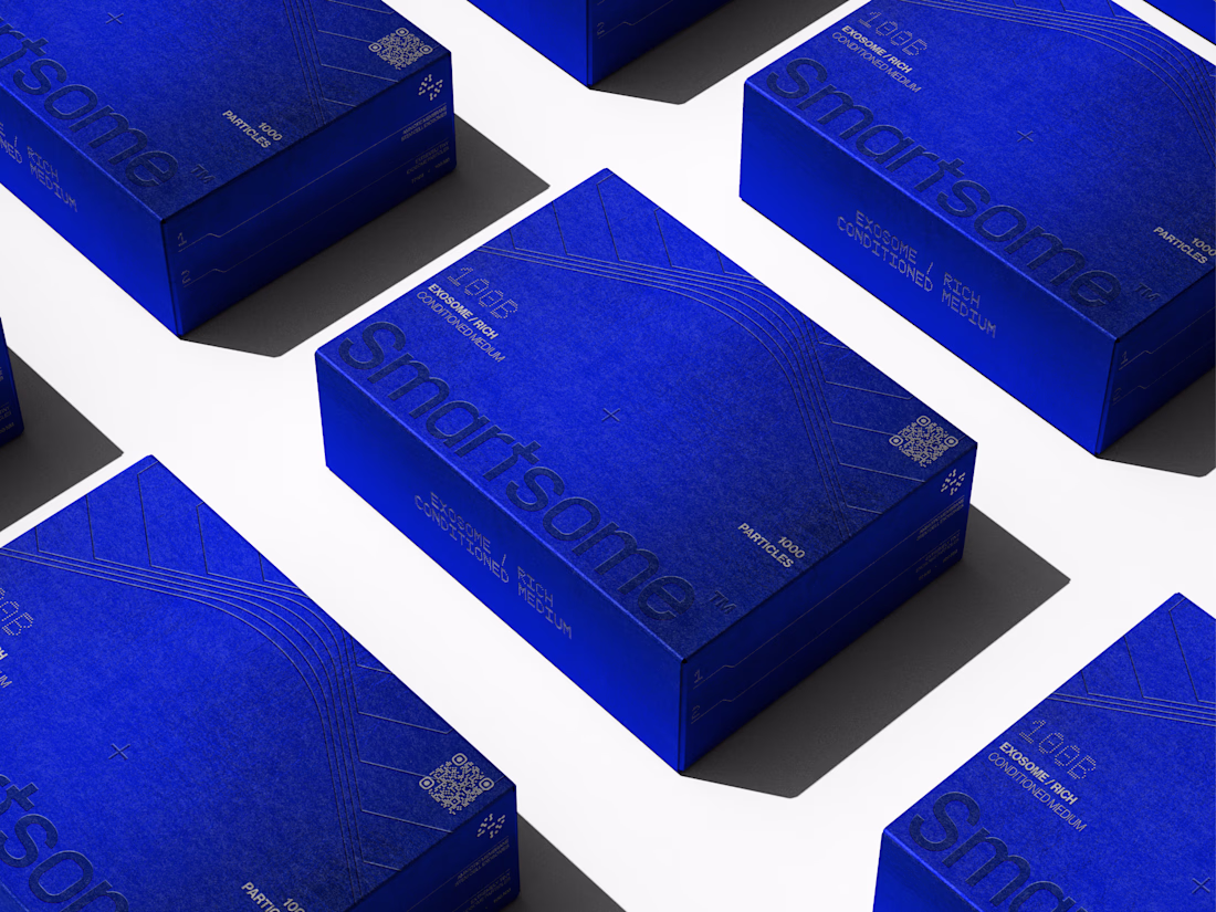
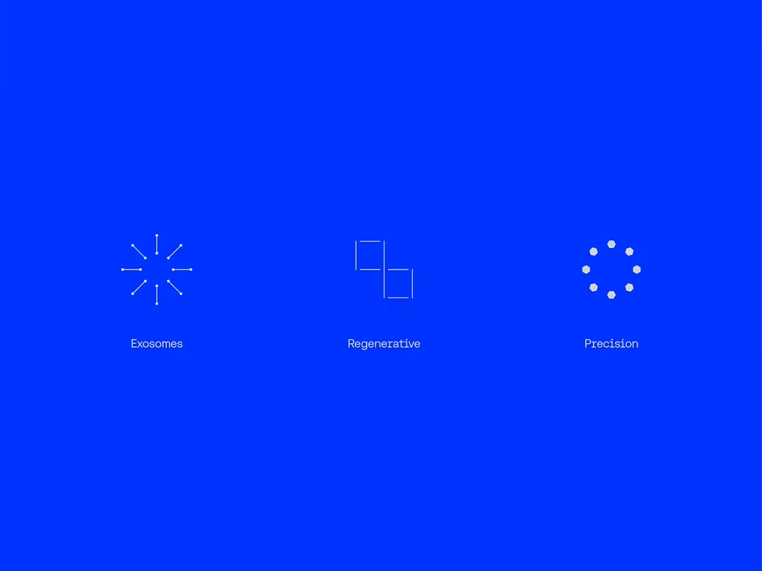
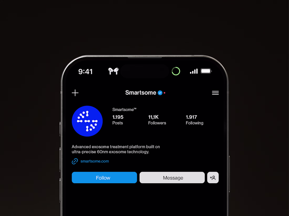
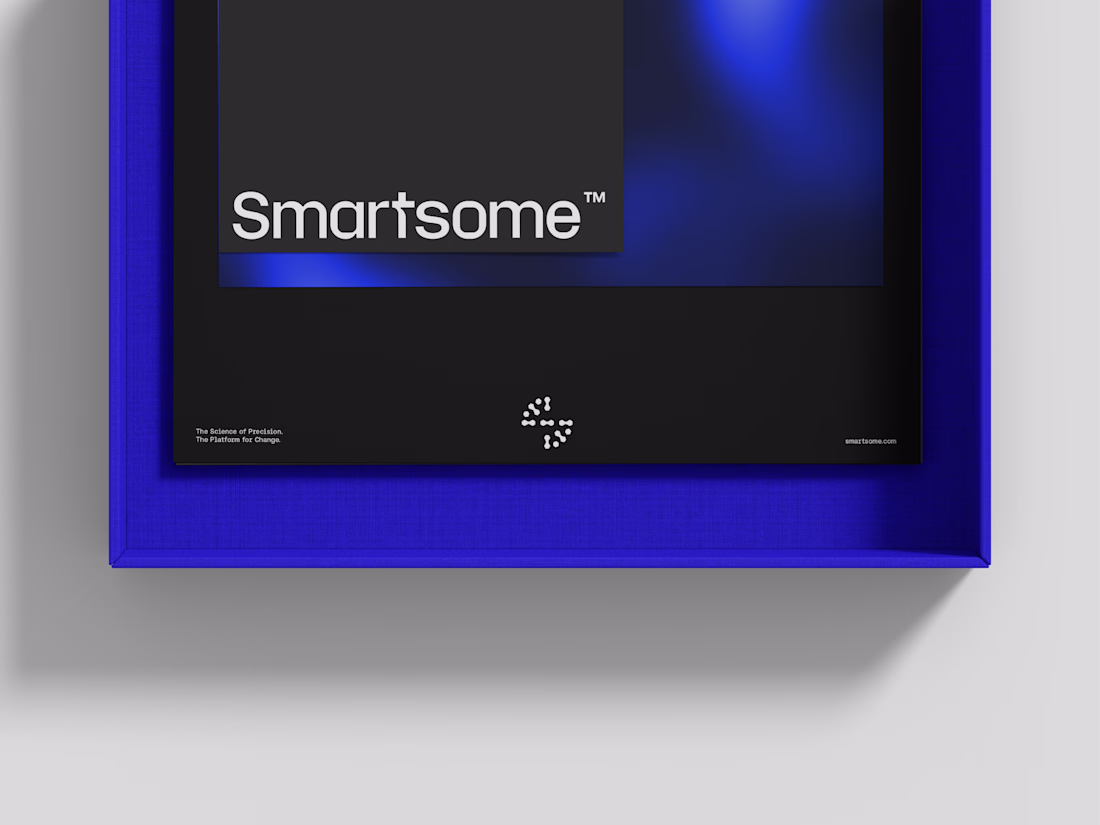
Our most recient visual identity project: Smartsome™


KINESIS LIVE DEMO.
30 seconds. No mouse.
I built a tool where you sculpt typography with your hands.
This is KINESIS.
Real-time hand tracking.
Modular type construction.
No stretching. No presets.
You move — the letter responds.
No one has seen this before.
Your hands are the font.
Exlpore it your way: Kinesis.figma.site


Trending
maxearnings
The next frontier of payments is live on Contra. How are you maximizing revenue?
freelancerlife
Freelancer life is wins, pivots, and everything in between. What’s yours right now?
aidesignflow
AI tools are redefining how designer work. What does your workflow look like?
micrographics
Micrographics started as utility - barcodes, packaging, instruction labels. How would you use them?
aivideo
AI video tools are moving at warp speed. What tools are you using?