The network for creativity
Join 1.25M professional creatives like you
Connect with clients, get discovered, and run your business 100% commission-free
Creatives on Contra have earned over $150M and we are just getting started
Back to feedPost

Authors: Is your Amazon book page actually helping the right readers understand why they should pick up your book?
Sometimes the problem isn't the book itself. It can be the way the book is positioned, described, or presented to the reader.
I’m offering a few authors a focused review of their Amazon book listing, looking at the description, reader positioning, presentation, and comparable books.
If you'd like me to take a look at yours, DM me the Amazon link.
The network for creativity
Join 1.25M professional creatives like you
Connect with clients, get discovered, and run your business 100% commission-free
Creatives on Contra have earned over $150M and we are just getting started



Related posts

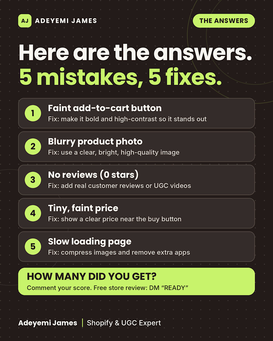
Here are the answers to the “Spot the 5 Mistakes” product page puzzle, and how to fix each one:
A faint add-to-cart button. Make it bold and high-contrast so it stands out.
A blurry product photo. Use a clear, bright, high-quality image.
No reviews. Add real customer reviews or UGC videos to build trust.
A tiny, faint price. Show a clear price near the buy button.
A slow-loading page. Compress images and remove extra apps.
Small details like these are easy to miss when you look at your own store every day, but shoppers decide in seconds whether to trust it.
I’m Adeyemi James, a Shopify and UGC expert. This week I’m offering free store reviews to 5 Shopify stores. Send me a message with your store link and I’ll look it over and send you my notes.
How many did you spot? Comment your score from 0 to 5.



Sunday from Bayelsa — Available now for Amazon & Shopify
product descriptions.
I write 300-word descriptions that sell — benefit bullets,
SEO keywords, clear call to action.
Starter $20 — 2 days delivery — 1 revision.