The network for creativity
Join 1.25M professional creatives like you
Connect with clients, get discovered, and run your business 100% commission-free
Creatives on Contra have earned over $150M and we are just getting started
Back to feedPost


The network for creativity
Join 1.25M professional creatives like you
Connect with clients, get discovered, and run your business 100% commission-free
Creatives on Contra have earned over $150M and we are just getting started





Related posts

Aveo: Brand Identity, Packaging & E-commerce Website for a Skincare Concept
A self-initiated skincare brand built end to end: identity, packaging, and a multi-page store.
Overview :
Aveo is a self-initiated skincare brand concept, designed end to end: brand identity, product line, packaging, and an e-commerce website, presented through a motion walkthrough in After Effects.
The challenge :
Skincare tends to look clinical or quietly minimal. I wanted Aveo to feel playful and confident, built around the idea of skin's "new favourite pop," without losing the credibility a product people put on their face needs.
Brand & packaging :
The identity runs on a saturated palette of magenta, lime, and violet. Each product gets its own color, and a sphere-topped cap gives the range a recognizable silhouette on a shelf and in a thumbnail. Packaging does the loud work so the interface doesn't have to.
Website :
The site gives the products a clean white stage and lets the packaging supply the color. Products are color-coded by category (toner, cleanser, serum), and benefit sections like Barrier Support and Radiance Boost pair one ingredient story with one image and one clear CTA. A drag-driven product carousel and a social gallery keep the page tactile without crowding the shopping path.
Deliverables
Brand identity, packaging system, responsive website, motion presentation.
Tools :
Framer, After Effects, Adobe Photoshop, Adobe illustrator


Carrying one visual system from packaging into e-commerce makes Aveo feel cohesive.

Shopify Skincare eCommerce Strategy & Consulting


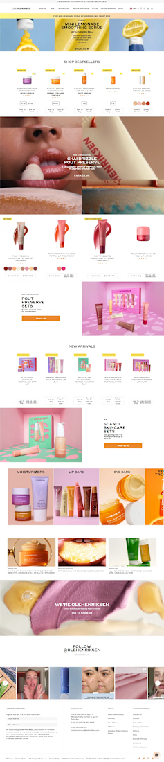
Shopify Skincare Store Design & Optimization
