The network for creativity
Join 1.25M professional creatives like you
Connect with clients, get discovered, and run your business 100% commission-free
Creatives on Contra have earned over $150M and we are just getting started
Back to feedPost

The network for creativity
Join 1.25M professional creatives like you
Connect with clients, get discovered, and run your business 100% commission-free
Creatives on Contra have earned over $150M and we are just getting started





Related posts

Studio section for Gateon, a interior design and architecture studio with bases in Lisbon and Porto


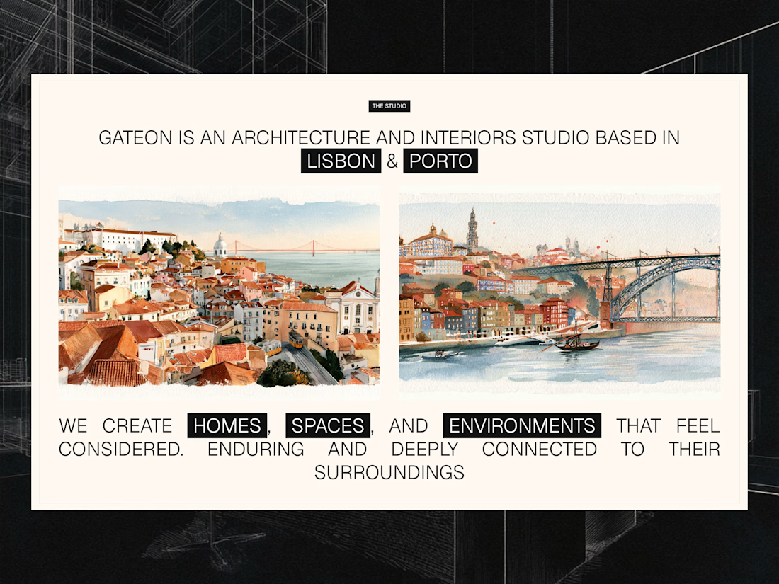


A calm, editorial landing page for an architecture studio, built around daylight and materials. We'd love to hear your thoughts! 🏛️


The warm timber slats against the pale page feel calm. Did you build the motion in Jitter?


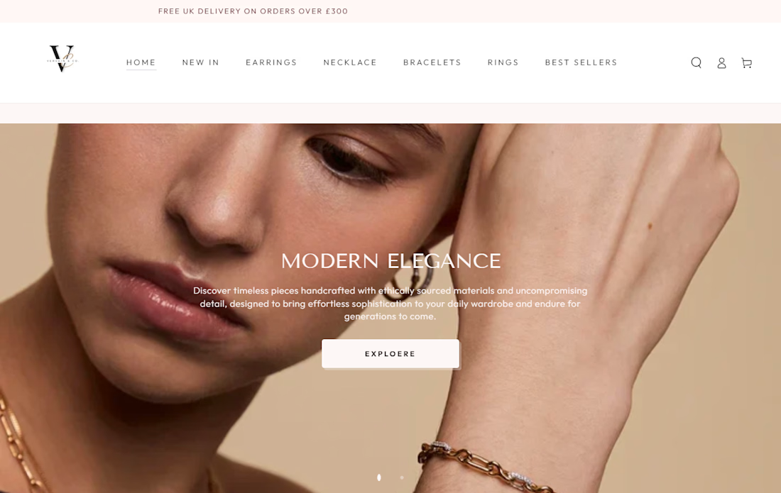
The entry point to modern luxury.
From messy layouts to clean, agency-grade storytelling. The new homepage banner system for Vervain & Co. is officially live. Drop a comment and let me know what you think!



This is lovely


