The network for creativity
Join 1.25M professional creatives like you
Connect with clients, get discovered, and run your business 100% commission-free
Creatives on Contra have earned over $150M and we are just getting started
Back to feedPost
Before a Shopify store goes live, the design is usually done. The checks are not.
• Test the checkout with a real order, end to end
• Test the contact and newsletter forms — do the messages actually arrive?
• Open the product pages on a phone and check the load time
• Check that the automated order and abandoned-checkout emails actually send
Automation fails quietly. Nobody gets an error message. The order email just never arrives, and the store owner finds out from a customer.
Which check do store owners skip most often?


Test the checkout with a real order, end to end, is the one that saves launches. Which check do you see skipped most often?

Good point — and I agree, the checkout test is the one that saves the launch. In my experience the most skipped check is the automated emails. Everyone tests the page they can see, but nobody waits to see if the order confirmation actually lands in the inbox. That's the one that fails quietly.
The network for creativity
Join 1.25M professional creatives like you
Connect with clients, get discovered, and run your business 100% commission-free
Creatives on Contra have earned over $150M and we are just getting started
Related posts

A clean design. A seamless shopping experience. A Abaya Shopify store built around the brand. ✨
What do you think of this Jennifer Shopify storefront redesign?
What would you improve or keep as it is? 👇


Well Structured Layout that match the Abaya product Style. Keep up the great Work💯
Designed a premium audio e-commerce storefront for VickMix 🎧
From the bold headphone hero section to product listings, audio technology highlights, and a clean product-focused layout, every section is designed to showcase the products and make browsing effortless.
What do you think of this design? Would you keep the minimalist look or make it more colorful? 👇


I'd keep it minimal. The grey palette lets the headphones do the talking.

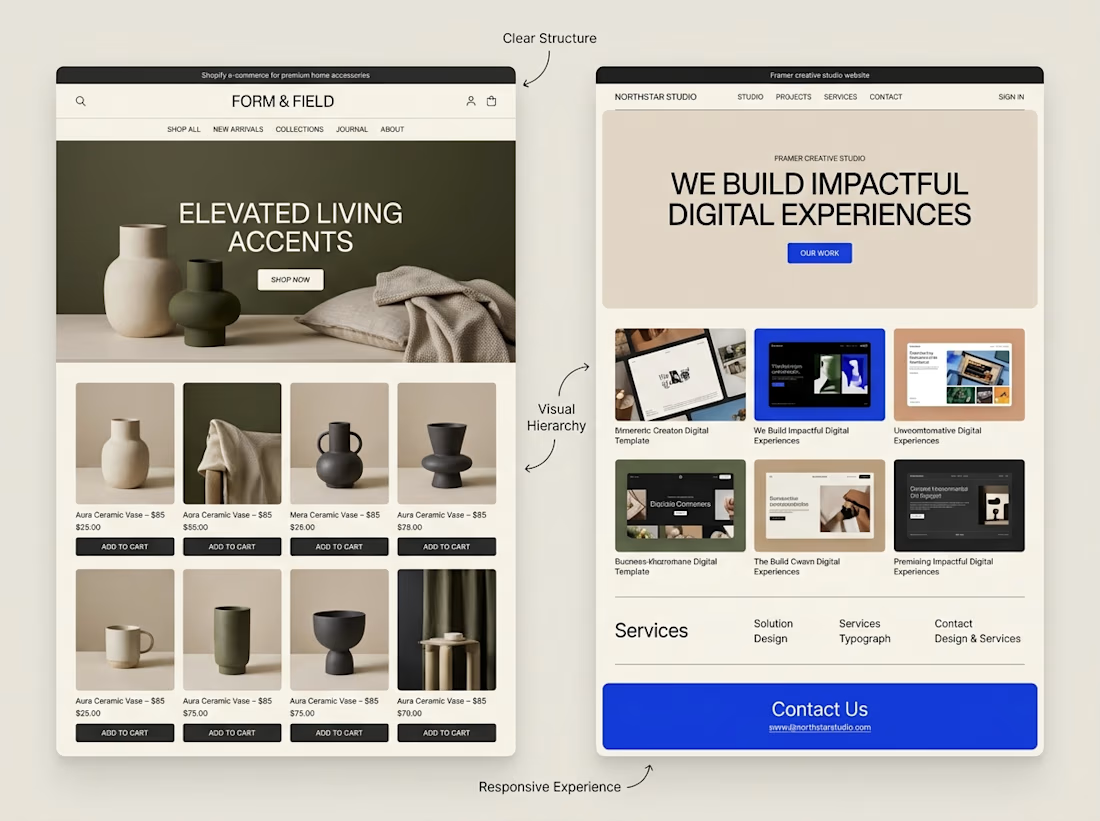
A website can look beautiful and still be difficult to use.
That's something I keep in mind when exploring both Shopify store design and Framer website design.
Although the platforms serve different purposes, some design principles apply to both:
→ Clear navigation helps visitors find their way.
→ Strong visual hierarchy makes important information stand out.
→ Thoughtful page structure creates a natural flow.
→ Responsive layouts help the experience work across screen sizes.
→ Clear calls to action help visitors understand what to do next.
The goal isn't simply to make a website look impressive.
It's to make the experience clear, useful, and easy to navigate.
I'm continuing to explore how these principles can be applied across different types of websites and projects.
What matters most to you when visiting a website, its visual design, its usability, or a combination of both?


Well said. Usability first, then visuals. Clear navigation wins me every time. 🙌