The network for creativity
Join 1.25M professional creatives like you
Connect with clients, get discovered, and run your business 100% commission-free
Creatives on Contra have earned over $150M and we are just getting started
Back to feedPost

Hi everyone! 👋
I’m working on improving the logo and brand identity of ARYA MEDIA NETWORK.
I’d love to hear your professional feedback. What improvements would you suggest in the typography, 3D effects, colors, spacing, or overall visual identity to make the logo look more premium and globally competitive?
Honest feedback and suggestions are welcome. Your insights will help me improve my design skills. 🙌
Thank you!
— Manoj Siyag | Arya Media Network

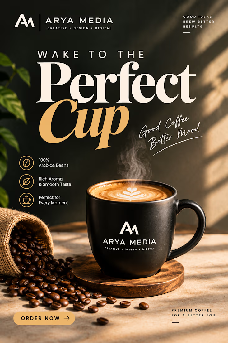

The WAKE TO THE Perfect Cup pairing of bold serif with the golden script is a strong type combo, Manoj. The GOOD IDEAS BREW BETTER RESULTS tagline sits nicely at the top. Refining the letter-spacing on the small caps would make it feel even more premium.
The network for creativity
Join 1.25M professional creatives like you
Connect with clients, get discovered, and run your business 100% commission-free
Creatives on Contra have earned over $150M and we are just getting started






Related posts

Most gyms follow a pretty similar approach to branding. I wanted to see what a strength club could look like if it drew more inspiration from a private-membership club vibe, since that's really trending right now.
Designed two directions for Arkos using the same mark. A is more refined and traditional, while B takes a bolder, more modern approach.
Which direction would you go with?
11 voted
50%
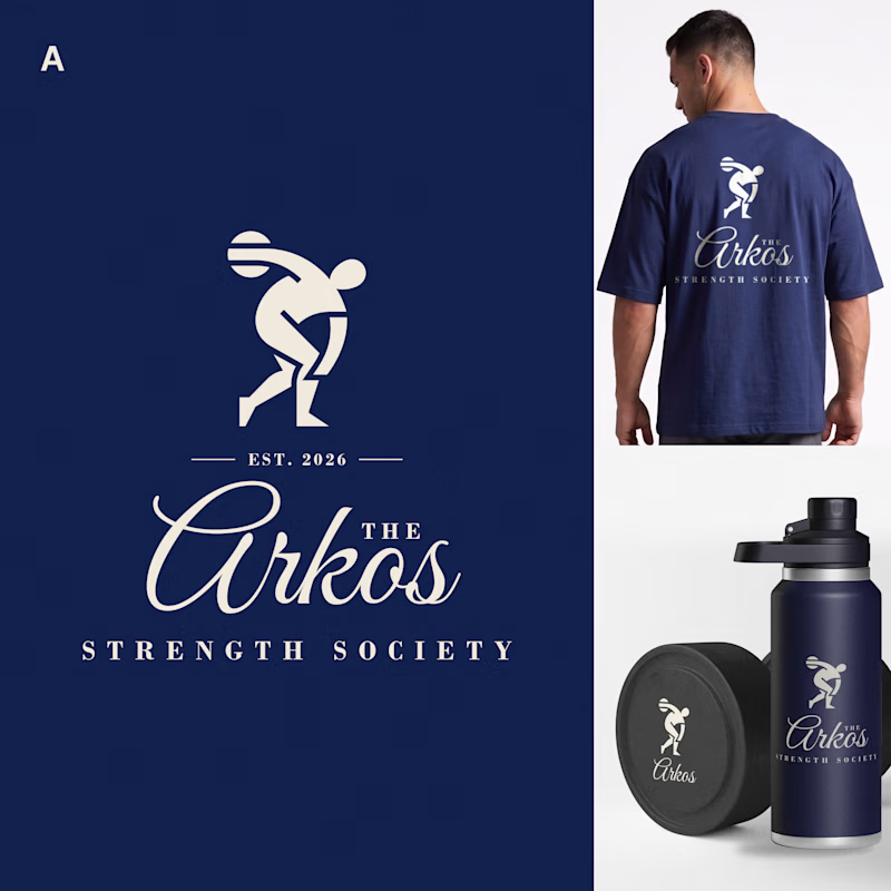
11 voted
50%
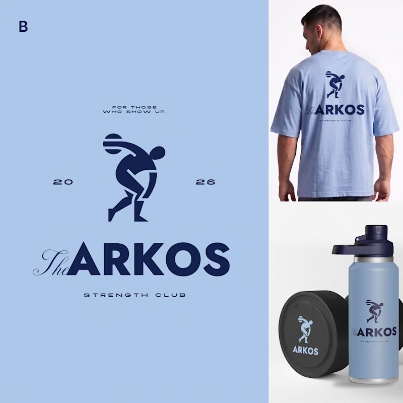
22 votes
Closed

The darker one is the best for me, but both are really good, man

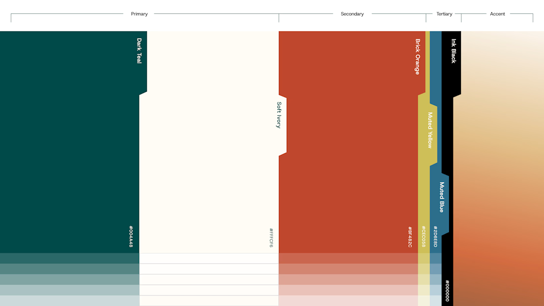
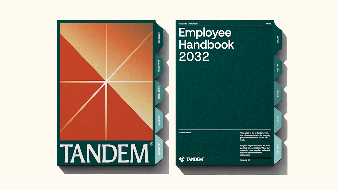
The new brand identity for Tandem is live!
Quite a lot of thought and work went into building this one, and I'm excited to finally share it. Would love to hear your thoughts!
We developed a complete brand experience for Tandem, covering:
1. Brand Strategy
2. Brand Naming
3. Logo Desig
4. Visual Identity
5. Brand Collaterals
6. Brand Guidelines
7. Motion Design
The complete project is now live. Take a look and explore the full identity here


Great work!!

One of the hardest things in branding is knowing what not to change.
Nubank recently worked with Koto to evolve its visual identity as the company expands internationally.
They kept the recognizable logo but rebuilt the wider system around typography, colour, illustration, photography, and motion.
The interesting part for me is how much of this work happens inside the actual product.
Animations built in Rive, a more consistent interface language, and an identity that needs to work across different markets without losing its personality.
I think that's where branding is heading, especially for digital-first companies.
A good identity shouldn't just look great in a presentation. It needs to work just as well inside the product people use every day.

Top-notch branding/rebranding