The network for creativity
Join 1.25M professional creatives like you
Connect with clients, get discovered, and run your business 100% commission-free
Creatives on Contra have earned over $150M and we are just getting started
Back to feedPost
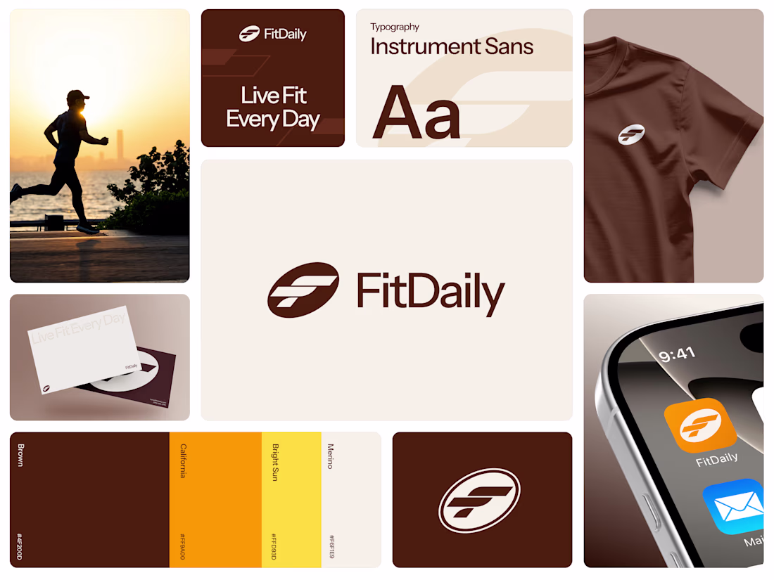
FitDaily - Health Monitoring app Brand Identity
The visual identity was designed to embody energy and clarity. Clean typography represents simplicity and structure, while the dynamic symbol expresses movement, rhythm, and continuous growth. The color direction leans toward fresh and vibrant tones — capturing vitality, motivation, and balance.
Every branding decision was intentional. From logo construction to visual language, the system was built to communicate reliability, modernity, and encouragement. FitDaily speaks to people who want to improve themselves without pressure — people who believe that showing up every day matters more than being perfect.
Progress is built daily.
Live fit every day.
The network for creativity
Join 1.25M professional creatives like you
Connect with clients, get discovered, and run your business 100% commission-free
Creatives on Contra have earned over $150M and we are just getting started
Related posts
Project I worked on with @brandtcreative.co
Every element in this identity was chosen with intention. The house, the trees, the cactus rooted in the founder's story and brought to life through a visual language that feels both personal and precise.
Deep navy and a collegiate green. A clubhouse energy that is refined, grounded and confident. The kind of brand that carries its history without having to explain it.
Every great brand is built, not born.
Sharing the identity we created for Harrow a hospitality group that curates boutique hotel and restaurant experiences where refined design and genuine service move together like a well-run room.
The visual language reflects that same coordinated thinking. Striped brick elements that layer and build, grounded in a palette of mint, deep green + gold. Something structured, but alive.
Wow I love these! 💕
Trending
Claude
Claude has entered the design space. How are you using Claude Design?
Contra University
Learn from expert creatives how to earn more using next-gen AI tools.
creativeaiflow
Creative AI workflows are evolving. What tools do you use, and what are their strengths and weaknesses?
portfolioreview
The best portfolios tell a story, not just show a grid. Share yours for feedback.
freelancerlife
Freelancer life is wins, pivots, and everything in between. What’s yours right now?