The network for creativity
Join 1.25M professional creatives like you
Connect with clients, get discovered, and run your business 100% commission-free
Creatives on Contra have earned over $150M and we are just getting started
Back to feedPost

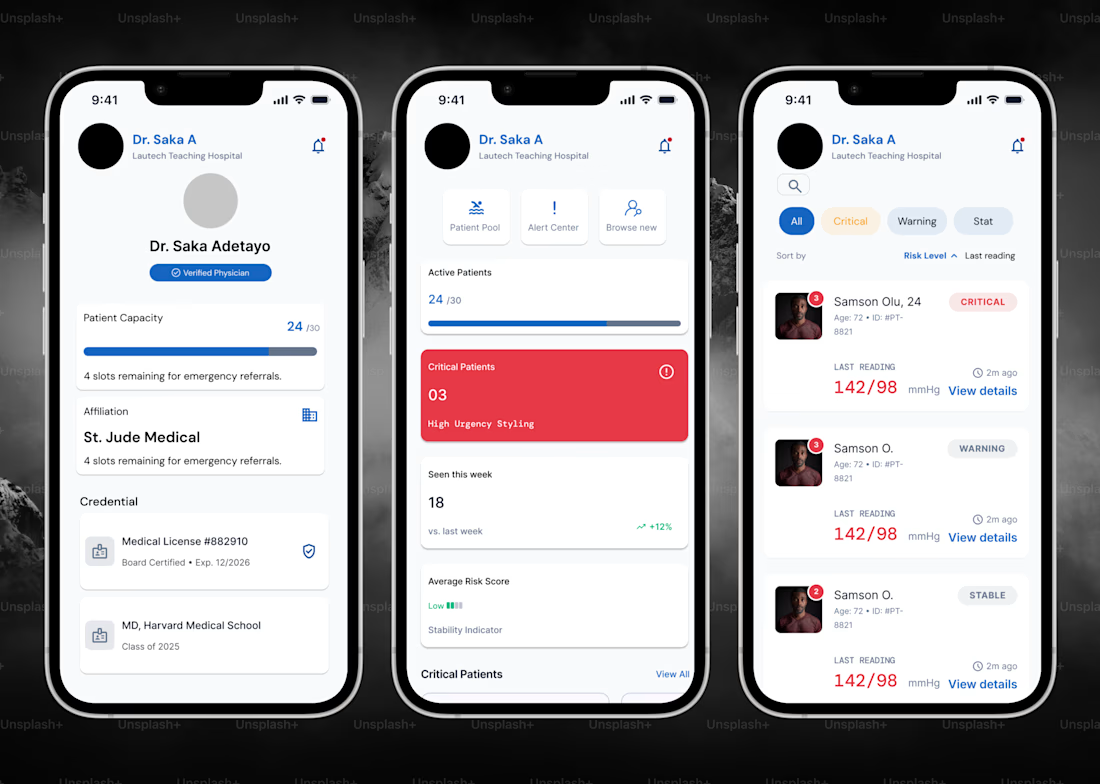
Designed a mobile dashboard for physicians to manage patient loads, track vitals, and respond to critical alerts in real time.
The goal was simple, I gave doctors a way to triage patients at a glance. Active patient count, critical case flags, and average risk score sit right up front on the home screen, so a physician can tell in seconds if something needs urgent attention.
From there, the patient list lets them filter by risk level (Critical, Warning, Stable) and sort by last reading, with live vitals (BP, timestamps) surfaced directly on each card, with no digging through charts mid-shift.
Built with a calm, clinical visual language: soft blues, clear hierarchy, and red reserved only for what's actually urgent, so the UI doesn't cry wolf.
Scope: UX research → user flows → wireframes → high-fidelity UI → prototyping (Figma).

The network for creativity
Join 1.25M professional creatives like you
Connect with clients, get discovered, and run your business 100% commission-free
Creatives on Contra have earned over $150M and we are just getting started


Related posts


When you forget that it's not 2005 and you don't work for 2Advanced... 😅
Designed and animated in Figma.
(it's about time to finally discover these new animation features).

That looks like an underwater design😊 Great Work!

Interior Design Website
The white flowers on the mantel overlap the headline.
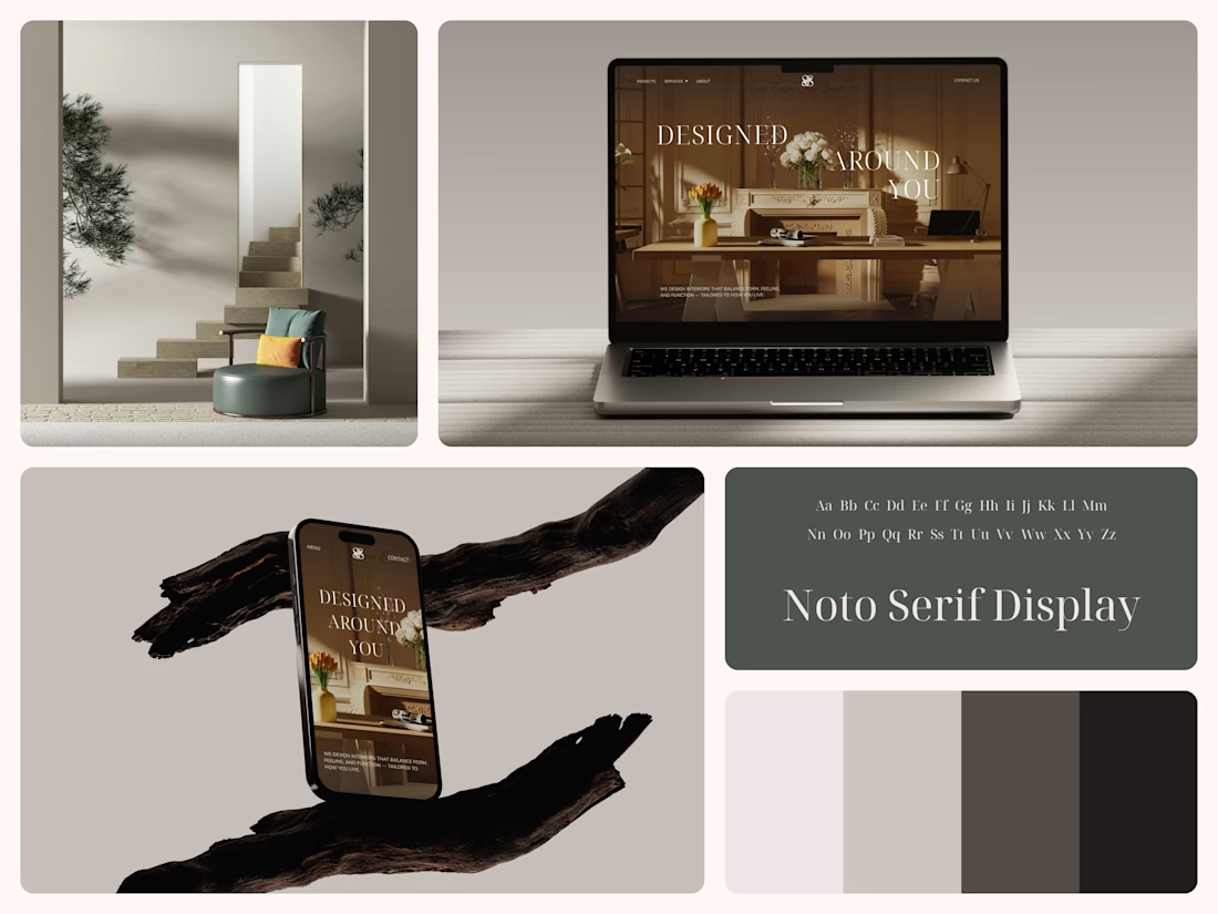
Thin Noto Serif Display capitals step down across one warm photo of a paneled room, so the space stays in view between the words. On the phone, the three words stack in a centered column, with Menu and Contact on either side of the monogram.
The palette runs from soft white to near black, which leaves the color to the photo: orange tulips and warm light on the walls.
The headline reads "Designed Around You", and the hero takes it literally, with the wall behind the type and the flowers in front of it.
Designed by the Hue & Machine team.
#InteriorDesign #InteriorStudio #WebsiteDesign #HomepageDesign #WebDesign #ResponsiveDesign #Typography #EditorialDesign #UIDesign #FigmaDesign


Nice!

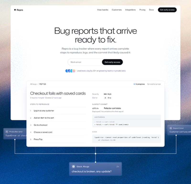
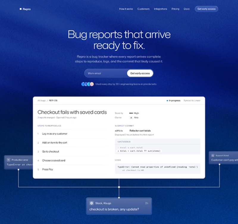


hard pick, both are clean