The network for creativity
Join 1.25M professional creatives like you
Connect with clients, get discovered, and run your business 100% commission-free
Creatives on Contra have earned over $150M and we are just getting started
Back to feedPost


The network for creativity
Join 1.25M professional creatives like you
Connect with clients, get discovered, and run your business 100% commission-free
Creatives on Contra have earned over $150M and we are just getting started

Challenges
View all


Related posts

Congratulations

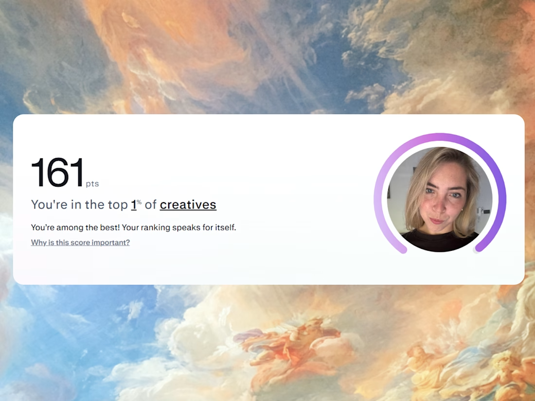
Feels like I joined Contra just yesterday - and today I'm in the top 1% of creatives. Pretty wild.

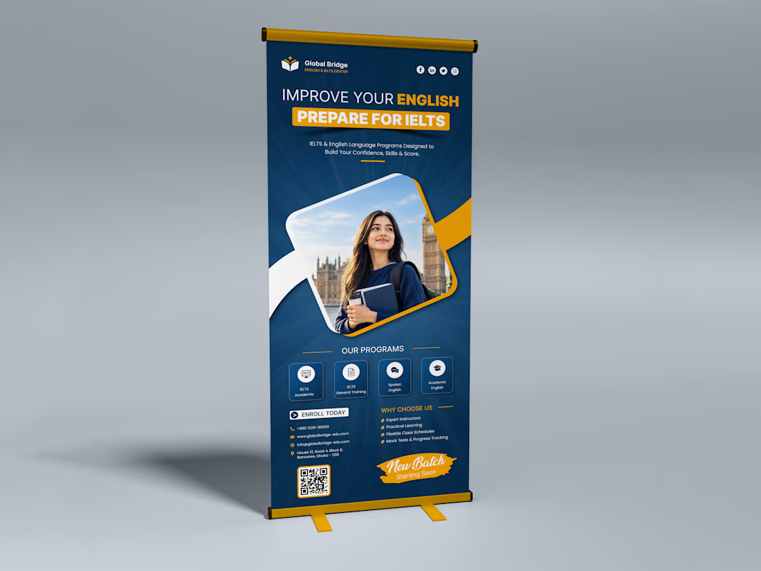
A banner should do more than fill a space, it should make people stop, look, and remember your brand.
Designed this English & IELTS Training Center Roll-Up Banner with a clean layout, strong hierarchy, premium colors, and a clear CTA, so students can understand the message in just a few seconds.
Because when your brand looks professional, people notice the difference.
Would your institute stand out with a banner like this? 👀
Best Design: www.fiverr.com/sellers/rifatislam149/edit
Portfolio: https://dribbble.com/artoryxrifat
#RollUpBanner #EducationDesign #IELTSBanner #GraphicDesign #Branding #PrintDesign #BannerDesign #CreativeDesign

nice work

Designed a colorful and creative hero section UI for an online Design School! 🎨✨ Built with bold geometric shapes, clean typography, and a modern layout to engage creative learners.

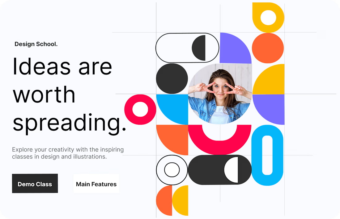

The portrait sits inside the bento grid as just another tile instead of breaking out of it - the hero stays a system of equal-weight shapes rather than one photo with decoration around it.