The network for creativity
Join 1.25M professional creatives like you
Connect with clients, get discovered, and run your business 100% commission-free
Creatives on Contra have earned over $150M and we are just getting started
Back to feedPost

Creative direction, concept development, and social storytelling for a food & design publication. Defined the visual language, editorial themes, and content strategy from the ground up.
Art DirectionartdirectionbrandstrategycreativedirectionBrand StrategyCreative DirectionCanvaGoogle DocsInstagramShopify


Love this, it doesn't feel overly nostalgic, very moody and sexy but natural.


I love that feedback! Thank you!
The network for creativity
Join 1.25M professional creatives like you
Connect with clients, get discovered, and run your business 100% commission-free
Creatives on Contra have earned over $150M and we are just getting started
Related posts

Rofella - Brand Expressions



The serif wordmark against that warm, textured paper feels so confident and timeless, and the deep burgundy gives the whole identity real character. Beautifully restrained work, keep going! Did the paper texture come from a real scan or did you build it digitally?

AREA — Minimal Brand Identity
AREA’s identity began with a simple idea: structure can make a brand more distinctive.
We explored it through bold typography, geometric forms, and a restrained monochromatic palette, bringing clarity and consistency to every touchpoint.
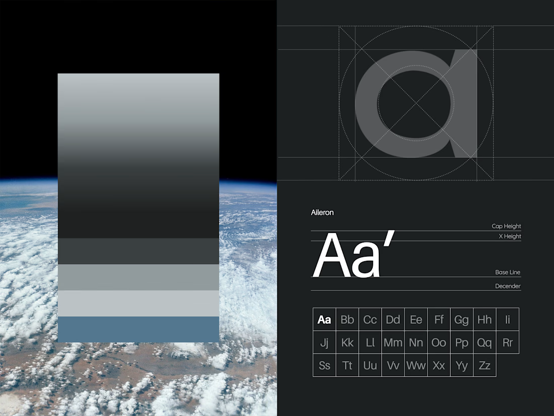
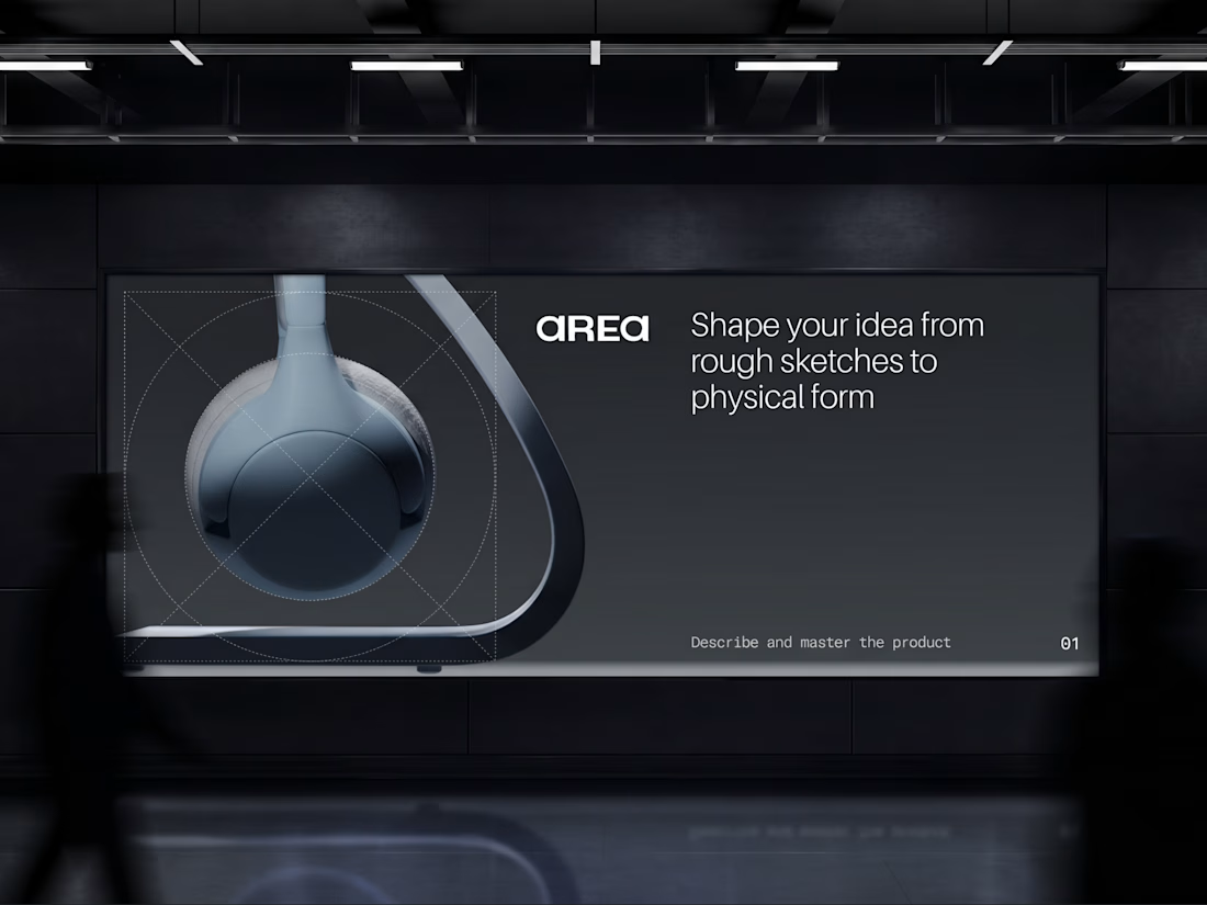

Monochrome can feel cold, but the big type keeps this sharp. Did you start with the type or the shapes?

Real estate client for Mumbai - Ran Facebook Ads for luxury flats. Generated 89 qualified leads in 28 days, closed 3 deals worth 1.2Cr revenue at $3.45 CPL.


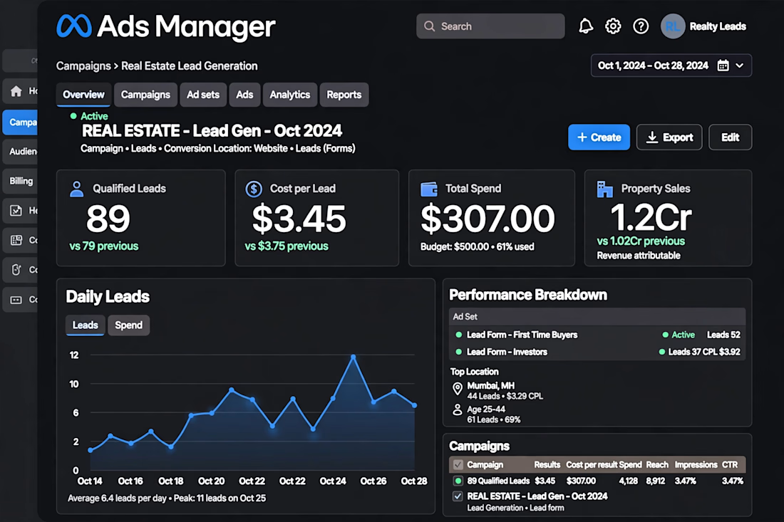

The dashboard view makes the funnel easy to follow. For luxury flats, which creative angle pulled the cheapest leads: lifestyle shots or the location and price hook?