The network for creativity
Join 1.25M professional creatives like you
Connect with clients, get discovered, and run your business 100% commission-free
Creatives on Contra have earned over $150M and we are just getting started
Back to feedPost


Clean, playful motion with a strong visual rhythm.

thanks a lot

Thank you so much for your kind words!😊
The network for creativity
Join 1.25M professional creatives like you
Connect with clients, get discovered, and run your business 100% commission-free
Creatives on Contra have earned over $150M and we are just getting started







Related posts

So, what is ROSI?
A few cans.
Five colours.
One very simple fish.
A ridiculously large wordmark.
And hopefully proof that everyday products don’t have to look everyday.



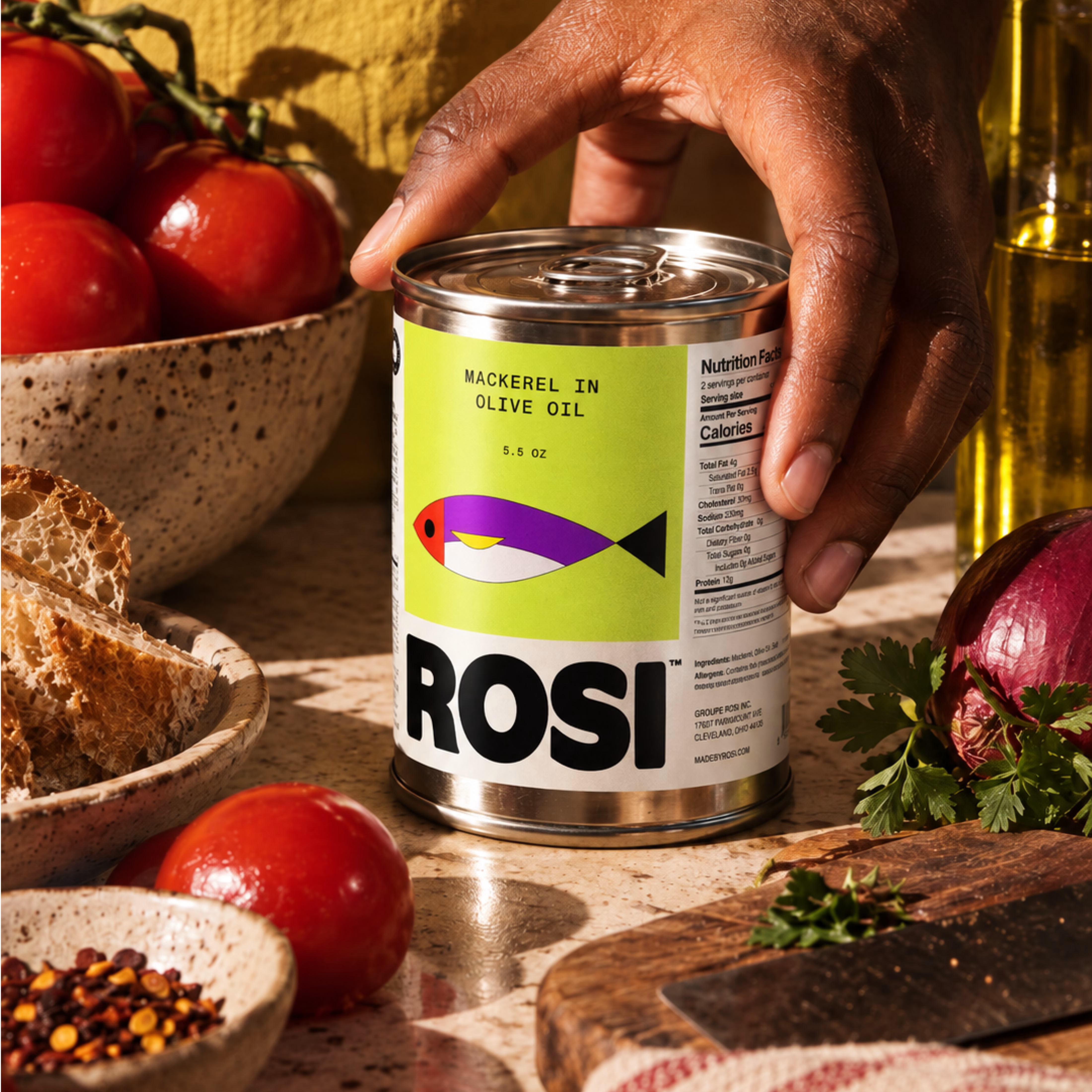
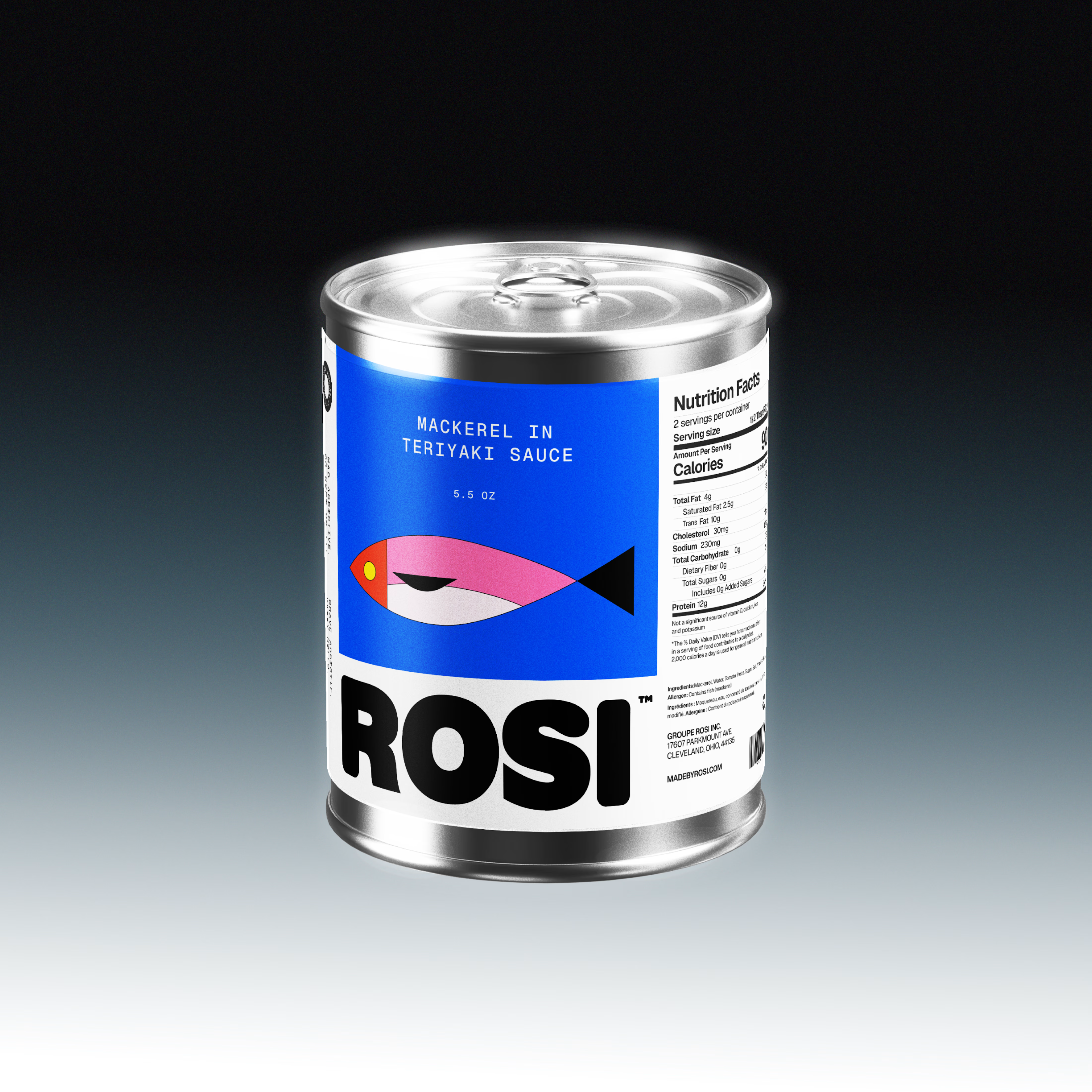
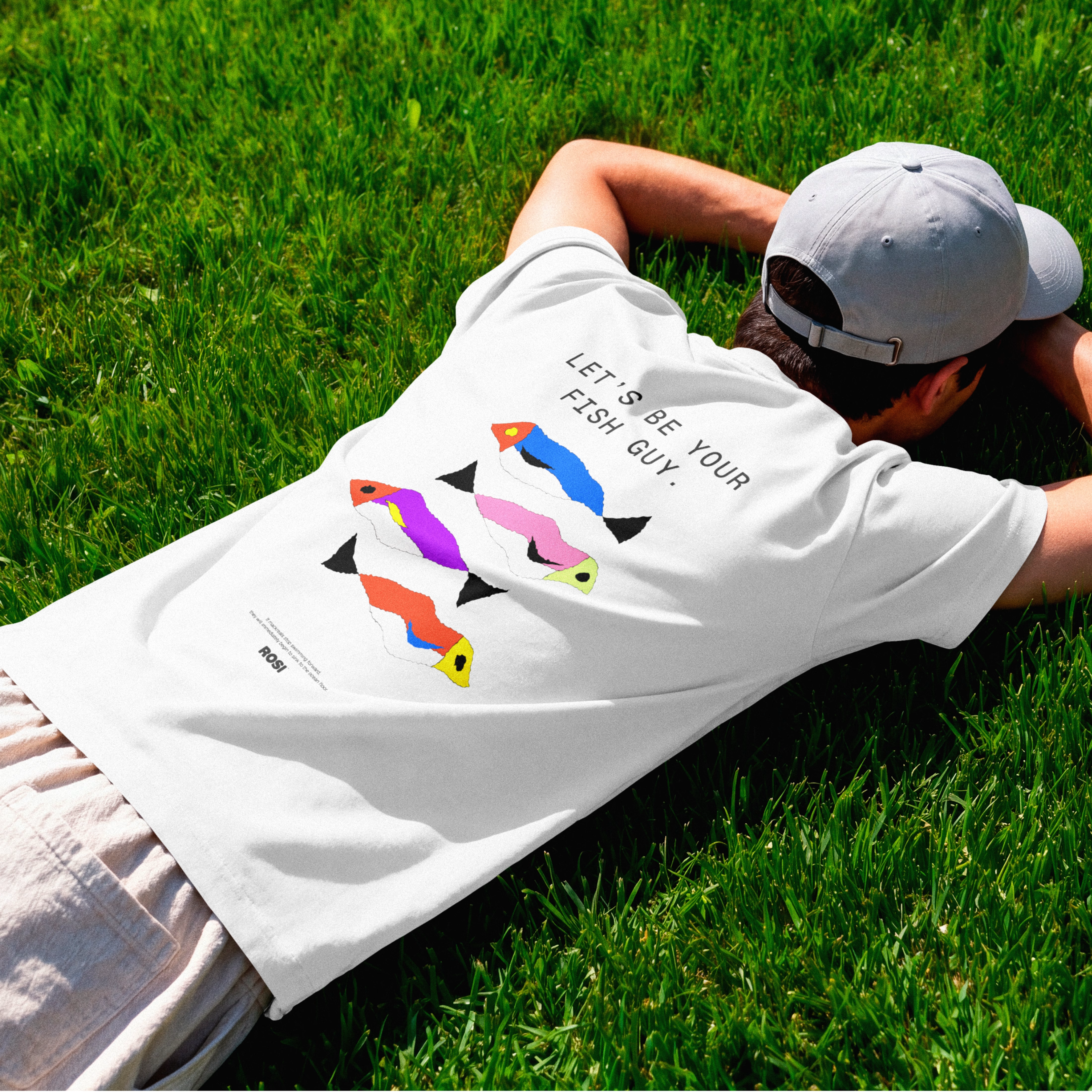

The ridiculously large wordmark is the entire personality, tinned fish has never strutted like this. Proof that confidence is a design decision, not a budget line.

Made this video with H3.
Exploring typography animation.


The way the letters stretch and reveal themselves in that typography feels almost cinematic. H3 handles motion blur really well for this kind of editorial animation.

🙌

Is sketching part of your creative workflow or we've forgotten what it feels to be human?
Depending on the projec's scope, I normally like to explore my ideas on paper before I come up with the best solution.
And no, they're not perfect.
They are rough and messy, my goal is so...

It used to be but now i try to create and start digitally as my drawing sucks so i feel like it saves my time somehow!