The network for creativity
Join 1.25M professional creatives like you
Connect with clients, get discovered, and run your business 100% commission-free
Creatives on Contra have earned over $150M and we are just getting started
Back to feedPost

“Duolingo does it” is one of the easiest ways to make a weak product decision sound researched.
Someone suggests a feature.
Someone else points to Duolingo.
Now the idea feels validated.
I saw this happen during a product review. The reference gave us a useful example of how an interaction could work.
The visible feature was only the surface.
Behind it were assumptions about the audience, the behavior being encouraged, how often someone uses the product, and what the product is trying to teach.
Those assumptions belonged to Duolingo.
Copying the feature would have brought them into a completely different product without anyone discussing whether they fit.
In that review, we kept Duolingo as the reference and went back to our own users before deciding what to build.
The network for creativity
Join 1.25M professional creatives like you
Connect with clients, get discovered, and run your business 100% commission-free
Creatives on Contra have earned over $150M and we are just getting started
Related posts


What happens when one website has to talk to two different people?
A client of ours teaches two audiences at once: expecting mothers who want a calm pregnancy, and women who want to become doulas. One brand, one site, two very different reasons to visit.
The usual fix is a hero that speaks to "everyone" and lands with no one. We designed it as a fork in the road instead:
1. Two doors in the hero. "I'm pregnant" and "I'm training to be a doula", side by side, equal weight. The visitor picks a path in one click, and the headline above them stays about the shared value.
2. One voice, two tones. The mothers' path is softer: fewer words, more room, gentle photos. The doula path is more structured: modules, certification, dates. Same fonts, same colors, different rhythm.
One proof section, split in two. Testimonials from mothers on the left, from doulas on the right. Each visitor sees people like them before the price.
Writing for everyone is writing for no one. Give each reader a door.
Have you ever designed a page for two audiences at once? How did you split it?

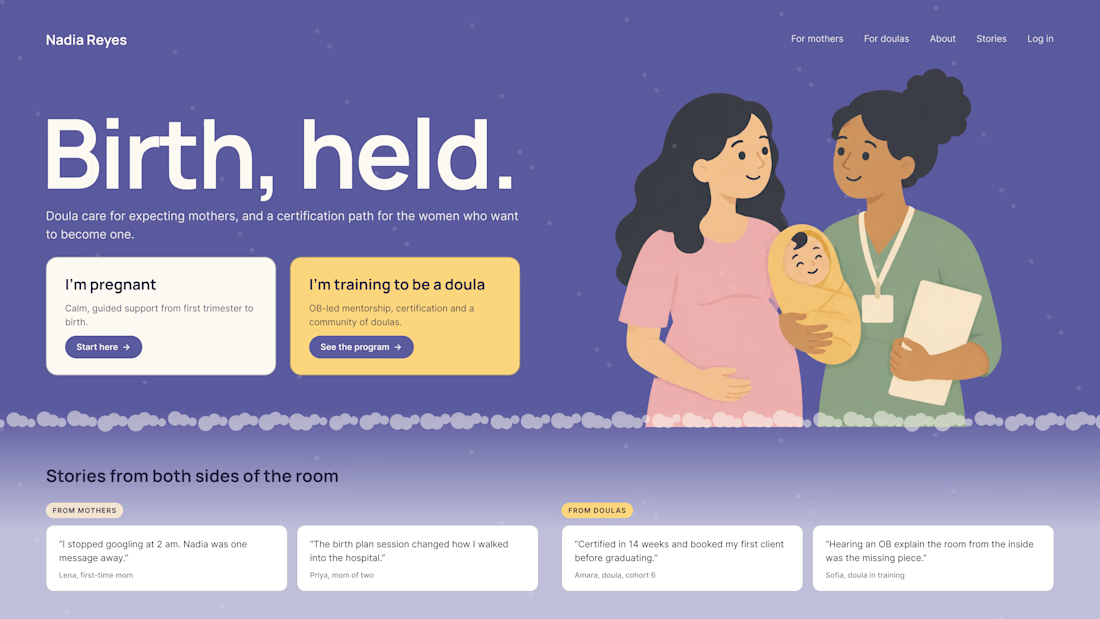

Love that purple hero with the two cards right up top.

I collaborated as a Staff Product Designer on Homebase, working through the Hakuna studio. I contributed to designing experiences for a workforce management platform, focusing on modules such as employee scheduling and payroll to make everyday tasks clearer and easier to manage. 👉 https://www.joinhomebase.com/


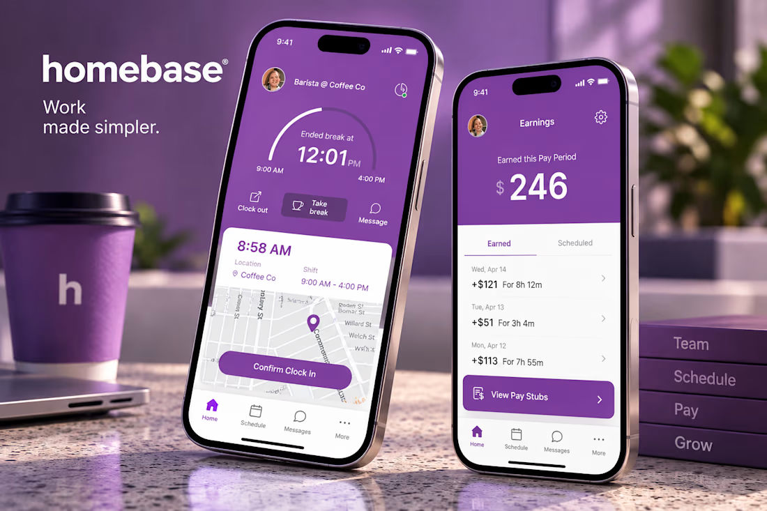


scheduling AND payroll in one project is a lot of screens. how long were you on it?


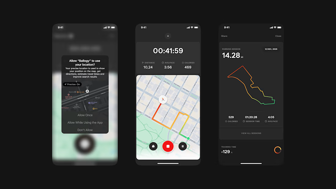
Ballogy app screens pt.2: live workout tracking, from location setup to the route map and session stats.