The network for creativity
Join 1.25M professional creatives like you
Connect with clients, get discovered, and run your business 100% commission-free
Creatives on Contra have earned over $150M and we are just getting started
Back to feedPost

For the #stitchchallenge, I wanted to explore how a custom wellness design system and simple canvas animations could make personal health tracking feel a bit more human.
Link to Project / Prototype
📋 Project Description
Aura Health is a personal, mobile-first medical wallet designed to completely replace cold, sterile medical software with an approachable interface that balances ironclad data security with empathetic, mindful design. Built around the theme "interfaces that feel alive," Aura acts as a living chronological companion.
Instead of overwhelming a patient with dense tables, it dynamically surfaces upcoming care plans and extracts unstructured diagnostic documents. This transforms an inherently stressful task into a clean, reassuring, and intuitive daily habit.
🚀 How I Used Google Stitch
I leveraged Google Stitch as the structural centerpiece of my creative design process:
Design Token Initialization: I loaded a completely customized .md design system directly into Stitch. This established a premium typography hierarchy and a palette centered on calming alabaster creams, warm ochres, and coral accents, instantly mirroring the comforting aesthetics of world-class wellness products.
Layout Scaffolding via Streaming: I used the canvas streaming feature to spin up three core screens instantly: a master health dashboard, an active document ingestion scanner, and a secure provider vault.
In-Place UI Iteration & Refinement: Stitch’s in-place AI edit engine allowed me to run highly explicit prompt iterations to eliminate horizontal layout clipping, fine-tune container padding, and cleanly position floating action targets without disrupting the core design foundation.
🌊 Key Stitch Features Showcased
📄 Existing Design System Import: Allowed me to seamlessly map out a dedicated, organic mobile skin without manually setting individual element tokens.
🎥 Dynamic Motion & In-Place Tuning: I used Stitch’s HTML canvas engine to inject fluid micro-animations directly into the interface—crafting an undulating SVG health trendline, continuous breathing timeline nodes, and a live scanning laser overlay.
💭 My Experience & Feedback with Google Stitch
Google Stitch represents a massive leap forward in rapid interactive prototyping. The ability to declare a global design token structure via plain markdown and then immediately prompt elements into existence on a unified canvas speeds up product workflows exponentially.
What I Loved: The streaming generator and in-place prompting make the platform feel like a helpful design partner. Being able to refine components right where they stand saved me a lot of manual tweaking. I especially appreciated being able to add fluid motion directly into the layout.
Feature Requests for Future Releases: During generation passes, the flex engine can sometimes compress side-by-side elements unpredictably when text lengths change, so a simple layout constraint or minimum size lock would be wonderful. Additionally, having the option to occasionally click and manually drag an element to reposition it on the canvas, without needing to write a prompt, would make fine-tuning even faster.


Rarely do I stop scrolling but this one got me.

Really like this, the shift from sterile medical UI to something more calming and human feels very thoughtful. The “living health companion” idea is strong.
View my entry for this challenge
https://on.contra.com/pnfJBQ
Curious what you think about it.

on.contra.com
Introducing Voya: Revolutionize Your Travel Planning Experience
Connect with next-gen talent and tools to get work underway. Hire more independents. Start more projects. Get more creative.
The network for creativity
Join 1.25M professional creatives like you
Connect with clients, get discovered, and run your business 100% commission-free
Creatives on Contra have earned over $150M and we are just getting started





Related posts

Can a designer push Lovable as hard as any design tool?
Yes, and the method is simpler than you'd think. Three steps. I'll show each one on real slides from this challenge.
First, why I'm back. I sat out the last couple of challenges: I needed a real break, and other projects needed me more. I hadn't opened Lovable in a bit over a year. When this one landed, I thought: let's see if a designer can take it to the limit, the way I do with every other tool. So far, it's holding.
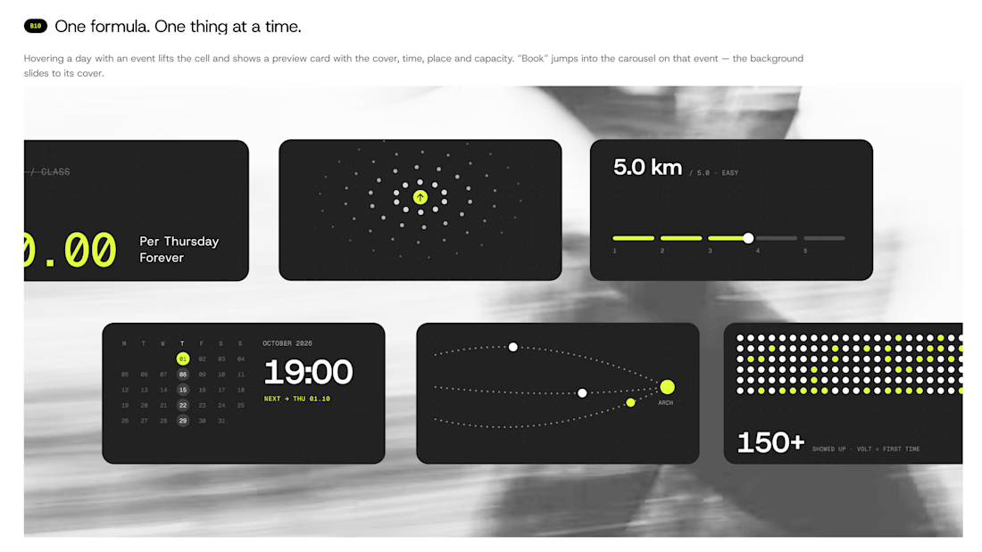
The client is Endorphin, a run club in Turin. Every Thursday, 19:00, under the Arco del Valentino, free, any pace. Here's the method.
1. Design every state before you prompt. Default, hover, spots left, full, waitlist, booked, past. Look at the third slide: each chip is a different state of the same event, "You're in", "23 left", "31 going". If a state isn't designed, Lovable guesses it. So I never leave it a guess.
2. Write the prompt like a spec. Real sizes, real colors, real timings. Mine says things like: the slide takes 480ms, easing cubic-bezier(0.2, 0.8, 0.2, 1), no bounce. Then I attach the Figma export of that exact state and write "match this pixel for pixel". That's how the calendar on the last slide got its hover: the cell lifts, a preview card shows cover, time, place and spots left, and Book sits right there.
3. One prompt at a time. I send a piece, compare it with my board, and only then send the next. The phone view on slide two came out that way: a booking sheet with two fields and one line, "No account. No password. Just show up." Above it, a molecule where every dot is a moment from a Thursday.
The first slide shows the result of all three: the whole night as single cards. Price, distance, time, meeting point, crowd. One idea each.
The tool is only as sharp as the brief you give it.
If you've built with an AI tool: where did you hit the wall first, design or logic?

great designs, all made in lovable right?


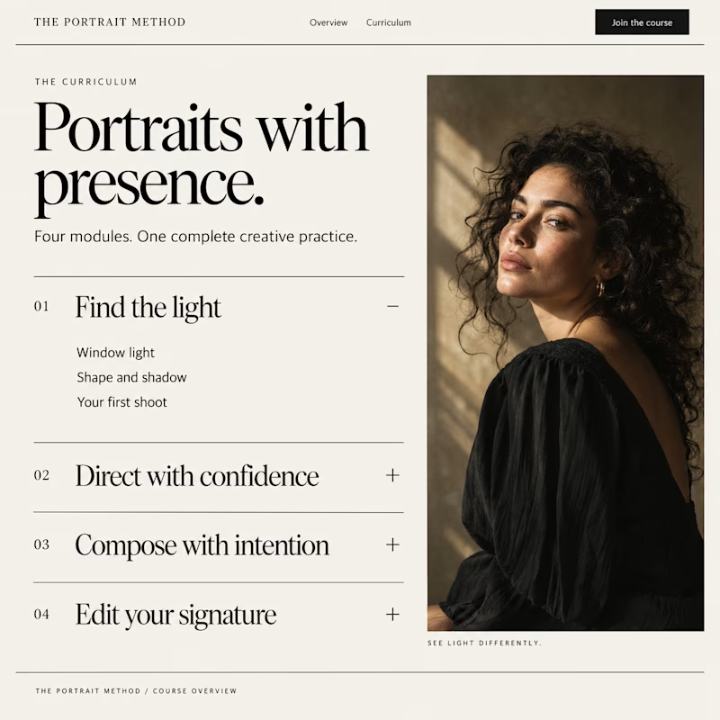
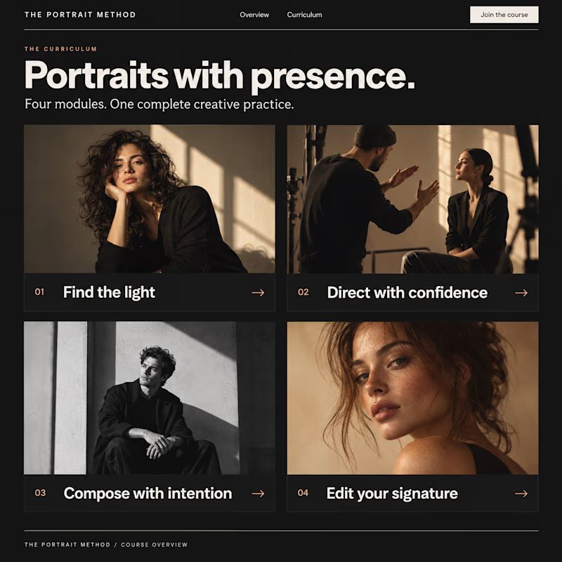
Which Kajabi course outline makes you want to enroll?
Same course. Two directions: a clean accordion or visual module cards.
Vote below. What tipped the scale for you?

10 voted
33%
20 voted
67%
30 votes
Closed

Visual module cards win every time for user engagement—they give buyers an immediate sense of structural depth before they even enroll.

One small detail I didn't want to let go unnoticed in STUDIO HRSE: the nav doesn't just show you where you are, it follows you there.
It's the kind of thing most people won't consciously register, but it's exactly the level of care I wanted this template to carry throughout.
Free template, live on Framer


The layout is perfectly balanced, great eye for spacing.