The network for creativity
Join 1.25M professional creatives like you
Connect with clients, get discovered, and run your business 100% commission-free
Creatives on Contra have earned over $150M and we are just getting started
Back to feedPost
Taste Test

Community. We need to talk about smileys. Not that I’m giving up on them. But look what happens when you don’t use one.
Which group are you in?
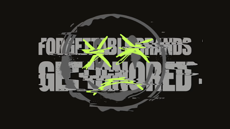
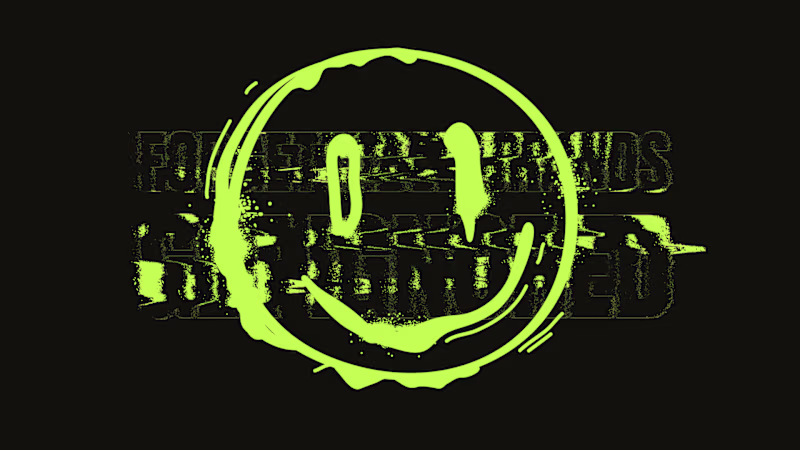
13 votes
Ends in 1d

I'm definitely in the smiley group! Option B with the neon smiley pops so much more — without it (Option A) it feels like it's missing that edge. Your smiley makes the "FORGETTABLE BRANDS GET IGNORED" hit way harder. Never give up on them!
Haha, the smiley definitely adds that extra punch! 😄 Thanks for sharing your take!

I like with smiley, it makes message more expressive and warm
Exactly! It adds a bit of personality to the message

Team A. Without the smiley the type just reads as noise, it gives the lettering something to anchor to.
That’s an interesting point! The smiley does give the lettering a clearer focal point.

B
Thanks for voting, Sahil! 🙌
The network for creativity
Join 1.25M professional creatives like you
Connect with clients, get discovered, and run your business 100% commission-free
Creatives on Contra have earned over $150M and we are just getting started





Related posts


Which feels more established to you?
22 voted
30%

52 voted
70%

74 votes
Closed


Badge Placement: Consistency or Visual Balance?
Even a small indicator can change how the entire interface feels
Adaptive Position
The badge placement changes depending on the icon’s shape and available space. The result feels more visually balanced but requires individual adjustments.
Fixed Position
The badge always appears in the top-right corner. This creates a consistent and predictable system, but on some icons it may feel disconnected or awkwardly placed.
What matters more in a design system: consistency or optical balance?
17 voted
43%
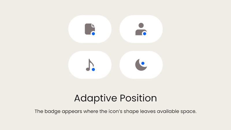
23 voted
57%
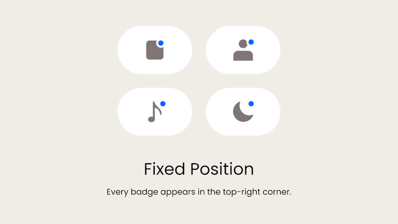
40 votes
Closed
Fixed for me. In a system, people learn where to look. I'd tweak the odd icons before breaking the rule.

Jiangliang (疆良) · SHC-12/36 🐯⚡
Which do you prefer — Foil Card 🃏 or 3D Render?


11 voted
48%
12 voted
52%
23 votes
Closed

Honestly I has no choice every work you do is stunning 🔥🔥