The network for creativity
Join 1.25M professional creatives like you
Connect with clients, get discovered, and run your business 100% commission-free
Creatives on Contra have earned over $150M and we are just getting started
Back to feedPost

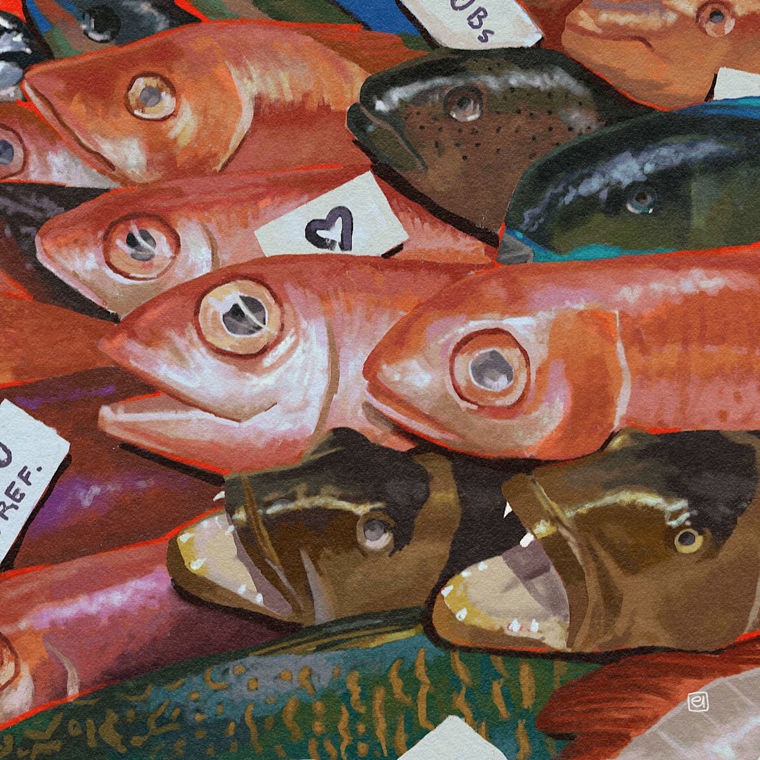
Painting fish is really fun! It's always fascinating to see how colors and shapes vary so much from one species to another.
Check it out :)


The network for creativity
Join 1.25M professional creatives like you
Connect with clients, get discovered, and run your business 100% commission-free
Creatives on Contra have earned over $150M and we are just getting started



Challenges
View all


Related posts


New case study!
Artist portfolio website design and Webflow development for Teri Sanders, a New York-based artist.


The way the editorial grid lets Teri’s work lead while the oversized name anchors the page feels beautifully restrained. Nice balance of art direction and a usable Webflow portfolio structure.


Love this concept 🧡

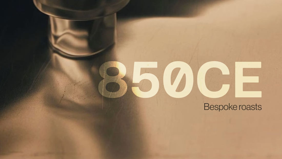
850CE is a self-initiated brand concept for a bespoke roastery. The project started as a landing page and grew into a full brand concept that evokes the tactile aspects of coffee rituals.
Check it out
The warm coffee-toned palette and soft-focus close-up make the tactile ritual feel tangible, while the oversized 850CE wordmark gives it a confident anchor. Nice move letting the brand grow from a landing page into a fuller identity system.