The network for creativity
Join 1.25M professional creatives like you
Connect with clients, get discovered, and run your business 100% commission-free
Creatives on Contra have earned over $150M and we are just getting started
Back to feedPost
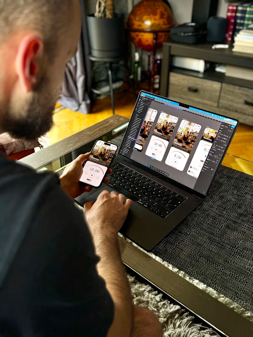
Most apps reward you by showing you a task completed. A tick. A bar filling up. A streak counter. It works because it borrows the dopamine of getting things done.
"Avoid the checkmarks. Avoid the percentage bars. Avoid anything that feels like productivity."
A friend I'm building a wellness app with said that during a working session. It changed how I approached the entire reward system.
But this product isn't about getting things done. It's about getting someone to pause. The second you put a progress bar on a calm experience, you've made it a chore. You've turned breathing into a to-do list item.
So we stripped the productivity signals out entirely. No checkmarks. No percentages. The reward had to feel like acknowledgment, not achievement. You opened the app, that was already enough, and the design needed to say that without making it feel like a level you cleared.
The reward you choose tells the user what kind of product they're in.
Get it wrong and a calm app starts to feel like homework. Nobody comes back to homework.
Nice work as usual
The 'turned breathing into a to-do list item' line nails the exact failure mode. Most wellness apps pick up productivity patterns without realizing they're importing the same anxiety the user was trying to escape.
The network for creativity
Join 1.25M professional creatives like you
Connect with clients, get discovered, and run your business 100% commission-free
Creatives on Contra have earned over $150M and we are just getting started
Related posts
💸FINANCIAL LITERACY CAN SAVE PEOPLE YEARS OF THEIR LIVES.
From debt.
From fear around money.
From depending on one salary.
From expensive mistakes that take years to repair.
That is why this project means more to me than another mobile app.
TEENAGERS + FINANCE IS A SERIOUS PRODUCT CHALLENGE.
Teenagers will not use a product simply because it is useful.
They lose interest quickly, ignore long explanations, and immediately sense when a product is trying too hard to speak “their language.”
The real challenge is to make complex financial mechanics clear, build healthy habits, and create an experience they genuinely want to return to.
In another situation, I might have turned this project down.
But this one felt personal.
🧠For as long as I can remember, my father has repeated:
“MONEY SHOULD MAKE MONEY.”
When I was around 4, he took me to work because there was nowhere else to leave me during the summer.
I spent entire days in his car, waiting while he went to meetings.
Then he came back and entertained me with business.
😍We played “my business.” He explained how money was made, why assets mattered, and why a person should always have a financial way out.
First, in the language of a 4-year-old.
Later, in real business language.
I do not know whether he was intentionally shaping my mindset or simply entertaining a permanently bored child.
But it worked.
I started investing early and understood:
FINANCIAL LITERACY IS NOT ABOUT NUMBERS. IT IS ABOUT FREEDOM.
It means not living from paycheck to paycheck.
It means having passive income when business slows down or you temporarily cannot work.
It means being able to change your city, country, or life without waiting for circumstances to become convenient.
The war in Ukraine made that brutally clear.
Money does not erase pain or injustice.
But it gives you choices.
This product is designed for the US and European markets, but I believe it can become global and give teenagers what many adults learn only after debt, fear, expensive mistakes, and years of financial stress.
The client waited almost six months for our Discovery Phase.
We completed Discovery, rebuilt the product logic, and are now moving forward.
MY TEAM AND I ARE BUILDING AN ECOSYSTEM THAT:
keeps teenagers engaged,
builds financial habits,
scales,
and generates revenue for the founder.
Because impact without a strong business model does not scale.
🔥 I AM OPENING A FEW STRATEGY SESSION SLOTS FOR JULY AND AUGUST.
Have a mobile app idea? I will identify where it falls short of the real market and how to strengthen the product and business model.
Already have a live app? Even better.
I will review your metrics and show you where you are losing users, retention, and revenue.
I have launched 350+ mobile apps and know when the problem is not only in product design, but in the product logic, monetization, positioning, or business model itself.
🚀 DM ME OR BOOK A STRATEGY SESSION THROUGH THE LINK.
🟢 https://calendly.com/asol_design/book-diagnostic-call-linkedin-clone
.
.
.
#MobileAppDesign #ProductStrategy #Fintech #FinancialLiteracy #TeenFinance #UXDesign #MobileUX #ProductDesign #AppGrowth #UserRetention #Gamification #BusinessStrategy #StartupGrowth #Monetization #AsolDesign::
Nice work as usual
What if AI could help you achieve your goals by improving your routine week by week, while also offering Anti-AI exercises for a complete mental workout?
Sarthi: An AI-Powered Self-Management App with Anti-AI Exercises
Problem: "With the emergence of AI, our already fast-paced lives have become even faster. Our activities have multiplied, and almost everyone is pursuing multiple things at once. So it has now become very important that we manage our routines effectively.
However, analyzing our routines and patterns can create cognitive load.
Along with this, the use of AI is causing us to underutilize our mental capacity, so it's important that we keep our minds focused and sharp while staying relaxed at the same time
Solution: "Sarthi AI keeps track of our goals, routines, and task performance, and through expressive writing, it also gains access to our thoughts. After analyzing our thoughts and actions, it develops a sense of personal understanding and can help us identify patterns about ourselves that we may not even be aware of. Sarthi thus helps us modify our routines week by week, so that we can be as efficient as possible
Along with this, the AI offers exercises to keep various functions of our minds active. And after completing intense tasks, it can suggest relaxing exercises like deep breathing, gentle walks, and more."
https://halt-math-77224343.figma.site
The Anti-AI exercises are a genuinely interesting design decision. Most productivity tools push you further into AI dependency. Building in deliberate mental exercises that don't involve AI as part of the core flow is a counterintuitive but sensible response to the problem you identified.
Get violated by our FaceAura App.
(Dont worry we dont store your photo, AWS is expensive)
https://faceaura.figma.site/
AI Face Landmarking: The LLM micro-analyzes your bone structure to calculate your exact workplace flaws.
Zero Catfishing: Uploading different photos won't change your fate. The AI reads you like a book every time. We tried.
The Metrics: Raw data tracking your Yap Capacity, Audacity Levels, and Aura Points.
Made with ChrisLe
Trending
Claude
Claude has entered the design space. How are you using Claude Design?
Contra University
Learn from expert creatives how to earn more using next-gen AI tools.
MagicPath
The canvas is infinite, and exploration is becoming the workflow. How are you using MagicPath?
creativeaiflow
Creative AI workflows are evolving. What tools do you use, and what are their strengths and weaknesses?
freelancerlife
Freelancer life is wins, pivots, and everything in between. What’s yours right now?