The network for creativity
Join 1.25M professional creatives like you
Connect with clients, get discovered, and run your business 100% commission-free
Creatives on Contra have earned over $150M and we are just getting started
Back to feedPost

Project: Good Huis Co
Role: Senior Shopify Developer
Overview Technical optimization and scaling for a premium Australian homewares brand. Evolving the store’s architecture to handle high-value furniture data.
Key Contributions:
Dynamic Data: Engineered product pages to pull Lead Times and Stock Status dynamically via Shopify Metafields.
Care Dashboard: Developed a custom tabbed interface for material-specific product maintenance instructions.
PDP Optimization: Integrated Afterpay and custom accordion drawers for technical specs and a clean purchase path.
UX Refinements: Implemented global marquee tickers for transparency and advanced brand filtering in navigation.
The Result A high-performance furniture storefront that balances complex technical data with a minimalist, high-end aesthetic.


The network for creativity
Join 1.25M professional creatives like you
Connect with clients, get discovered, and run your business 100% commission-free
Creatives on Contra have earned over $150M and we are just getting started





Related posts

A Shopify homepage has a few seconds to answer one important question:
“Am I in the right place?”
A beautiful design helps, but the homepage also needs to guide the visitor toward the next step.
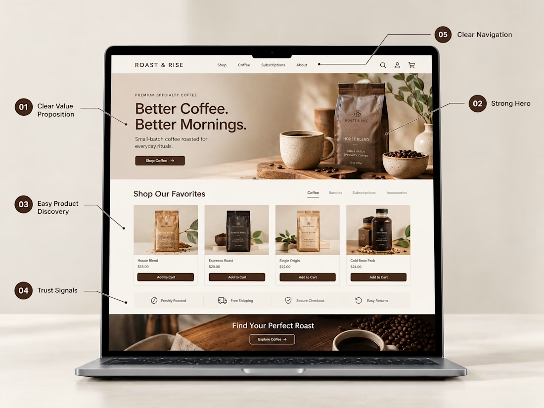
Here are 5 things I think every Shopify homepage should have:
1. A clear value proposition
Visitors should quickly understand what the brand sells and what makes it relevant to them.
2. A strong hero section
Use compelling imagery, a focused message, and a clear CTA instead of overwhelming visitors with too much information.
3. Easy product discovery
Featured products and collections should help shoppers find what they're looking for without having to search through the entire store.
4. Trust signals
Reviews, shipping information, return policies, guarantees, and secure checkout indicators can answer important questions before someone buys.
5. Clear navigation
Your navigation should make the store easy to explore. Customers shouldn't have to figure out where products or collections are hidden.
The goal isn't to put everything on the homepage.
It's to put the right things in the right order.
Good Shopify design isn't only about how the store looks. It's also about how easily someone can understand it and move through it.

100% agree! A great Shopify homepage is not just about design—it’s about clarity, trust, and guiding customers to the right next step. 👏

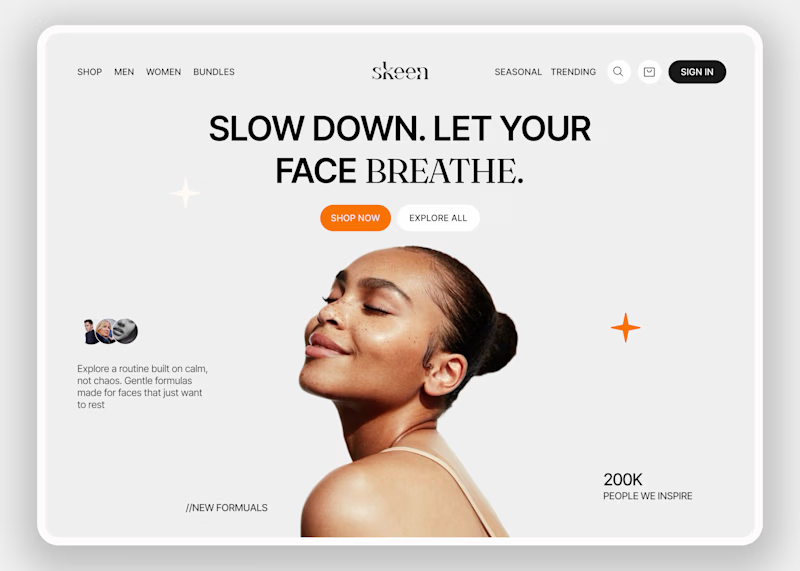
Skeen sells skincare online. People shopping for skin products are often unsure and overwhelmed by choices. The homepage has to make them relax first, and only then help them shop.
I kept the layout simple so the eye goes to one place and nothing fights for attention. Then I tested the mood with two backgrounds.
A is neutral grey, so nothing distracts from the product.
B is a warm peach that feels closer to skin and more caring.
Which one would make you trust a skincare brand more?

3 voted
33%
6 voted
67%

9 votes
Closed

On one will like normal bg in this context, B feels alive and actually grab focus ⭐

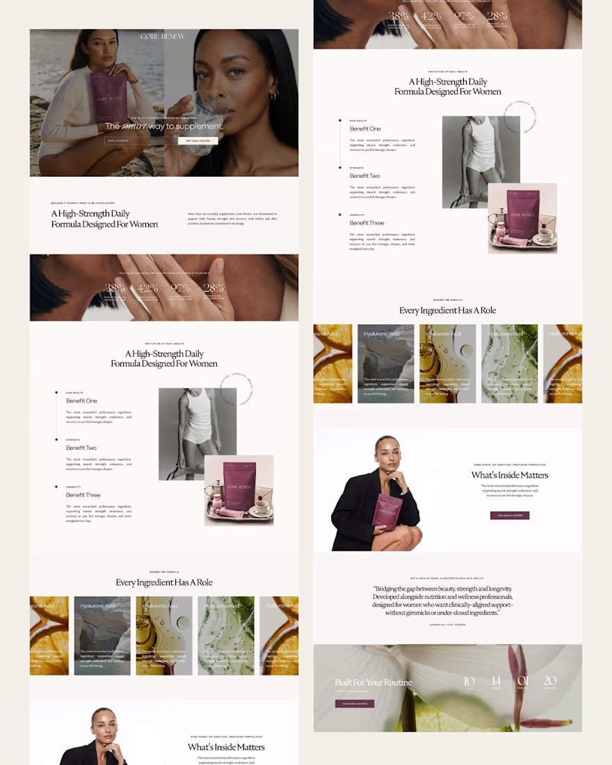
Introducing Core Renew 🤍 [ Branding, Packaging, Shopify + Klaviyo ]
A recent project where we built every touchpoint of the brand - from identity and packaging through to the digital waitlist experience.
Core Renew is launching with honestly such an incredible product, and bringing the brand world to life around it was such an incredibly rewarding process.
How lucky am I to work with clients who feel so aligned!!

Great work 💯