The network for creativity
Join 1.25M professional creatives like you
Connect with clients, get discovered, and run your business 100% commission-free
Creatives on Contra have earned over $150M and we are just getting started
Back to feedPost
Hey guys..
I'm officially a Framer Expert.
@Framer is an amazing I love using. So glad to be recognised by them.
Let's go get de Pro Expert Certification... I'll continue building and shipping.


Framer expert
Miguel Stephane Onana


$36M in Framer opportunities

Congratulations 🎊🎈

Thanks !

congrats miguel!!🔥
Thanks dude

Congratulations
Thanks !

Congratulations 🔥
thank you
welcome


Congrats
thank you

Let's go 🚀
road to the top ! 🚀

Congrats! Well deserved — keep building and shipping!
thank you. I'll keep up with the hustle.
The network for creativity
Join 1.25M professional creatives like you
Connect with clients, get discovered, and run your business 100% commission-free
Creatives on Contra have earned over $150M and we are just getting started





Related posts

A polished website doesn't have to start from scratch.
Braid gives creative brands a modern Framer foundation that can be quickly adapted to your own visual identity.
Grab Braid FREE → https://framer.link/ahePHmM



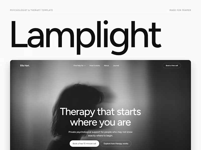
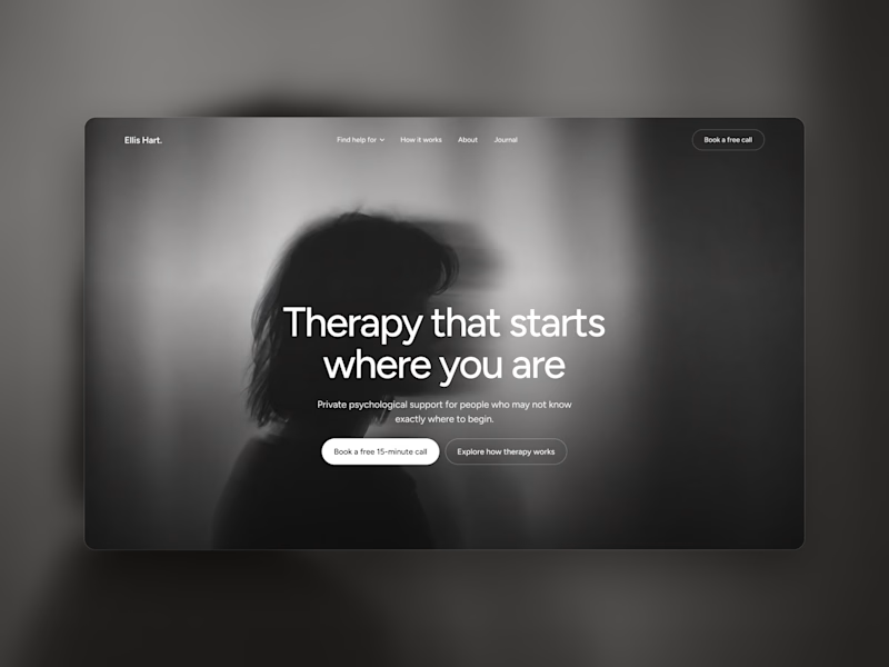
Which one grabs your attention and should be the main visual for a framer template thumbnail?

7 voted
50%
7 voted
50%
14 votes
Closed

Both works are great; it's hard to choose
Just launched Lamplight - Best @framer Template for Psychologists & Therapists
Remix Link: https://framer.link/tj4w3W3
A calm, editorial website template with 2 CMS-powered concern pages, a journal, and FAQs copy that actually sounds human.


Great visual hierarchy.