The network for creativity
Join 1.25M professional creatives like you
Connect with clients, get discovered, and run your business 100% commission-free
Creatives on Contra have earned over $150M and we are just getting started
Back to feedPost

A place is being built, but no one has experienced it yet.
There is no map for it, only intention. The land holds its own memory quiet, patient, unchanged by the pace of those who arrive and leave. What is being created here does not begin with structures, but with attention. How light settles in the morning. How the air shifts before evening. How silence can feel like presence rather than absence.
To write for something that does not yet exist is to listen more than declare. It is to notice what is forming beneath the surface materials chosen with care, spaces shaped with purpose, and the unseen thread that connects them all. Storytelling, in this sense, is not about filling gaps, but about honoring them.
I approach editorial work as a process of restraint and clarity. Each word must feel placed, not added. Each sentence must carry weight without excess. The goal is not to persuade, but to allow something to be felt before it is fully known.
editorialwritingstorytellingnarrativedesignContent EditingContent WritingEditing Google DocsGrammarlyNotion


The network for creativity
Join 1.25M professional creatives like you
Connect with clients, get discovered, and run your business 100% commission-free
Creatives on Contra have earned over $150M and we are just getting started











Related posts

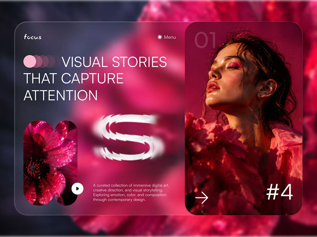
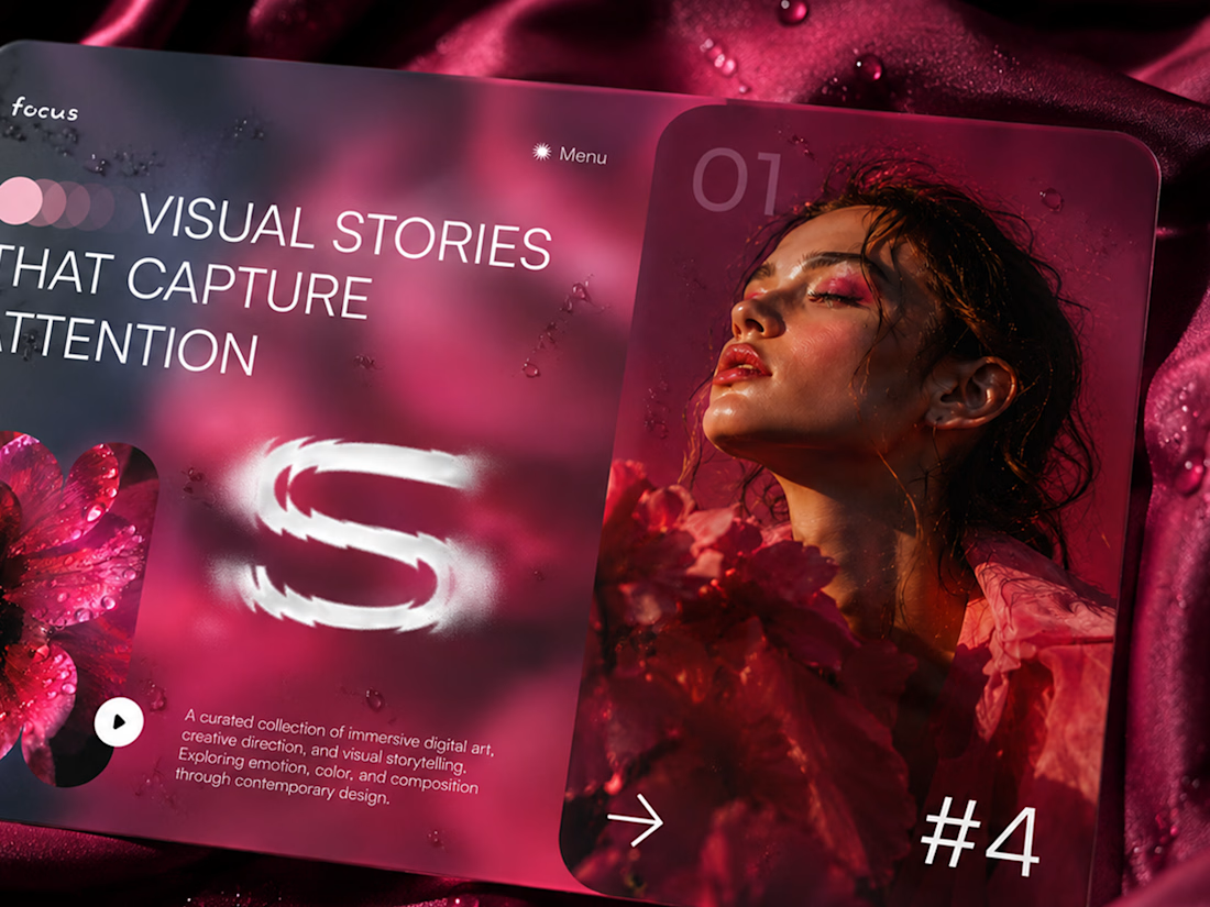
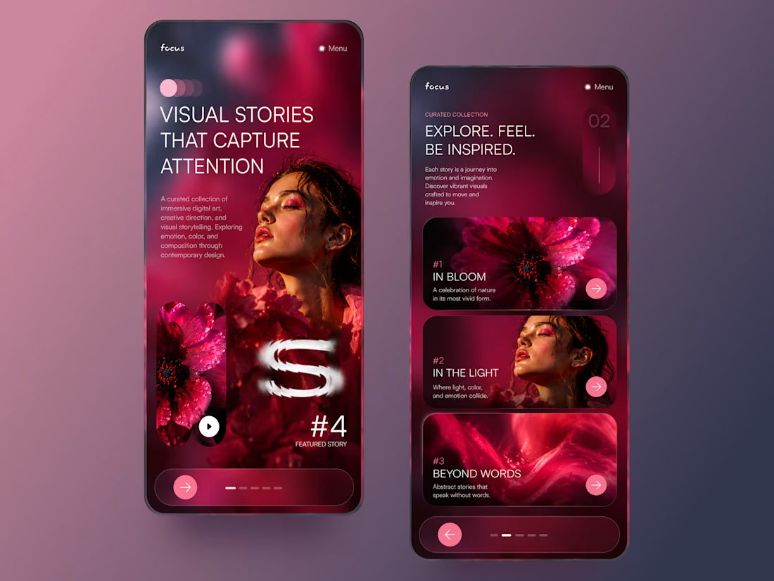
FOCUS — Creative Portfolio & Digital Art Website 🌸✨
A visually expressive website concept for a creative portfolio, built around digital art, bold imagery, and visual storytelling
The design combines vibrant pink tones, soft gradients, experimental typography, and immersive photography to create a distinctive editorial experience
Special attention was given to:
• Bold editorial hero composition
• Vibrant pink and dark color palette
• Experimental typography and visual details
• Immersive photography and digital artwork
• Creative project gallery and navigation
• Responsive mobile experience
• Clean layouts with a strong visual identity
The result is an expressive digital experience that puts creativity, emotion, and visual storytelling at the center of every screen 💗
Looking to create a standout portfolio or website for a creative brand? Let’s connect 🚀




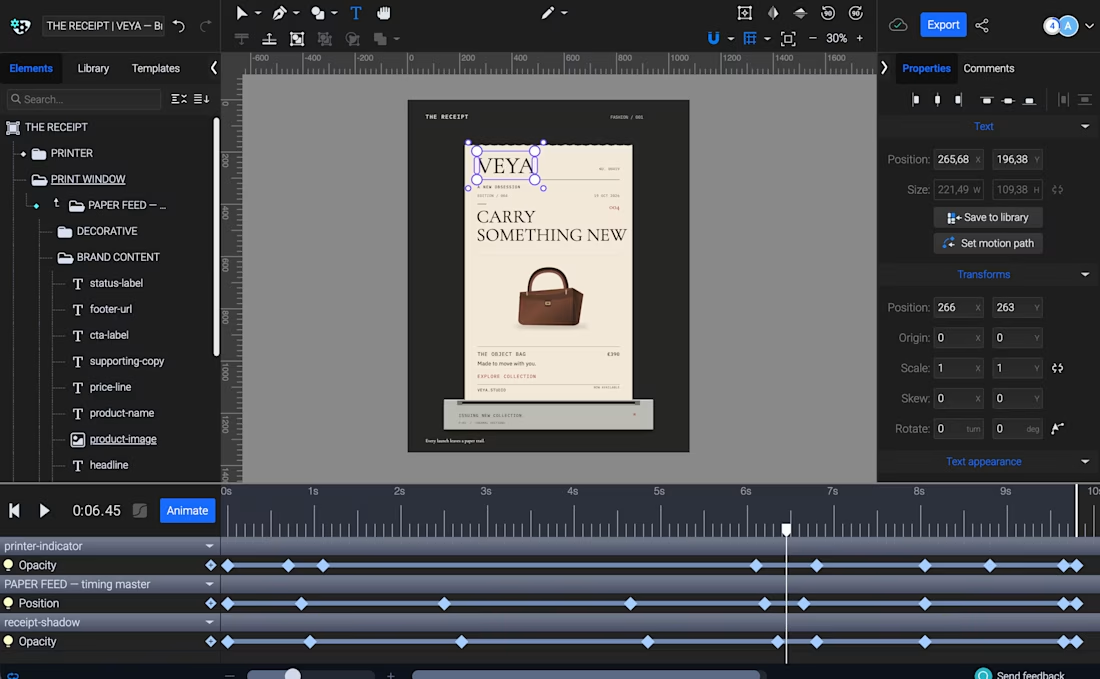
THE RECEIPT turns a simple thermal receipt into an editorial fashion launch announcement.
Built with Codex and SVGator MCP, the template lets creators swap brand identities, product imagery, and copy while keeping the same animation, making it ideal for product drops, collection launches, and promotional campaigns.


this is amazing!

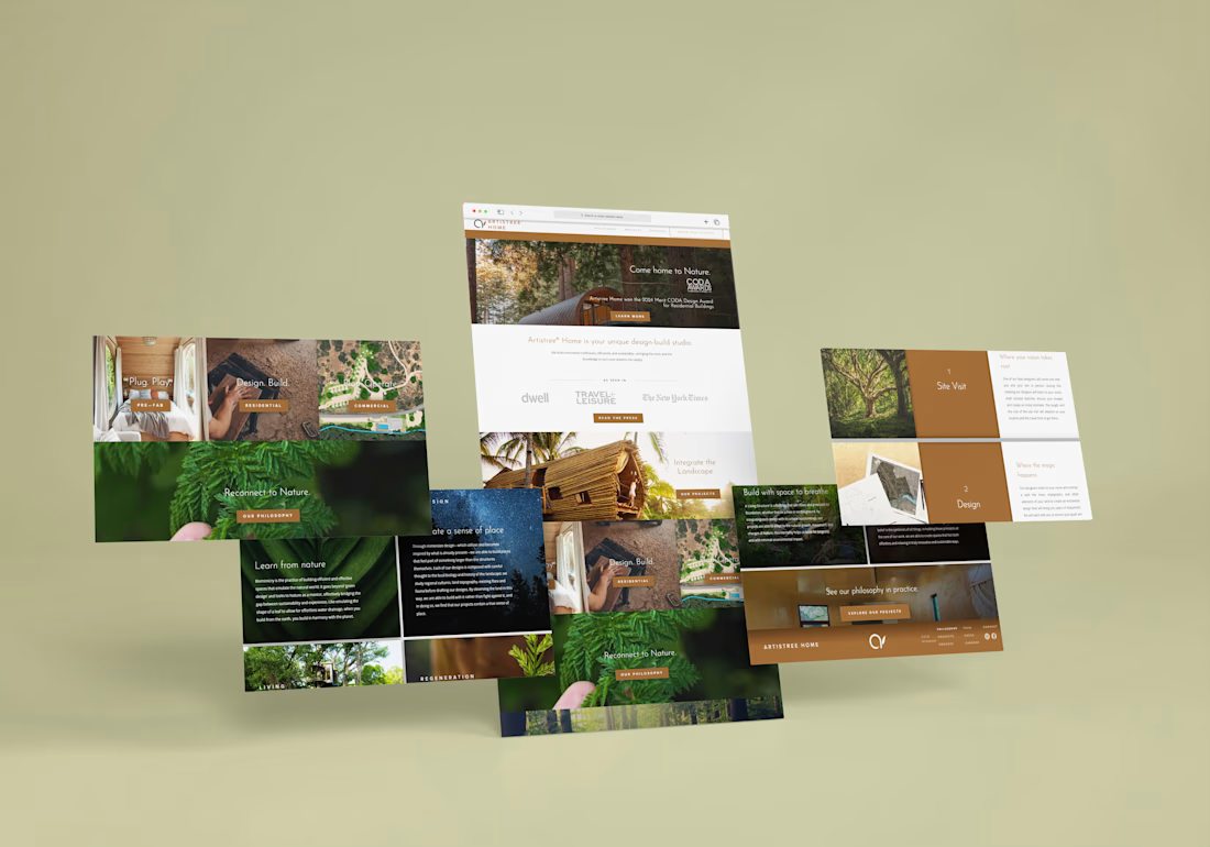
A treehouse studio shouldn't have a website that feels like a template.
Artistree Home builds treehouses and living structures that sit in the landscape instead of on top of it. Their old pitch was easy to say and hard to feel, so the site had to do the feeling.
A few decisions I'm proud of:
Each project tile gets its own verb pair. Pre-Fab is "Plug. Play." Residential is "Design. Build." Commercial is "Plan. Operate." Visitors can tell which door is theirs from one glance at the photo and two words.
Photography does the talking. A fern held between two fingers for "Reconnect to Nature." A night sky behind "Create a sense of place." A hand on raw timber for residential. Nothing is staged to look like architecture, because the point is the relationship with nature.
Copper is the only loud color. Everything else is forest green, deep shadow, or white space. The copper reads like bark and bronze and shows up only where I want a click: buttons, the process blocks, the footer.
The process is just two numbers and a tree. Site Visit and Design get big numbered copper blocks next to photos of old-growth trees and site plans. First-time clients can see what happens after they reach out before they reach out.
The philosophy section teaches without lecturing. Biomimicry is a heavy topic, so each idea gets one short paragraph over one strong image. "Learn from nature" sits over a leaf, because the example in the copy is a leaf shaping water drainage.
The result is a site where the first scroll feels like walking into the woods, and the last one ends at "See our philosophy in practice."
What would you have done differently? Genuinely curious. 👇

Your Thoughts?