The network for creativity
Join 1.25M professional creatives like you
Connect with clients, get discovered, and run your business 100% commission-free
Creatives on Contra have earned over $150M and we are just getting started
Back to feedPost


The network for creativity
Join 1.25M professional creatives like you
Connect with clients, get discovered, and run your business 100% commission-free
Creatives on Contra have earned over $150M and we are just getting started










Related posts

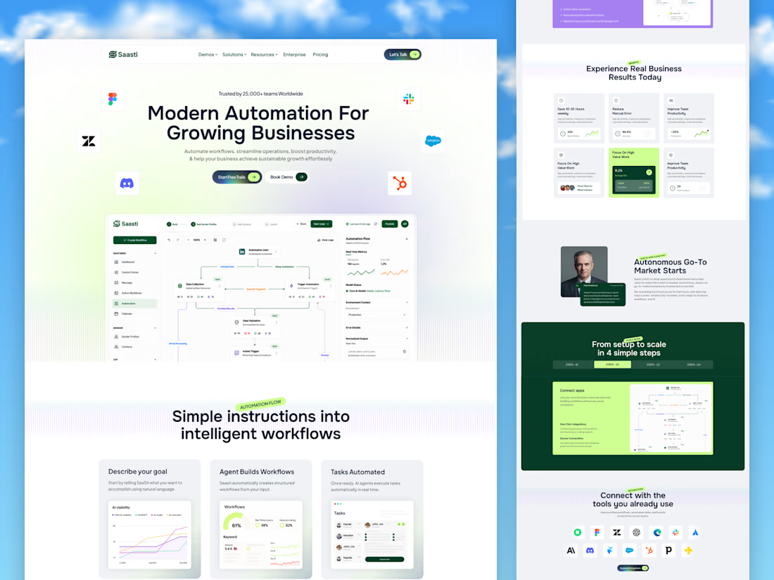
🚀 Saasti — Smart Automation for Growing Businesses
A modern SaaS website concept designed to turn complex automation into a simple, intuitive experience. With clean layouts, interactive workflow dashboards, vibrant accents, and clear messaging, every section highlights the power of smarter business operations.
✨ Modern SaaS UI/UX Design
⚡ AI-Powered Automation Experience
📊 Intuitive Workflow Dashboards
🎨 Clean, Conversion-Focused Layout
Designed by OrdainIT to bring innovation and usability together.
#SaaSDesign #UIDesign #UXDesign #AI #WebDesign #DashboardDesign #OrdainIT


Brilliant execution!

Project Management Dashboard UI – A powerful and intuitive interface designed to enhance team collaboration, productivity, and workflow efficiency.


the yellow date card gives the eye a clear place to start, which most dashboards skip. how does the to-do list hold up when someone has 30 tasks instead of 5?

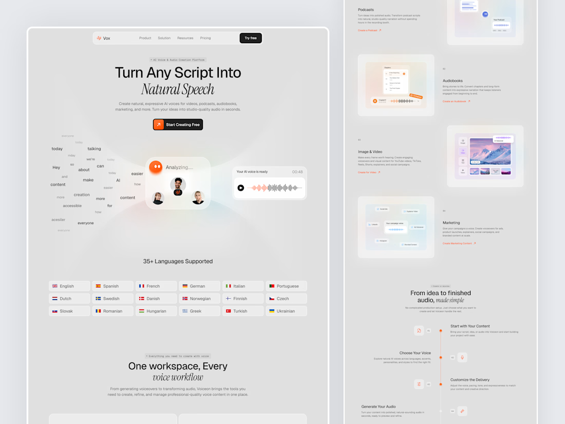
Designed a modern AI Voice SaaS Landing Page.
A soft light interface with gentle color glows, warm orange accents, and elegant italic serif headlines for a calm and creative first impression.
A floating word cloud turning into a voice wave, a language grid, use case cards for podcasts, audiobooks, video, and marketing, plus a simple step by step flow make AI voice creation feel easy to understand. Clean spacing and soft cards keep the whole page light and easy to explore.


Nice UI

