The network for creativity
Join 1.25M professional creatives like you
Connect with clients, get discovered, and run your business 100% commission-free
Creatives on Contra have earned over $150M and we are just getting started
Back to feedPost

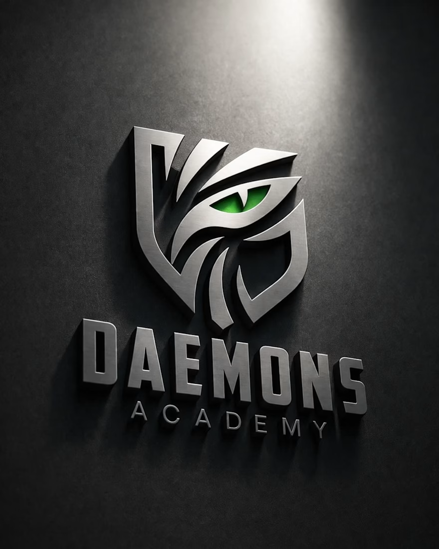
Elevating brand identity with a bold and modern visual approach ⚡
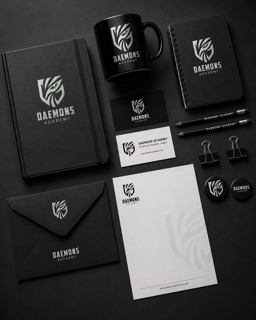
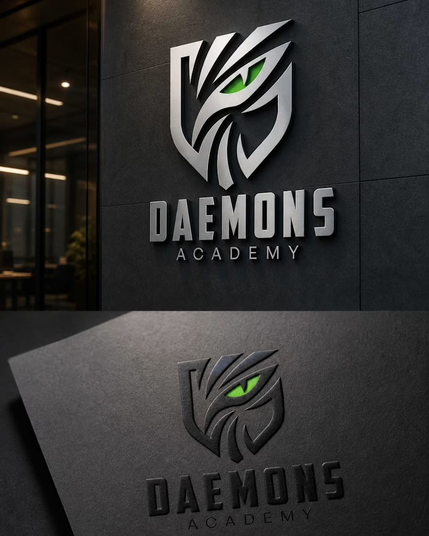
Presenting my latest logo & stationery mockup design for Daemons Academy, a concept focused on strength, intelligence, and a sharp futuristic edge.
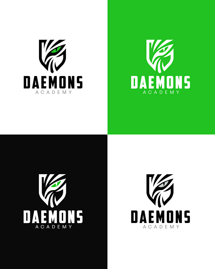
✔️ Custom logo design with symbolic eye + shield concept
✔️ Complete brand stationery (notebook, business cards, envelope, mug & more)
✔️ Clean, minimal, and high-end presentation
✔️ Strong monochrome palette with a striking green accent
This project highlights how a powerful visual identity can create a lasting impression and build brand authority.
💬 Would love to hear your feedback!
📩 Available for freelance & collaborations
#LogoDesign #BrandIdentity #StationeryDesign #MockupDesign #GraphicDesign #Branding #MinimalDesign #CreativeDesign #Portfolio #DesignInspiration
The network for creativity
Join 1.25M professional creatives like you
Connect with clients, get discovered, and run your business 100% commission-free
Creatives on Contra have earned over $150M and we are just getting started







Related posts

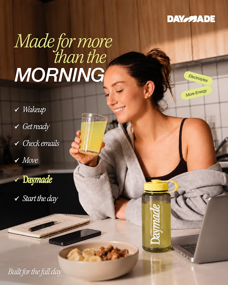
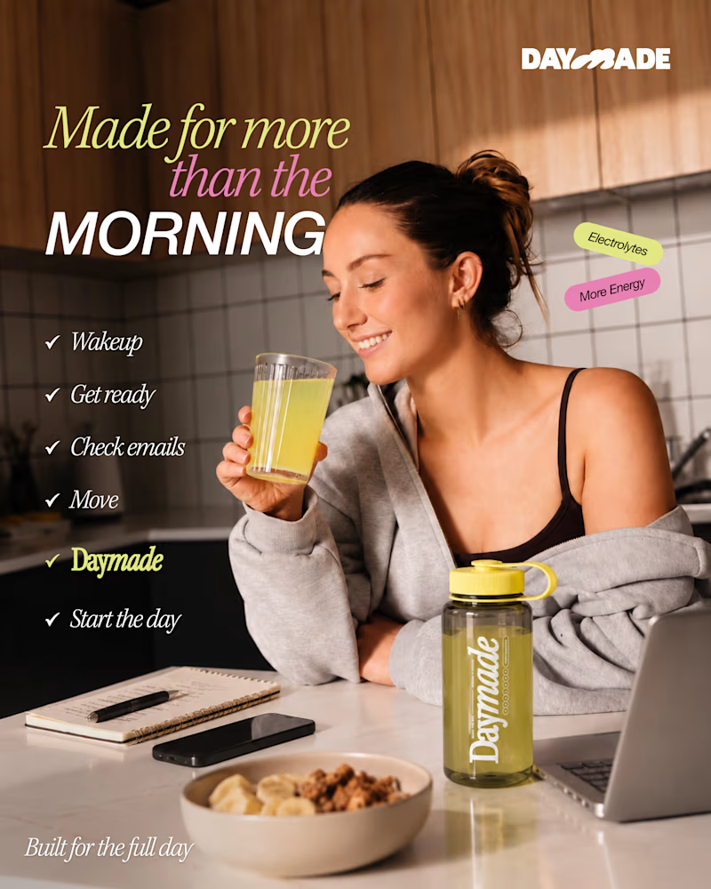
✨ Two styles. One campaign. Which Daymade design hits differently?
I explored two creative directions for Daymade, combining lifestyle storytelling with bold typography and fresh, energetic colors. ☀️🥤
💛 Option 1: Fresh & Minimal 💗 Option 2: Bold & Playful
Which one grabs your attention? 👀
Cast your vote! 🗳️👇
25 voted
26%
73 voted
74%
98 votes
Closed

Option 2 looks better

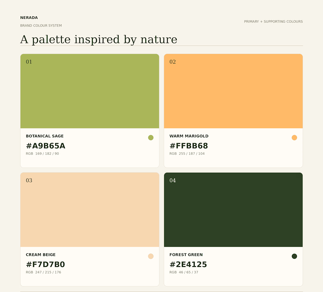
Created the complete brand identity for Nerada, a natural tea brand — developing the visual direction and design elements that shape how the brand looks and feels across every touchpoint. The goal was a clean, organic aesthetic that reflects the brand's natural positioning and builds a consistent, recognizable identity.


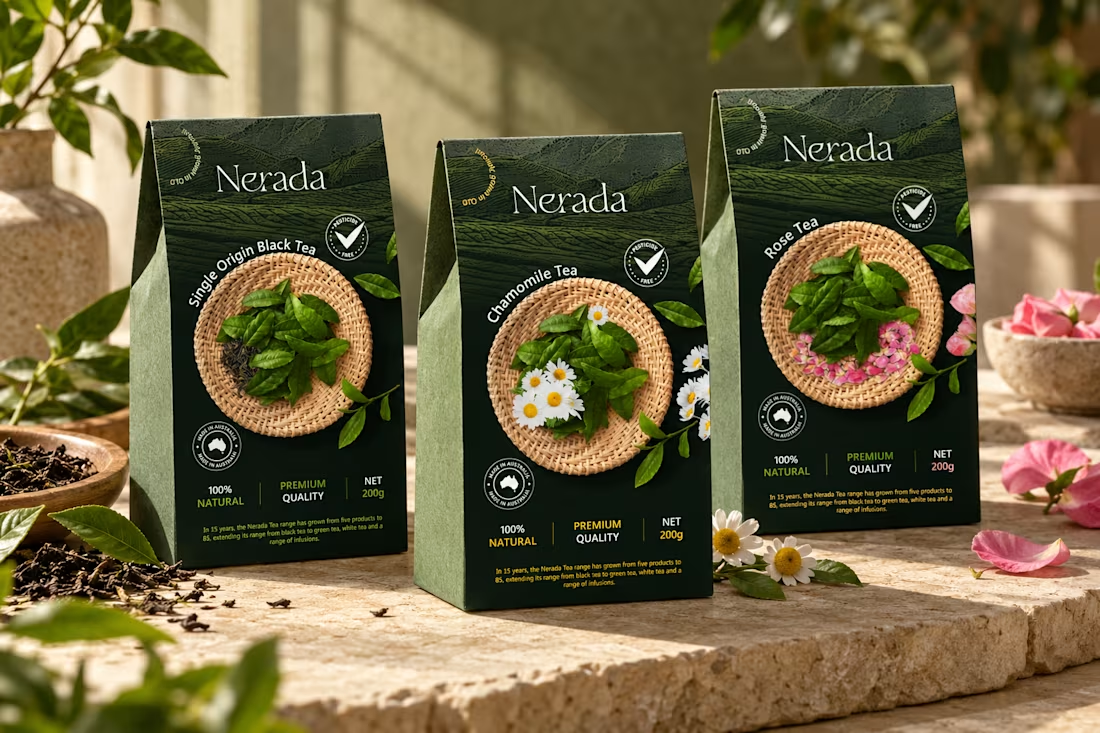
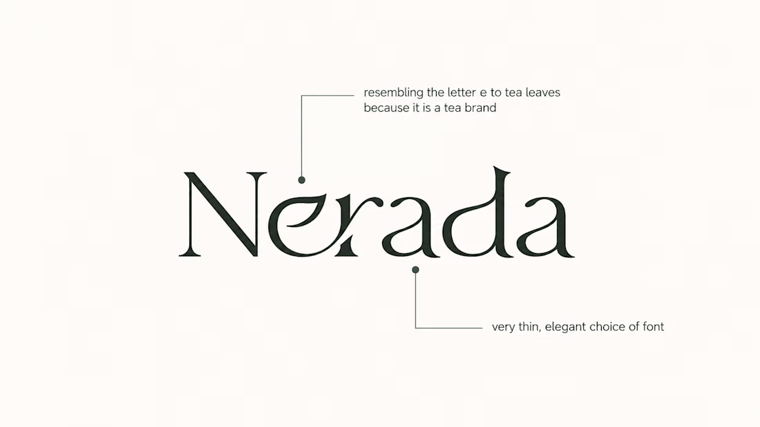
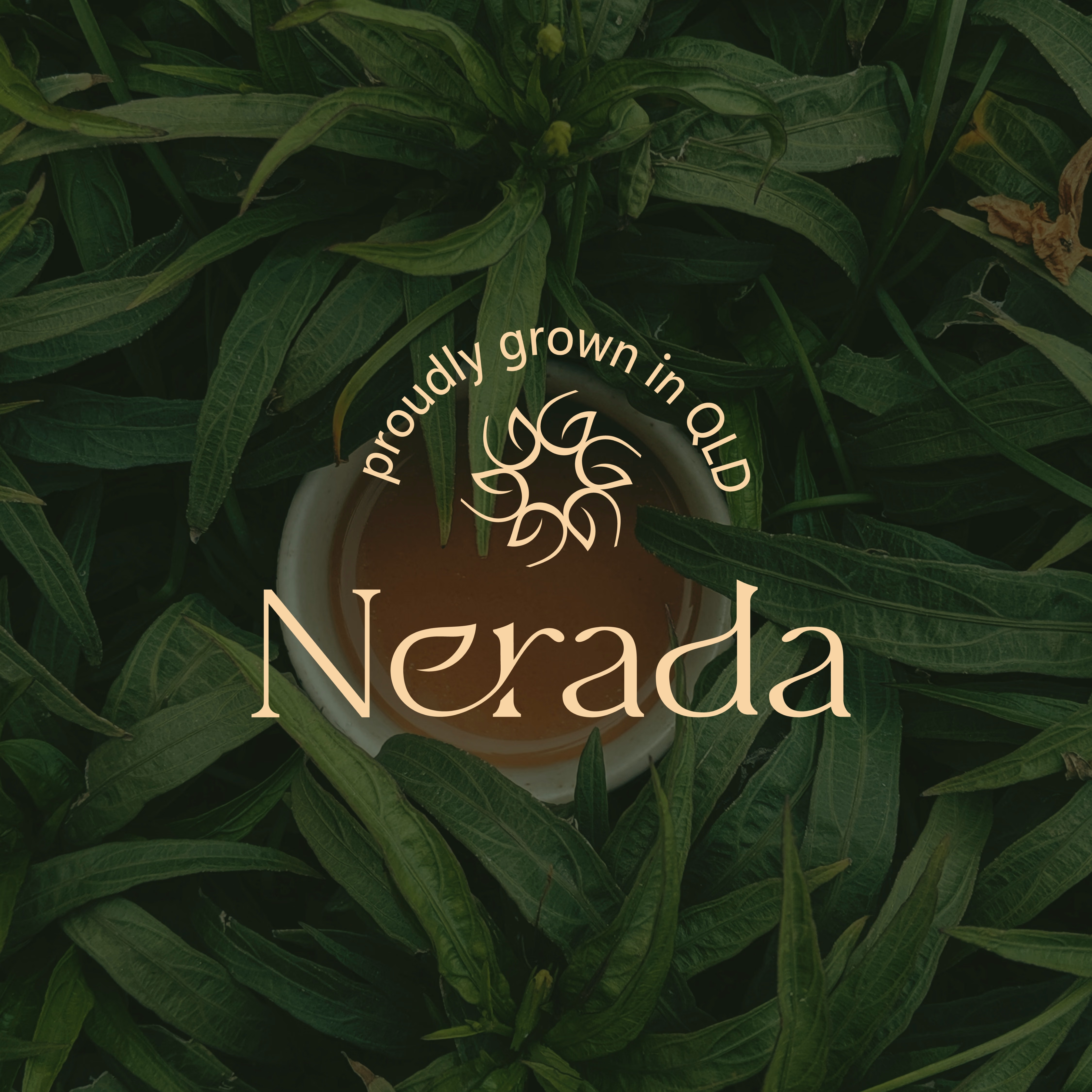

The mark feels grown rather than drawn, which is exactly right for a natural tea brand. Packaging is where tea brands win or lose. Does the identity change tone across blends, or stay one voice with different colours?

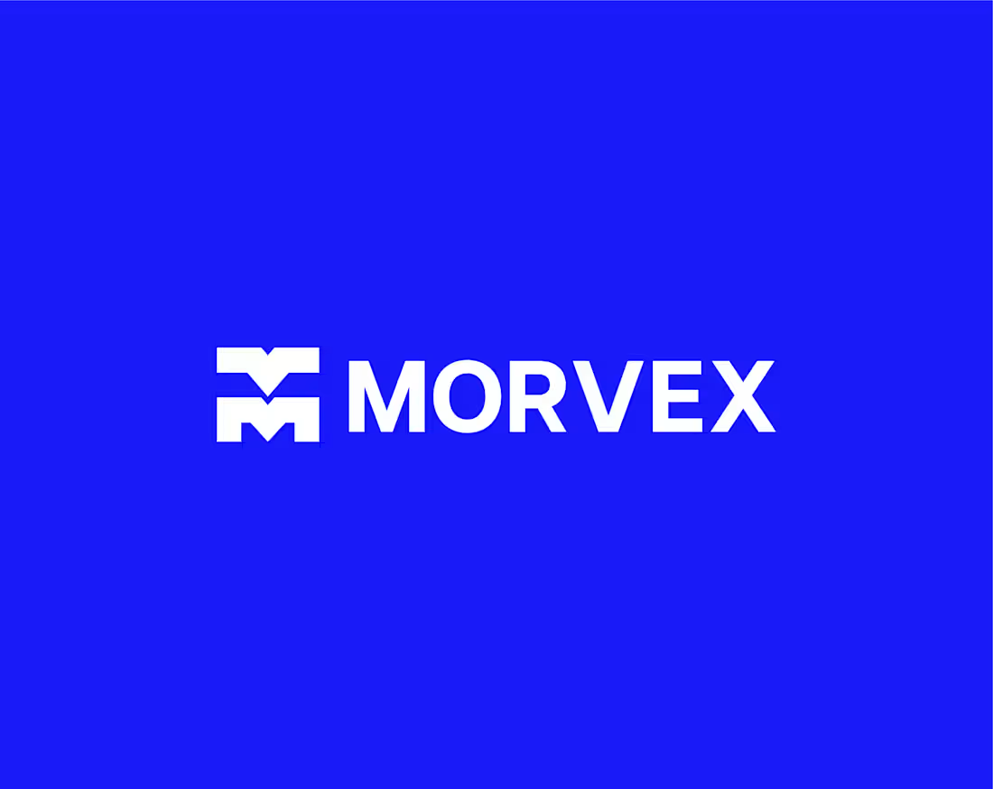
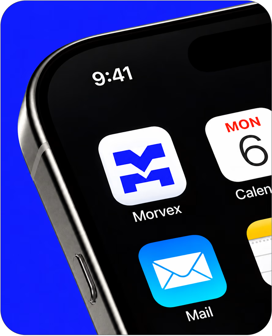
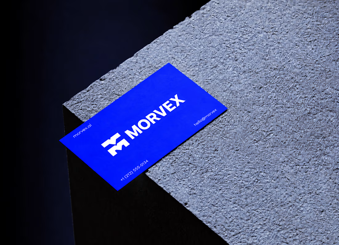
Morvex is a cybersecurity brand with a strong, bold visual identity. The idea behind the logo was to create something simple but recognizable, using a custom geometric M with sharp angles and carefully balanced shapes.
The identity brings together electric blue, bold typography, and a dark visual style to give the brand a modern, confident look. I carried the same design approach across the brand applications, keeping everything clean, consistent, and easy to recognize.


This is a really creative piece! I love how the visual elements come together to create something that feels distinctive rather than predictable. The composition, the overall visual direction, and the way the idea has been executed all contribute to making this stand out. It’s a...