The network for creativity
Join 1.25M professional creatives like you
Connect with clients, get discovered, and run your business 100% commission-free
Creatives on Contra have earned over $150M and we are just getting started
Back to feedPost

Blockchain-Powered Online School — Explainer Animation
A full-scale animated explainer video designed to present a next-generation online education platform powered by blockchain technology.
The goal of this project was to translate a complex ecosystem — combining traditional British education, crypto payments, and a “learn-to-earn” model — into a clear, engaging, and easy-to-follow visual story.
I handled the project end-to-end, from structuring the narrative and simplifying the messaging, to designing the motion language and delivering the final animation. The focus was on clarity, pacing, and maintaining viewer engagement while covering a large amount of information.
The animation highlights:
A flexible, personalized online learning environment
Integration of blockchain and cryptocurrency payments
A “Learn to Earn” system that rewards student engagement
A strong social impact component (education accessibility & scholarships)
Platform features like course navigation, tutor interaction, and progress tracking
The biggest challenge was balancing depth with simplicity — making the product feel innovative without overwhelming the viewer. This was achieved through clean motion design, structured flow, and a strong emphasis on visual storytelling.
Result: a polished, modern explainer that communicates both the product vision and its real-world impact in a way that feels accessible and compelling.


The network for creativity
Join 1.25M professional creatives like you
Connect with clients, get discovered, and run your business 100% commission-free
Creatives on Contra have earned over $150M and we are just getting started






Related posts

Who needs an invitation when you have a little imagination and a lot of fantasy?
That's how I got to the CapCut World LA event at the Audrey Irmas Pavilion. The trip was... intense! 🦄
This is my entry for the new Contra × CapCut challenge.
My workflow:
① I created the character sheet and the prop sheet for the mushroom, as well as the location sheets for a nature landscape and the Audrey Irmas Pavilion.
② I created still shots using my internal AI image generation tool.
③ I created trippy 2D/3D animated images to use as the opening frames of the videos.
④ I imported all the images into the CapCut Video Studio and used the CapCut AI to animate them.
⑤ I created the music in ElevenLabs/ElevenMusic.
⑥ I edited the videos using DaVinci Resolve.


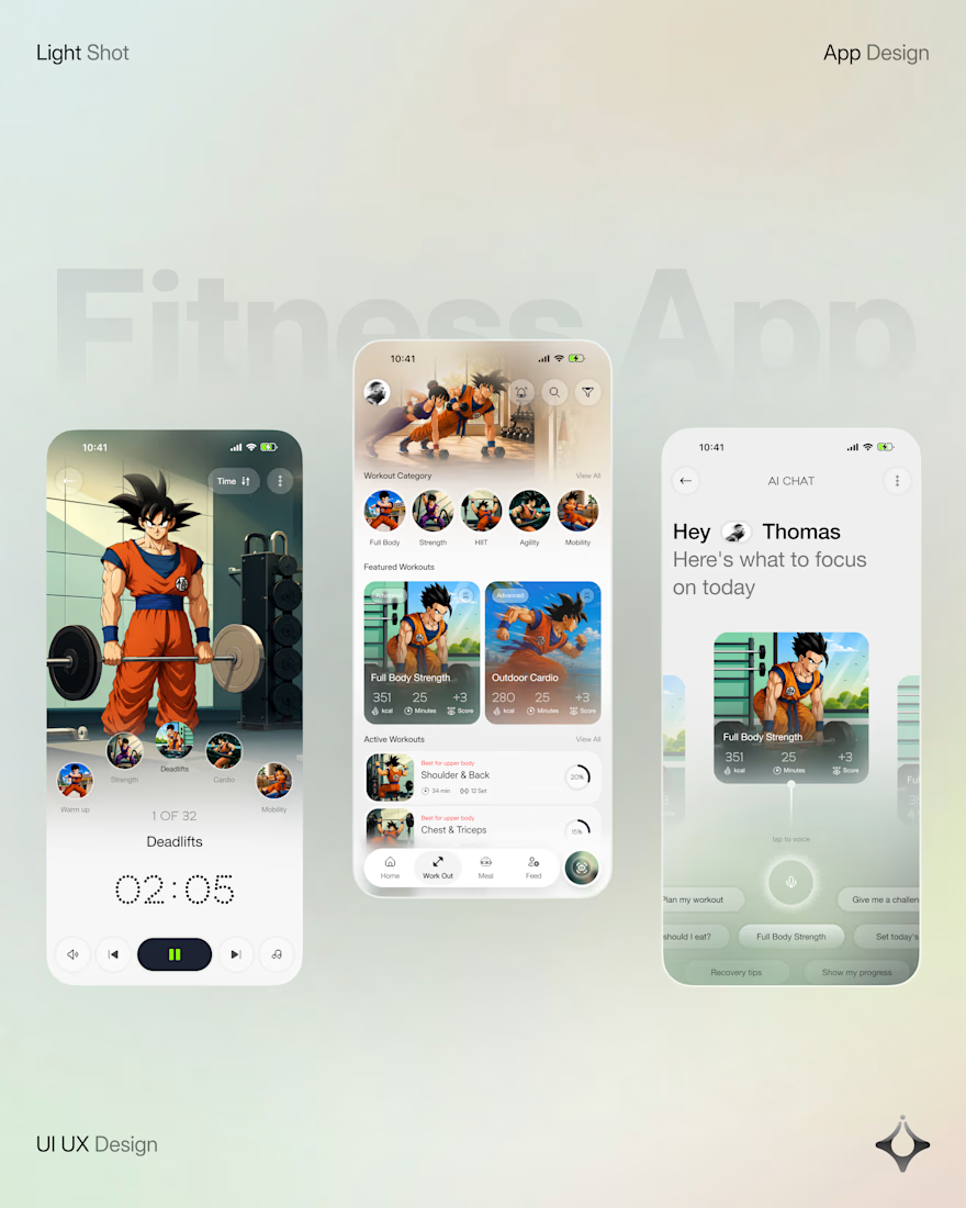
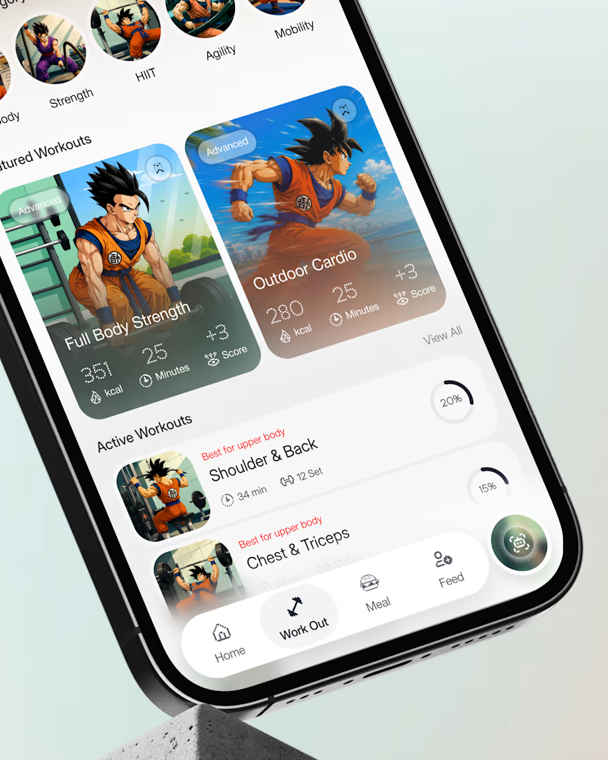
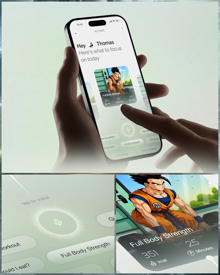
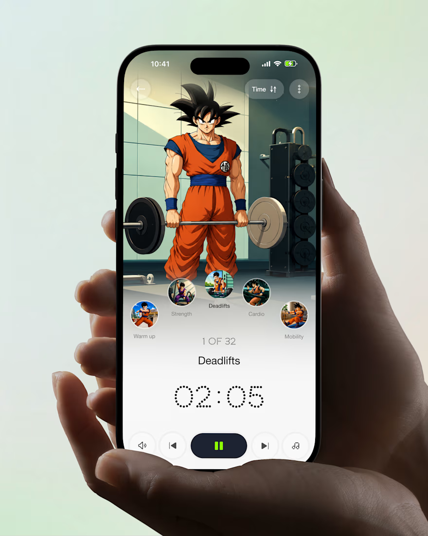
What if your fitness app felt like having a personal trainer in your pocket?
Meet your new workout companion. A bold fitness app concept combining personalized workouts, AI coaching, and a seamless mobile experience to make every session count.
Would you use this to level up your fitness journey?



Ye le Jani Juice Lab wali post ke liye copy-ready:
Love this concept Juice Lab! A fitness app that feels like a personal trainer in your pocket is exactly what's needed — combining personalized workouts with AI coaching and a seamless mobile experience is a great approach. The...

