The network for creativity
Join 1.25M professional creatives like you
Connect with clients, get discovered, and run your business 100% commission-free
Creatives on Contra have earned over $150M and we are just getting started
Back to feedPost
Taste Test

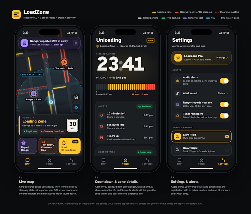
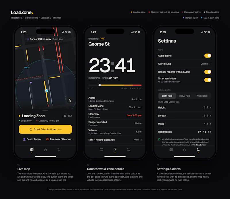
I'm designing a parking app for delivery drivers in Sydney: a live map with curbs colour-coded like the real ones (yellow = loading zone, red = no stopping), one-tap ranger reports, and a 30-minute unloading countdown.
It's read outdoors, in sunlight, in about two seconds. So glanceability beats prettiness.
Each board shows the map, countdown and settings screens. A is rich and visual. B strips it back to the essentials. (The map is an illustration.)
App designers, I'd love to hear:
→ Which one do you pick, and why?
→ What's the first thing you'd change?
→ Be brutal about hierarchy, type, colour and the timer.
Honest takes over polite ones. 🙏
1 vote
Ends in 1d
The network for creativity
Join 1.25M professional creatives like you
Connect with clients, get discovered, and run your business 100% commission-free
Creatives on Contra have earned over $150M and we are just getting started



Related posts

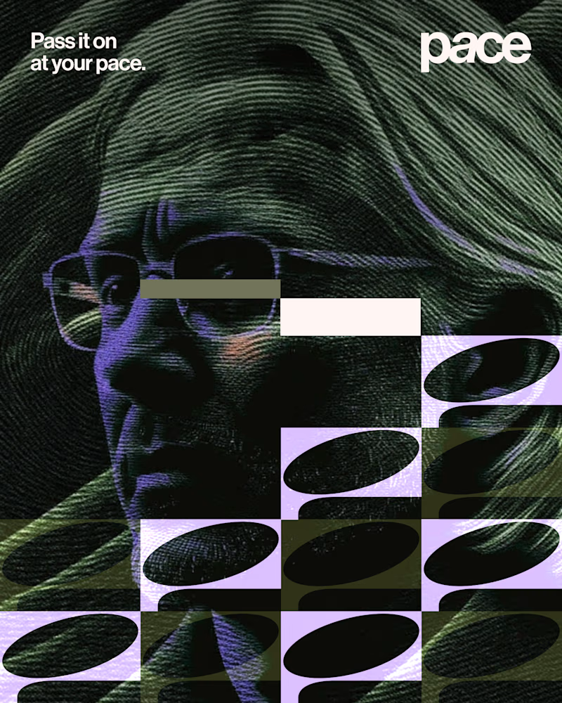
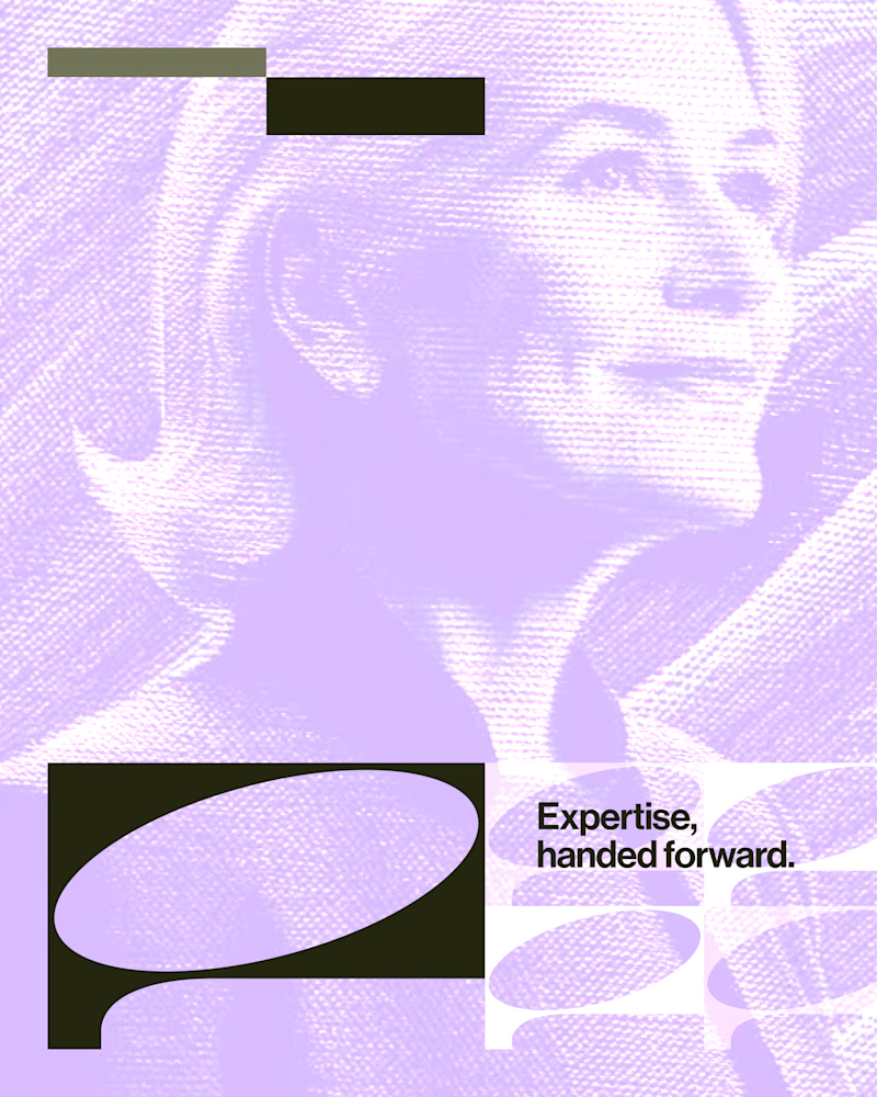
Experimental layouts for Pace. Which one do you like?
23 voted
52%
21 voted
48%
44 votes
Closed

Looks cool.

Same 19 seconds, cut two ways. One is driven by the copy, the other by the shape. 1 or 2.
26 voted
58%
19 voted
42%
45 votes
Closed


Dark!