The network for creativity
Join 1.25M professional creatives like you
Connect with clients, get discovered, and run your business 100% commission-free
Creatives on Contra have earned over $150M and we are just getting started


The network for creativity
Join 1.25M professional creatives like you
Connect with clients, get discovered, and run your business 100% commission-free
Creatives on Contra have earned over $150M and we are just getting started
Related posts


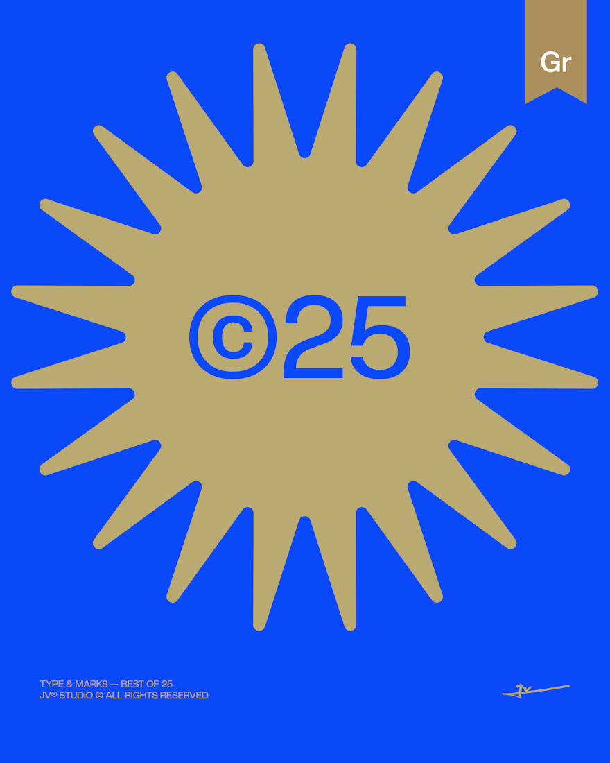
TYPE & MARKS — BEST OF 25
Form in its purest typographic state.
Is a typographic-focused project showcasing the strongest type-driven identities developed throughout 2025.
This collection is built entirely around letterforms — no symbols, no supporting graphic elements — only structured, intentional typographic marks designed to function as complete visual identities.
Each piece is developed with careful attention to spacing, proportion, weight, and rhythm. The goal is to push typography beyond simple readability and transform it into a distinctive and self-sufficient form. Every decision from kerning adjustments to structural refinements — is intentional, ensuring that the typography itself carries the full visual impact.
Rather than relying on icons or external elements, this project explores how form alone can define personality, tone, and brand presence. Some compositions are minimal and restrained, while others are bold and expressive, yet all remain grounded in precision and balance.
TYPE & MARKS — BEST OF 25 represents a focused study of structure, clarity, and typographic control.
A curated reflection of the most refined typographic explorations of the year — where letters are not just read, but experienced as identity.
✦ Logos created between 2025
✦ Editorial layout crafted in Adobe InDesign
✦ Designed & curated by EnmaJv
✦ Special Best of 25 Edition
2025© - Jv® Studio. — Enmanuel Jimenez V. All rights reserved.
Featured project in Graphic Design - Logo by @behance
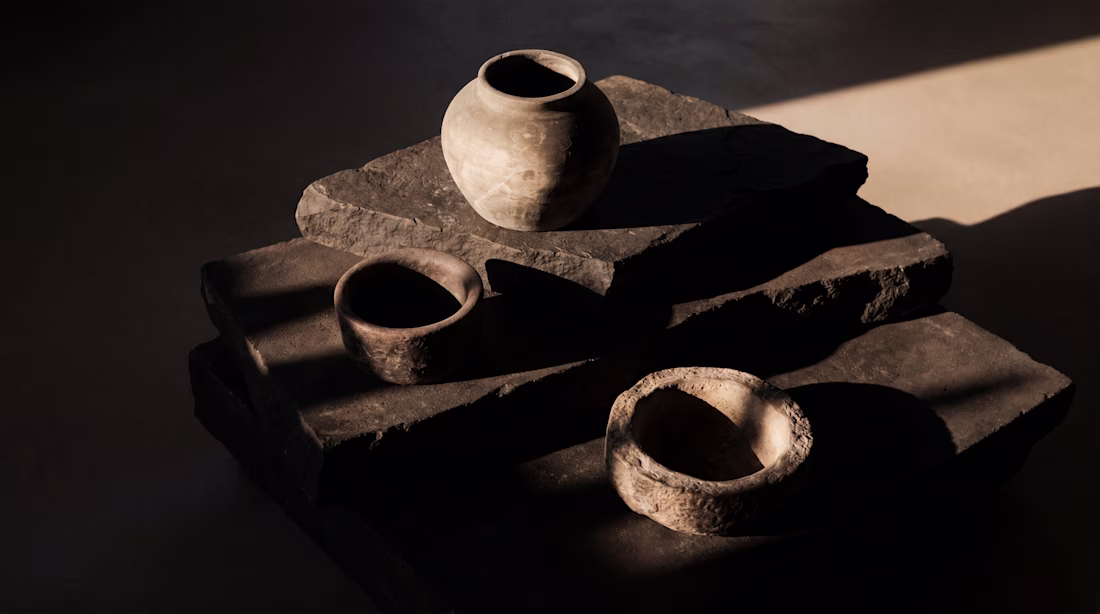
Nice play with light and shadow.
Trending
Claude
Claude has entered the design space. How are you using Claude Design?
Contra University
Learn from expert creatives how to earn more using next-gen AI tools.
creativeaiflow
Creative AI workflows are evolving. What tools do you use, and what are their strengths and weaknesses?
portfolioreview
The best portfolios tell a story, not just show a grid. Share yours for feedback.
freelancerlife
Freelancer life is wins, pivots, and everything in between. What’s yours right now?