The network for creativity
Join 1.25M professional creatives like you
Connect with clients, get discovered, and run your business 100% commission-free
Creatives on Contra have earned over $150M and we are just getting started
Back to feedPost
Who doesn't love bento grids!
I've been playing around a little with bento grids and needless to say that they are heavily underrated.
Plus they look 🔥


Yessir, I’m starting to love bento blocks, they fit amazing! Thank you so much @TRUEFRAME

Exactly! Such an easy way to fit important information in such a small space!

Bento grids are so underrated for exactly this reason, they let you show scale and detail in the same breath without a wall of identical cards. Do you have a rule of thumb for deciding which piece of content earns the big tile versus the small ones?
100% agree Maty, usually with bento grids the biggest tile is saved for something meaningful such as a logo, what the client does, or really any large scale horizontal animation/graphic.

Love it
Thank you Girum!

Bento grids get dismissed as a trend when really they just make hierarchy obvious without needing headlines to do it. What almost didn't make the cut in this set?
Hey Diego, I completely agree!
Honestly, what almost didn’t make the cut was the testimonial bento box because I also had a testimonial section within the build, but after many revisions, it just fit in perfectly so I kept it 😂

Yep, i love me some bento grids, great job! 🎉
The network for creativity
Join 1.25M professional creatives like you
Connect with clients, get discovered, and run your business 100% commission-free
Creatives on Contra have earned over $150M and we are just getting started





Related posts

A packaging project I worked on earlier this year for Chop O, a plantain cluster snack brand targeting Nigerian and European markets.
The idea was to create something bold, playful, and full of personality, with vibrant colors and a packaging system that stands out on the shelves.
Always excited to work on fun food and beverage brands. Let's connect! 🚀


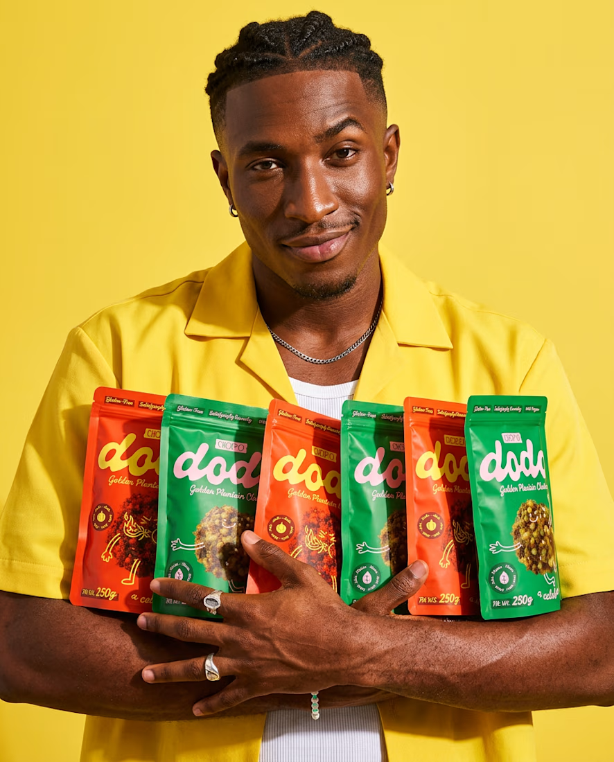
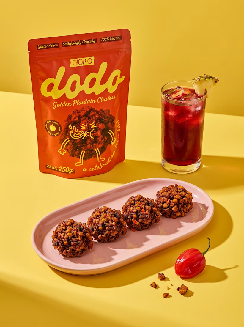
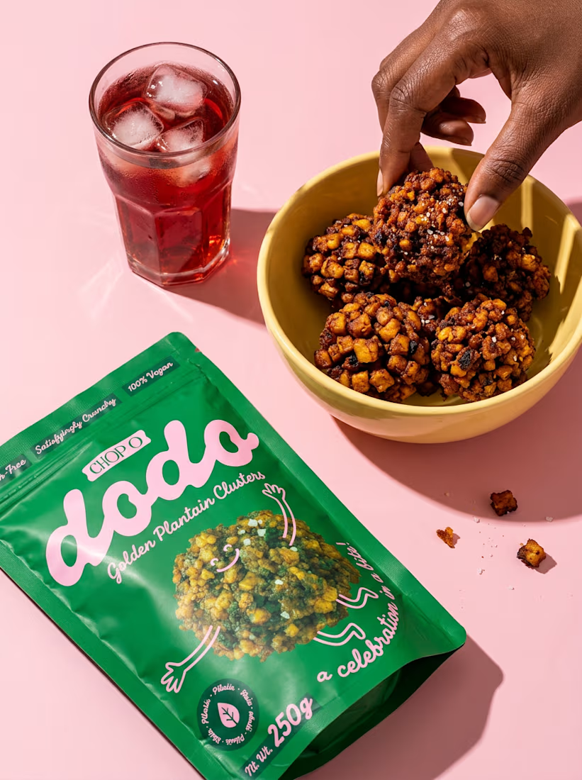

Bold and playful is the right call for a snack aimed at two very different markets. Plantain clusters deserve packaging like this.

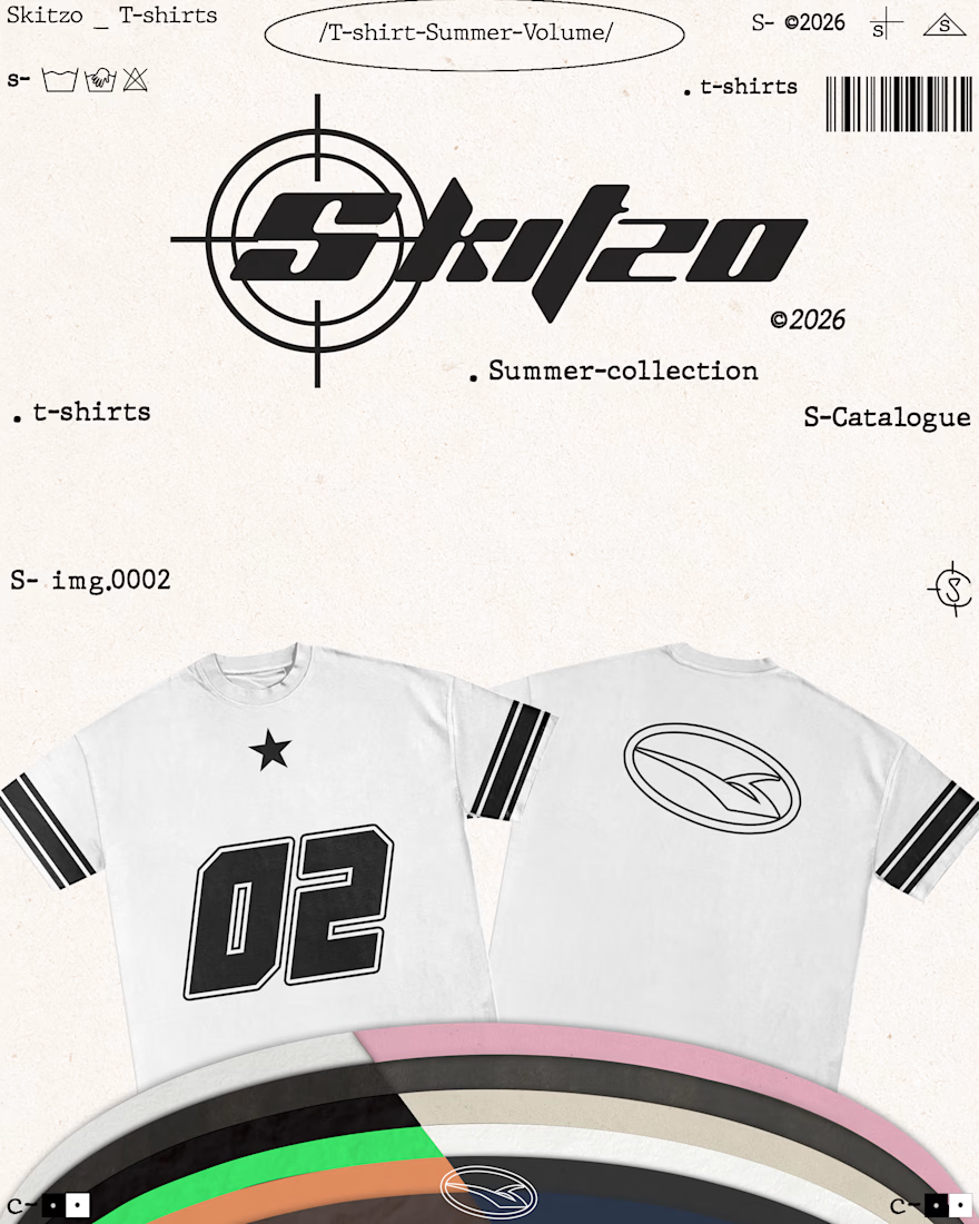
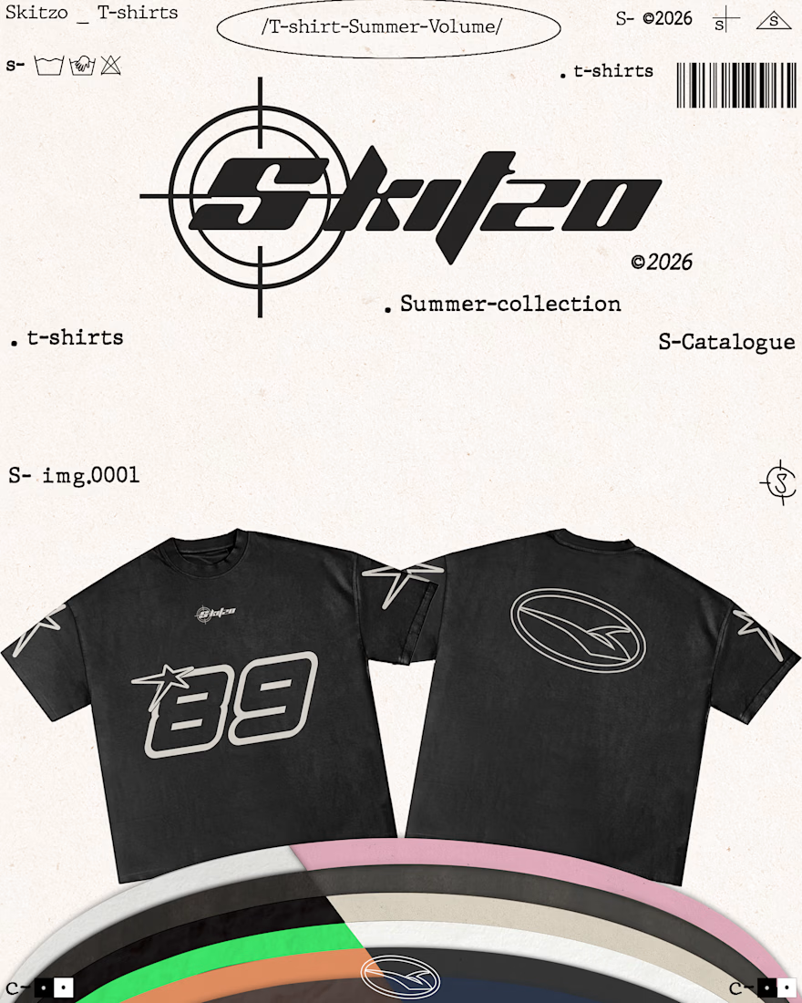
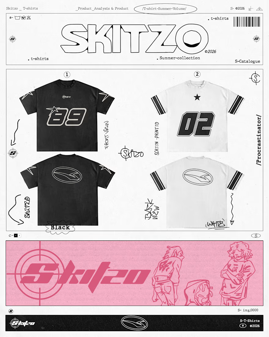
SKITZO — Summer ‘26
T-shirt graphics and visual direction for SKITZO’s latest summer collection.
Built around typography, technical marks, raw print textures, and catalogue style layouts — extending the SKITZO identity from the garments into the way the collection is presented.
Brand: SKITZO
Project: Summer Collection 2026
Role: Art Direction, Graphic Design & Visual Identity.



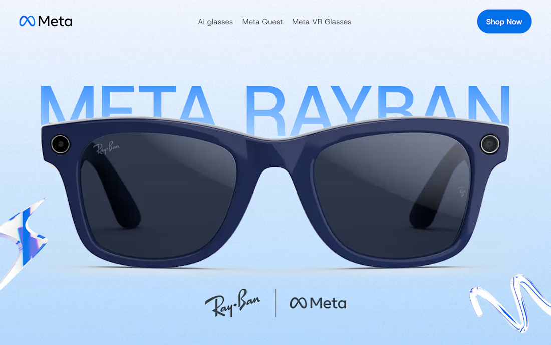
A creative take on Meta Ray-Ban glasses 👀 Clean, bold, and a little futuristic.
I design in Figma and build in Webflow and Framer, taking projects from first idea to a live site.
Got a website in mind? Let’s make it happen ✳️ I’m open to landing pages, startup sites, and other cool web projects. Send me a message!


Very nice 👌