The network for creativity
Join 1.25M professional creatives like you
Connect with clients, get discovered, and run your business 100% commission-free
Creatives on Contra have earned over $150M and we are just getting started
Back to feedPost
Taste Test
Good UX is also good writing.
During this group creation flow, the user can skip adding a display photo.
But does the instruction make that clear enough?
“Upload image or click on ‘Create group’ to skip.”
Big impact on clarity.
How would you rewrite it?
1 voted
33%
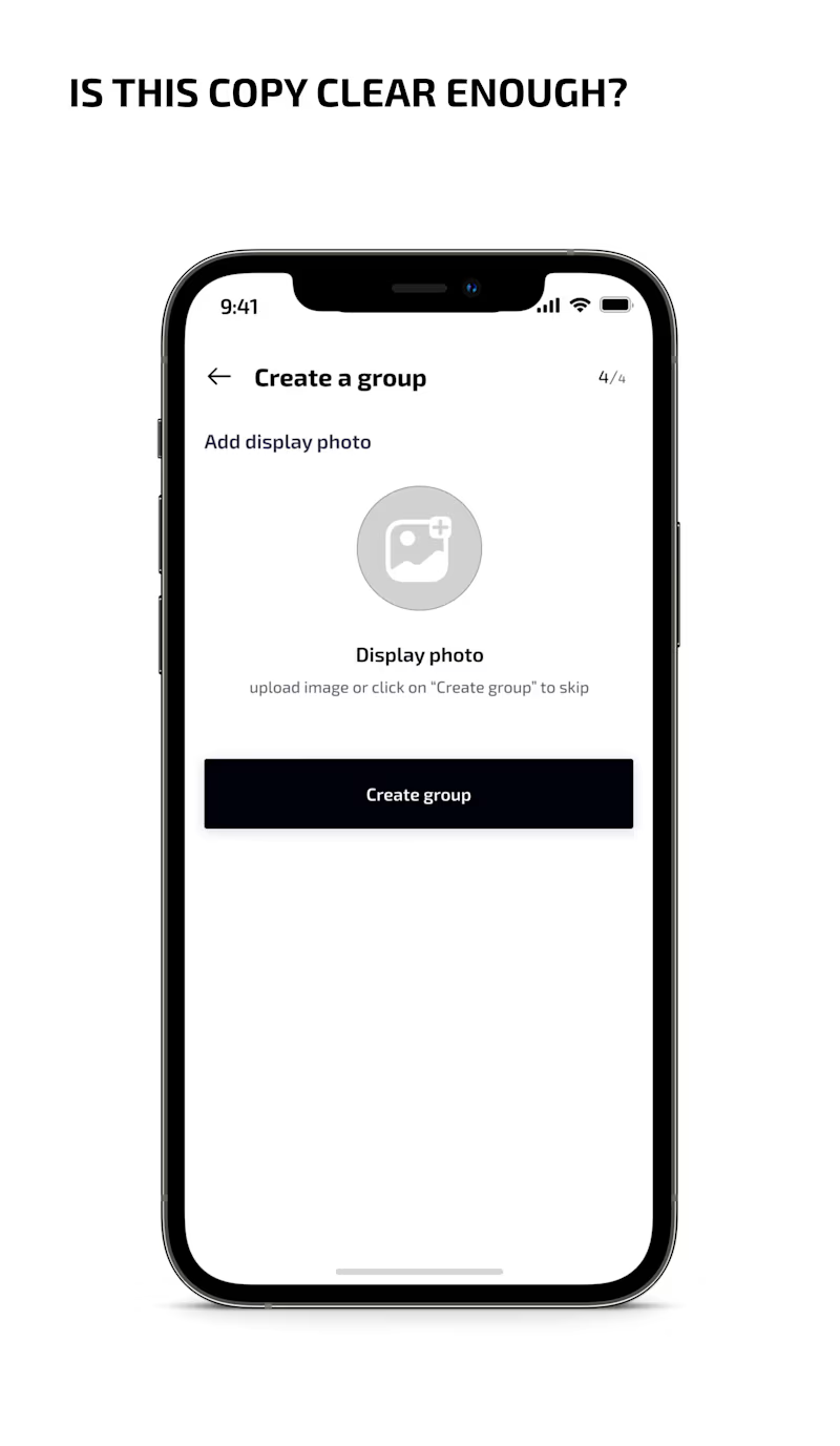
2 voted
67%
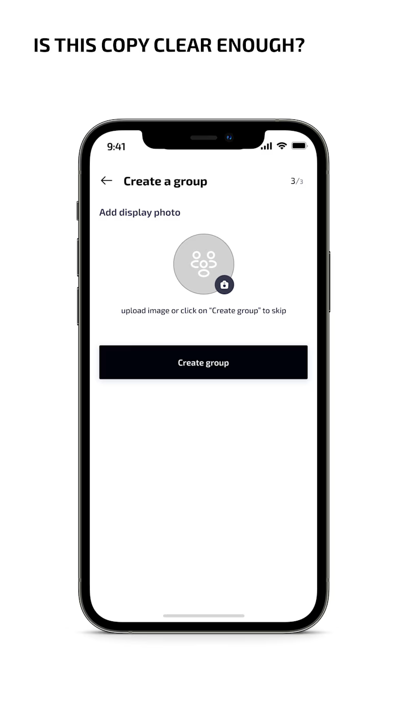
3 votes
Closed

users need clear explain ui which is B.

Exactly, Thank you Rajesh.
The network for creativity
Join 1.25M professional creatives like you
Connect with clients, get discovered, and run your business 100% commission-free
Creatives on Contra have earned over $150M and we are just getting started







Related posts

MindFlow — AI Productivity App UI/UX Design.
An all-in-one AI assistant for Write, Image, Code & Summarize.
Tool: Figma | Platform: Mobile + Web


Great

An interaction study for Mare’s collection feed, exploring how to make groups legible within a dense, mixed-format archive.
The layout preserves image proportions and integrates collection labels into the packing system. On hover, image-derived gradients establish the collection boundary, while subtle displacement creates space around the active group without changing its position or scale.
The motion studies isolate assembly, packing, colour and proximity, using real collection content to examine timing, spatial continuity and hover behaviour.


15 seconds of smooth UI, editorial layouts, and micro-interactions.
Kept the micro-interactions snappy, typography expressive, and transitions buttery smooth.
Rate this UI animation from 1 to 10 in the comments, or tell me what you’d improve! 😉