The network for creativity
Join 1.25M professional creatives like you
Connect with clients, get discovered, and run your business 100% commission-free
Creatives on Contra have earned over $150M and we are just getting started
Back to feedPost


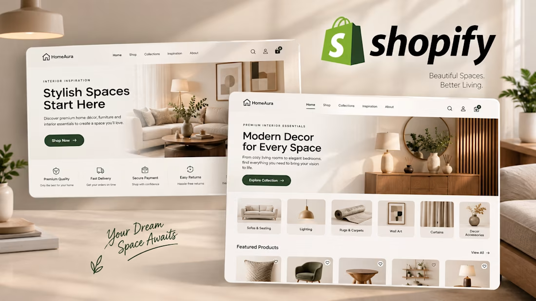
HomeAura | Modern Interior Decor Shopify Store - UI/UX Design
HomeAura is a premium home decor and furniture brand. The goal was to create a high-end, trustworthy Shopify experience that feels calm, luxurious, and easy to shop.
I designed a full homepage concept that balances aesthetics with conversions.
The Challenge:
Most furniture stores feel cluttered and overwhelming. HomeAura needed a design that is clean, modern, and inspirational - making customers envision the products in their own homes.
What I Designed:
Hero Section with clear value prop "Stylish Spaces Start Here"
Trust Badges: Premium Quality, Fast Delivery, Secure Payment, Easy Returns
Visual Category Navigation: Sofas & Seating, Lighting, Rugs & Carpets, Wall Art, Curtains, Decor Accessories
Featured Products with clean product cards
Collection discovery section "Modern Decor for Every Space"
Design Principles Used:
Warm beige / off-white palette for cozy premium feel
Plenty of whitespace and soft shadows
Modern typography pairing
Fully responsive, Shopify 2.0 ready structure
Perfect for home decor, furniture, lifestyle, and interior design brands.
Want a similar high-converting store for your brand? Let's talk!
The network for creativity
Join 1.25M professional creatives like you
Connect with clients, get discovered, and run your business 100% commission-free
Creatives on Contra have earned over $150M and we are just getting started




Related posts

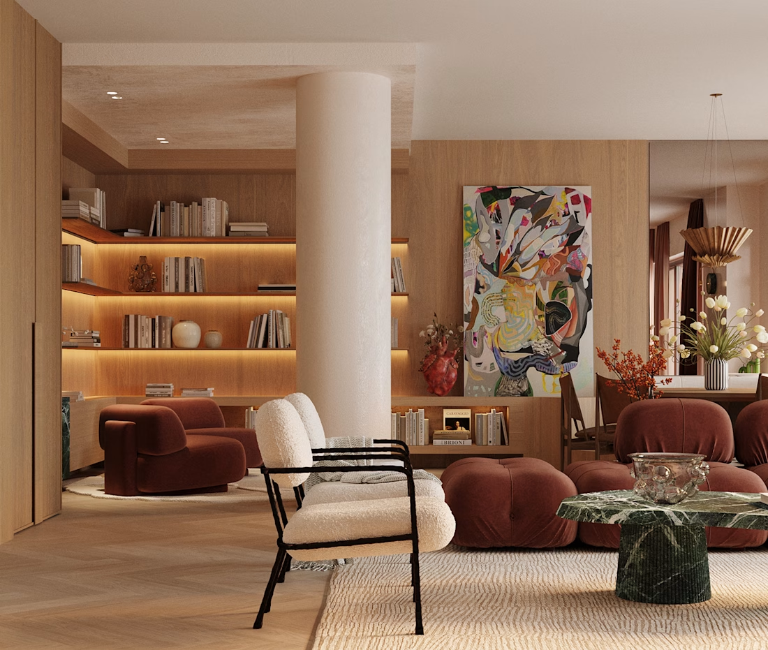
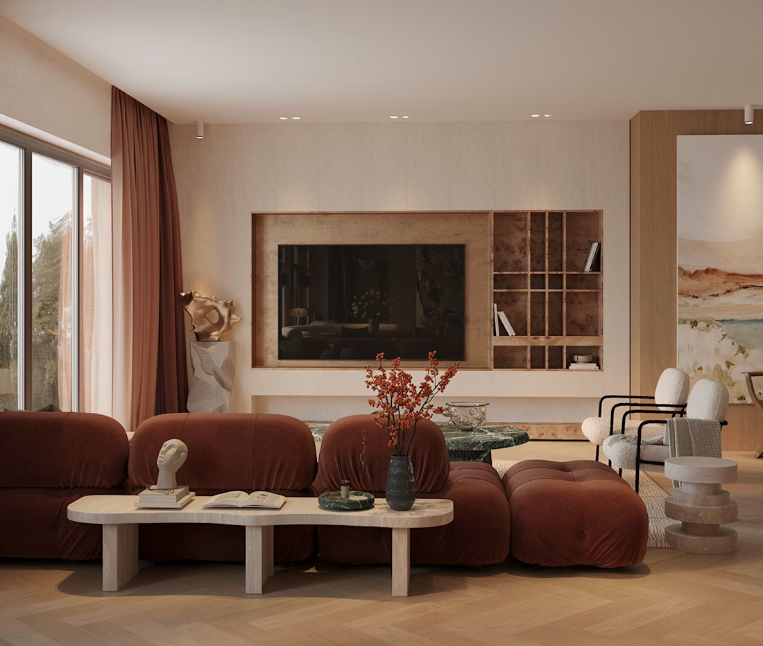
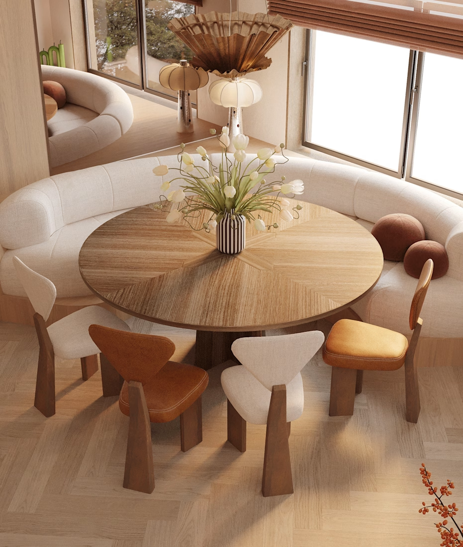
The Cankurtaran’s House — Warmth, Texture & Balance
A well-designed interior is more than just beautiful. It should feel balanced, intentional, and connected.
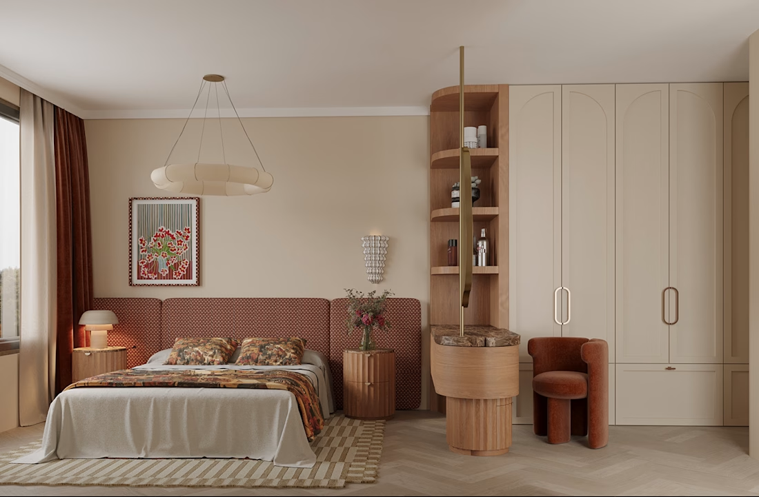
For this visualization, I focused on warm timber, earthy tones, layered lighting, thoughtful furniture placement, and natural textures to create a calm and inviting atmosphere.
Created by: Gift Olayinka Ayeni
Software: 3ds Max • Corona Renderer • Photoshop • Quixel Megascans
What catches your attention first?
• Lighting • Materials • Furniture • Composition
#InteriorDesign #LivingRoomDesign #ArchitecturalVisualization #3DRendering #ResidentialDesign
Interior Design 3D ModelingArchitecture & Interior DesignAdobe PhotoshopAutodesk 3ds MaxChaos Corona




✨ From 3D Render to Cinematic Animation
I transformed a 3D interior render created in 3ds Max + Corona Renderer into an engaging cinematic animation using AI.
The goal was to bring the space to life — highlighting the atmosphere, materials, lighting, and details through motion.
I’m available for remote freelance projects in interior design, 3D visualization, photorealistic rendering, and architectural animation.
🎬 3D Modeling | Interior Design | Visualization | Animation
#InteriorDesign #3DRendering #3DVisualization #3dsMax #CoronaRenderer #ArchitecturalVisualization #InteriorRendering #3DAnimation #AIAnimation #ArchViz #FreelanceDesigner #RemoteDesigner


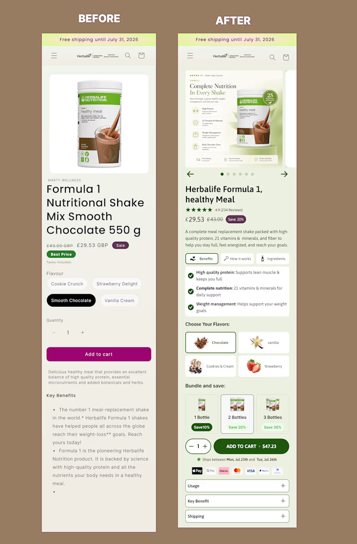
I redesigned this mobile offer section of product page on @Figma to create a clearer, more persuasive buying experience.
The original page presented the essential information, but the benefits, product options and purchase controls were difficult to scan.
For the redesign, I improved:
• Product and offer hierarchy
• Benefit-focused messaging
• Product gallery and visual presentation
• Flavour and bundle selection
• Pricing and savings visibility
• Trust signals near the CTA
• Mobile usability and buying flow
The goal was to help shoppers understand the product, compare their options and move toward purchase with less friction.
This is a concept redesign created to demonstrate my approach to conversion-focused Shopify product page design.



Good hierarchy fix, the before version buries the flavor picker and quantity discount below a wall of bullet points. On the bundle tiers, are the 10/20/30% discounts pulled from a real margin model for a shake product, or placeholder numbers for the concept? That third tier...