The network for creativity
Join 1.25M professional creatives like you
Connect with clients, get discovered, and run your business 100% commission-free
Creatives on Contra have earned over $150M and we are just getting started
Back to feedPost

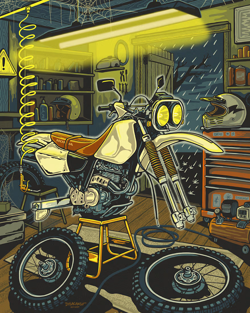
Had a lot of fun drawing this vintage Honda bike stripped down for some late night garage work while it’s pouring outside.
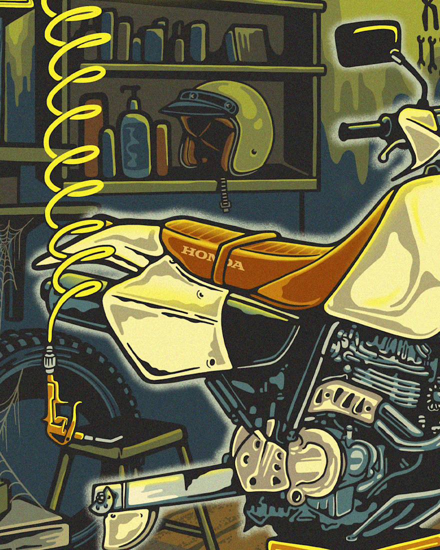
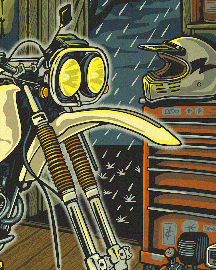
I wanted to capture the exact feeling of a cluttered workshop, so I packed the space with narrative details. Detached spare tires on the floor, a rolling tool chest, retro helmets resting on the shelves, and even spiderwebs hanging from the rafters.
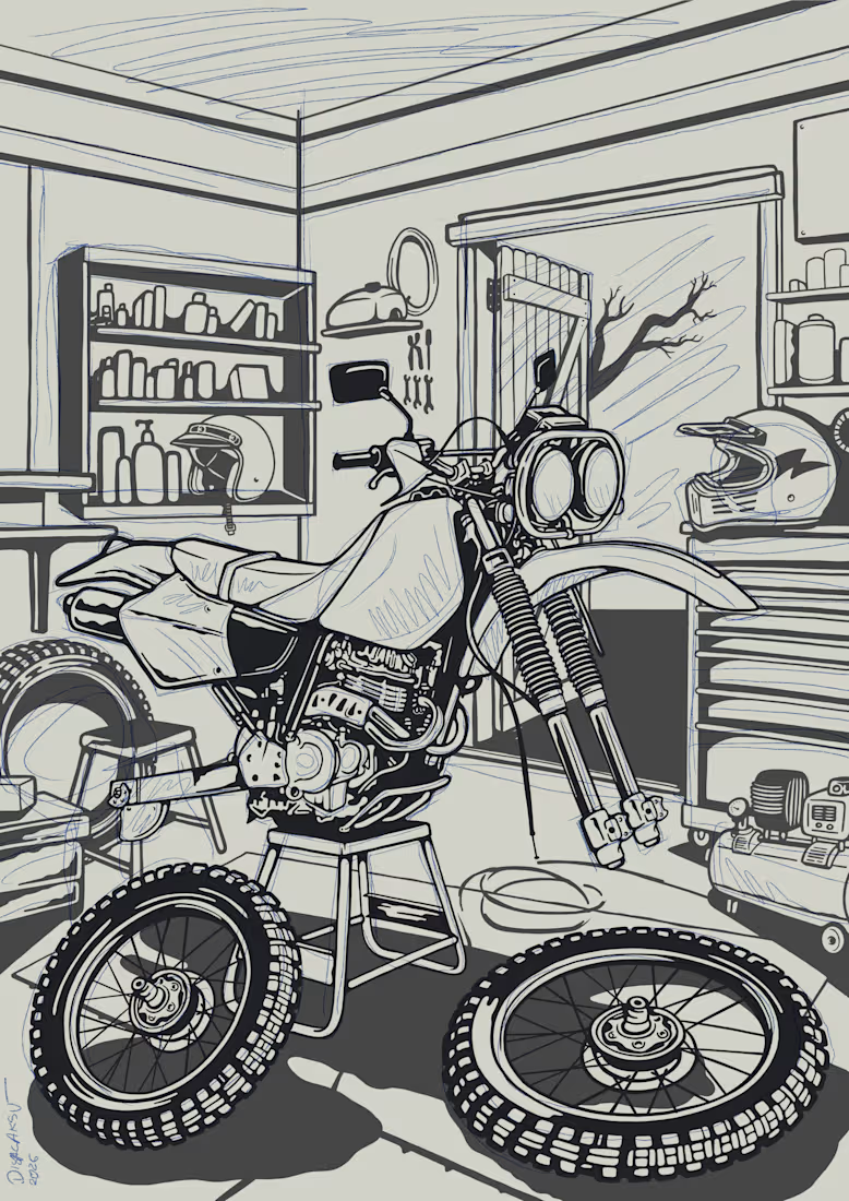
The whole piece is anchored by that heavy yellow glow from the overhead shop light, which contrasts perfectly with the cold rain in the background. Everything was built from the ground up using fine custom lineart and heavy, gritty textures to give it that authentic, tactile feel.


The network for creativity
Join 1.25M professional creatives like you
Connect with clients, get discovered, and run your business 100% commission-free
Creatives on Contra have earned over $150M and we are just getting started





Related posts


Okaaaayy, new profile picture and a new project! 🥳
This is one i'm really proud of and shows the development in our studio. Not just a brand or a website, but 120+ app screens + full IOS development for Mercury 🌍
I'm super proud of this project! Please check it out :)) 👇


Huge congrats Chris! 🎉 120+ screens + full IOS dev for Mercury is massive! Love the growth of your studio - from brand to full product. The editorial typography card looks premium. Big inspiration for us building in the app space! Checking it out now 👏

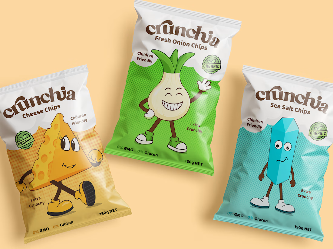
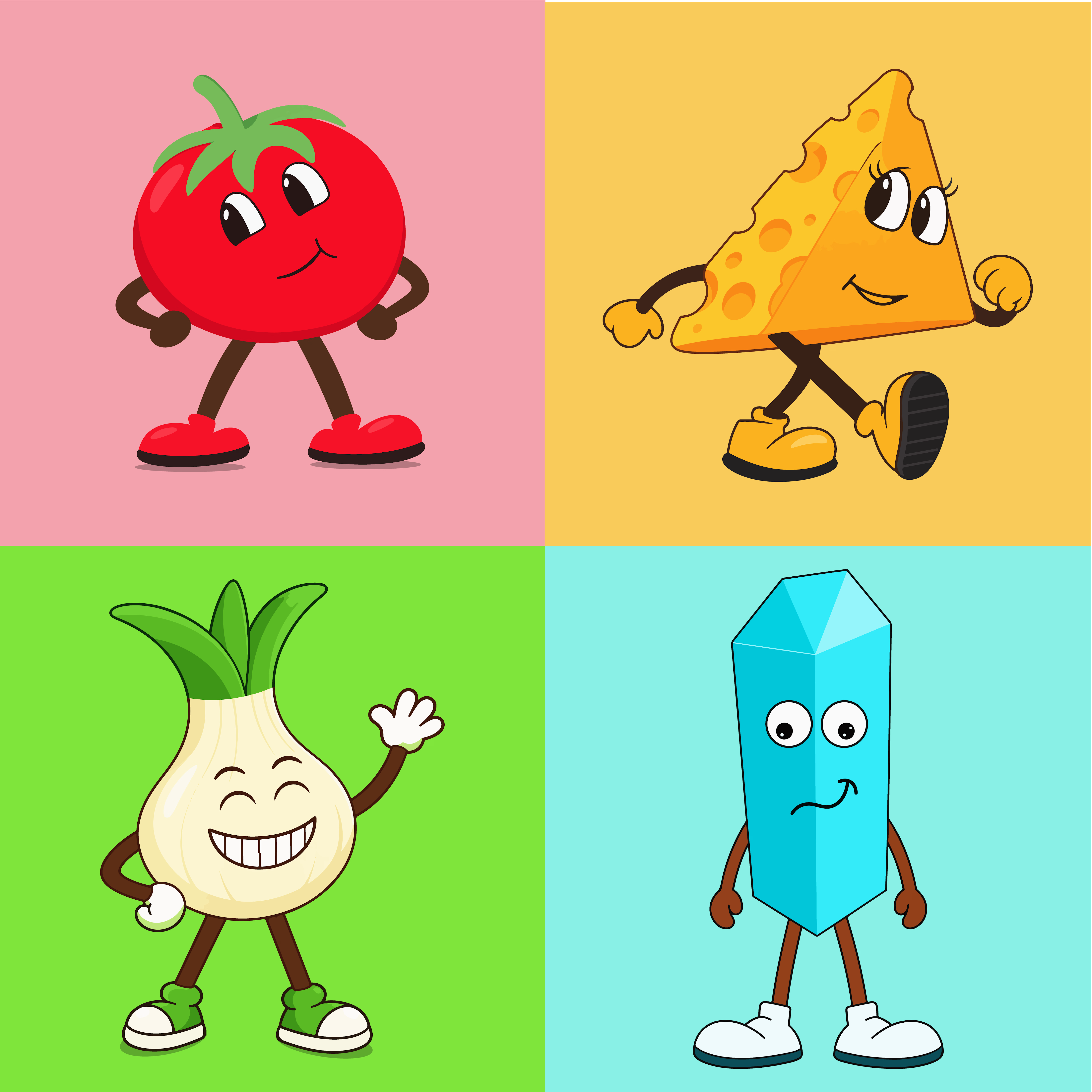
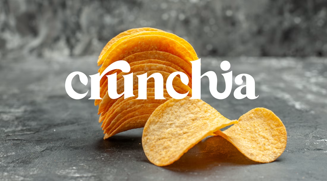
Crunchia – Brand Identity & Packaging Design
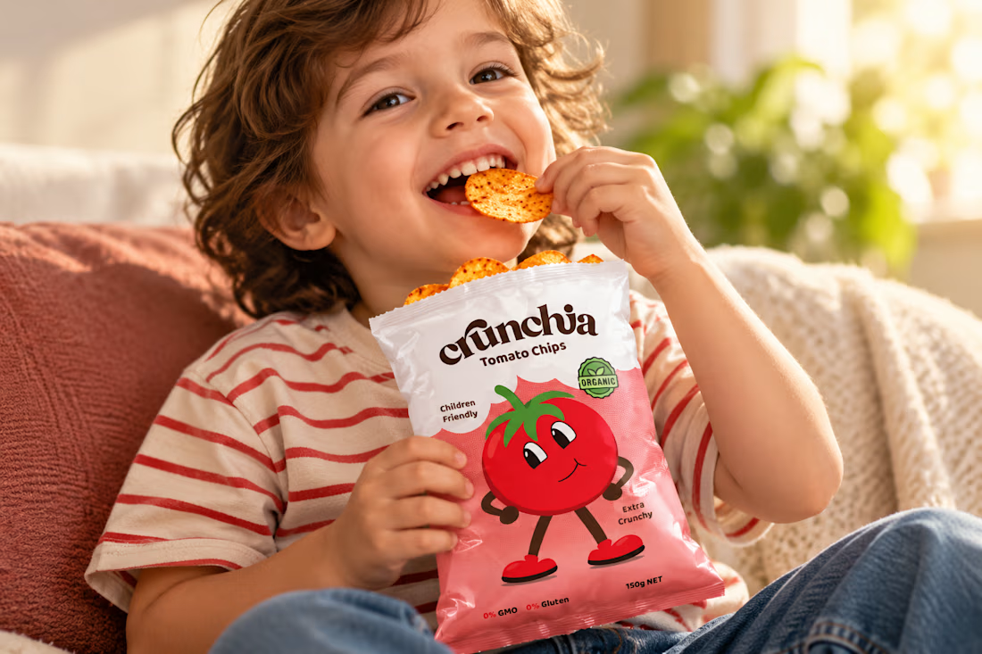
Developed a playful and eye-catching brand identity and packaging design for Crunchia, a tomato chips brand aimed at children and families. The project included a custom logo, vibrant packaging design, and a friendly tomato mascot to create a memorable and recognizable brand.
I also created realistic product mockups and lifestyle visuals to showcase the packaging and present the product in an engaging, market-ready way.


Title: Proper Form — Brand Identity & Visual Language
A brand identity for Proper Form built around a more modern, movement-driven take on recovery and healthcare.
The visual system extends the logo into a complete language through color, typography, imagery and layout, creating a consistent identity across different brand touchpoints.
Created by Lepisov Branding in collaboration with @Creative Mints
Logo design: Ilya Gorchanyuk
Creative direction: Dmitry Lepisov
Brand identity: Lepisov Branding × Creative Mints


Using the logo mark as the big graphic across the layouts is smart. The purple to pink gradient gives recovery a more energetic feel.


