The network for creativity
Join 1.25M professional creatives like you
Connect with clients, get discovered, and run your business 100% commission-free
Creatives on Contra have earned over $150M and we are just getting started
Back to feedPost
Dark Mode Isn't Just Aesthetic - It's Expectation
In 2026, if your app doesn't have dark mode, users notice. And they're annoyed. Dark mode reduces eye strain, saves battery on OLED screens, and frankly looks premium when done right.
The key?
Don't just invert colors. Design a true dark palette, desaturate your accent colors slightly, use dark gray (#121212) not pure black, and test your contrast ratios religiously.
The network for creativity
Join 1.25M professional creatives like you
Connect with clients, get discovered, and run your business 100% commission-free
Creatives on Contra have earned over $150M and we are just getting started
Related posts
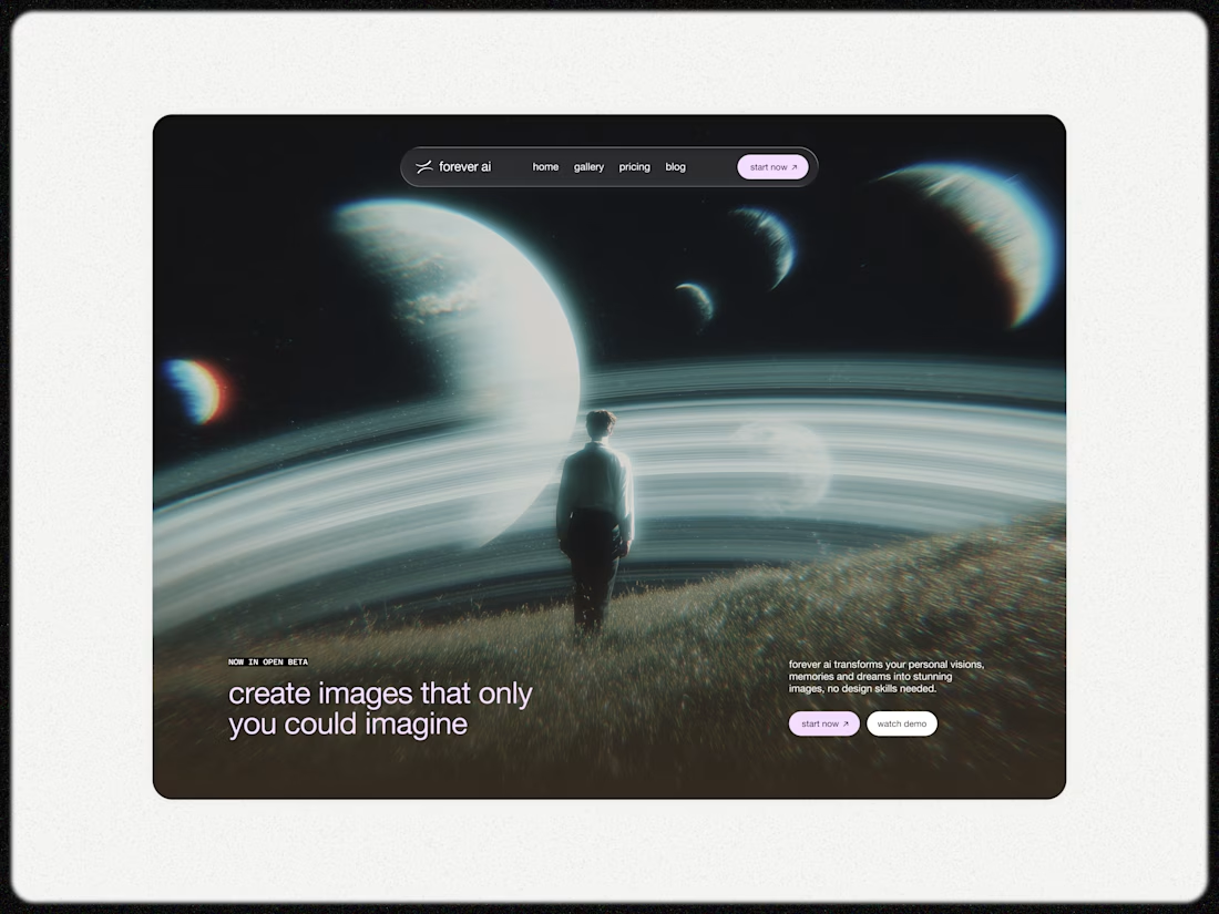
How do you make a landing page feel like a product — not a pitch deck?
For UNUS, we designed a landing page concept built around clean structure and premium visual storytelling.
The core of the experience is a set of 3D animated cards and icons, designed to communicate value instantly — with depth, clarity, and a strong product feel.
Instead of overloading the page with text, we used motion and hierarchy to guide attention naturally: sharp sections, controlled spacing, and visuals that actually support the message.
Built to feel modern, confident, and conversion-ready.
Created via our design subscription.
FANCY is currently available for new projects.
Quietly thrilled to share this.
Bearplus was selected for Dribbble Select: Best Shots of the Year, and featured in the Dribbble Select: Web Design Agencies directory.
We believe beauty isn't decoration. It's the shortest path to being believed. Every pixel, every revision, every late-night "let's push it one more round" is really about earning trust in the seconds before anyone reads a word.
Thank you to the founders, product teams, and marketers who let us push the details further.
Links in comments 👇
Huge congrats 🙌
I am really loving this.
Trending
FLORA
Reusable workflows are replacing one-off prompts in creative AI. Share what you're building in FLORA.
Contra University
Learn from expert creatives how to earn more using next-gen AI tools.
creativeaiflow
Creative AI workflows are evolving. What tools do you use, and what are their strengths and weaknesses?
portfolioreview
The best portfolios tell a story, not just show a grid. Share yours for feedback.
freelancerlife
Freelancer life is wins, pivots, and everything in between. What’s yours right now?