The network for creativity
Join 1.25M professional creatives like you
Connect with clients, get discovered, and run your business 100% commission-free
Creatives on Contra have earned over $150M and we are just getting started
Back to feedPost

A responsive web application built to categorize and aggregate educational resources across multiple fields including Programming, Languages, Medicine, and Internships.🍊
The network for creativity
Join 1.25M professional creatives like you
Connect with clients, get discovered, and run your business 100% commission-free
Creatives on Contra have earned over $150M and we are just getting started
Challenges
View all


Related posts

Which AKARI Design Looks Better? 🍣
I’ve been working on AKARI (あかり) — a Japanese food restaurant website that I’m building both as a real-shop-ready concept and as a showcase of my web design & development work.
I’ve made two different versions of the design, and I want the Contra community to decide which direction looks better.
🅰️ Option A
Design 1 — More bold, structured and brand-focused.
🅱️ Option B
Design 2 — More minimal, clean and modern.
🅲️ Option C
Neither? 😅
Tell me what you would change, add, or completely redesign. I’m open to ideas!
👇 Vote A, B, or C in the comments.
Which one would you choose for a Japanese restaurant?
🍣 AKARI — あかり
Authentic Japanese Taste, Made for Everyone.


6 voted
46%
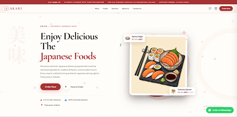
7 voted
54%
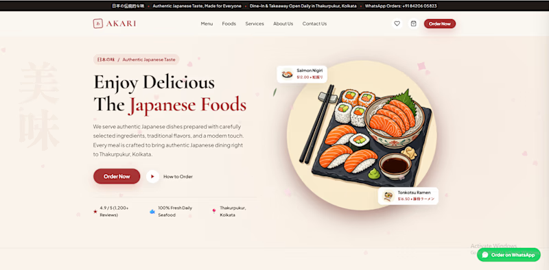
13 votes
Closed

I’d lean toward Design A—the bolder structure gives the restaurant a clearer point of view, while the centered dish still keeps the page inviting. The restrained palette and generous whitespace make the food do the talking.


Some updates on EnduroSat's website worth showing.


Amazing work!

Same offer, completely different perception. Good design changes how much trust your business commands in seconds.
Here is what changed the game in this recent website refresh:
• Better Typography: Modern fonts that give the headline real authority.
• Clearer Hierarchy: Guides the eye directly to the offer and next step.
• More Breathing Room: Clean whitespace that lets key messages stand out.
• Stronger Social Proof: Client stats and partner logos placed front and center.
When your site looks like an industry leader, people treat you like one.
If your website does not match the actual quality of your work, let us fix that. Check out my Contra portfolio or shoot me a direct message to chat.
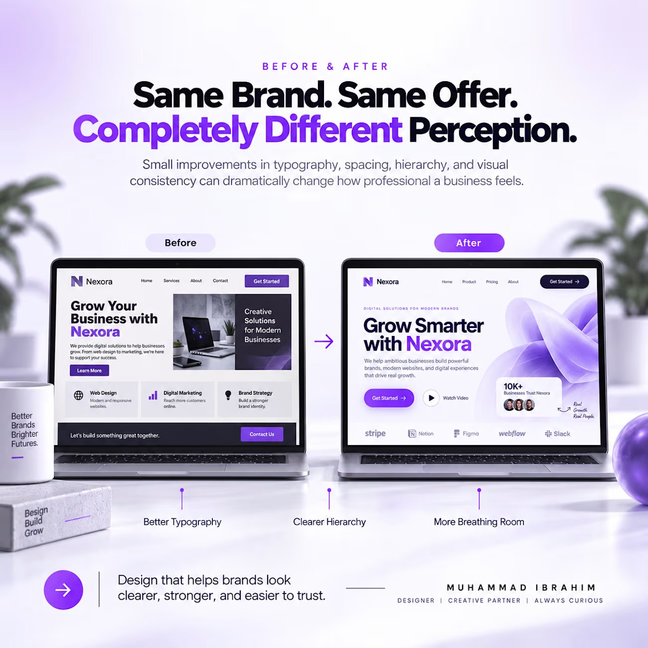
Strong before/after storytelling—your typography and breathing-room callouts make the redesign value immediately legible. The contrast between the two screens gives the whole refresh a convincing sense of momentum.