The network for creativity
Join 1.25M professional creatives like you
Connect with clients, get discovered, and run your business 100% commission-free
Creatives on Contra have earned over $150M and we are just getting started
Back to feedPost

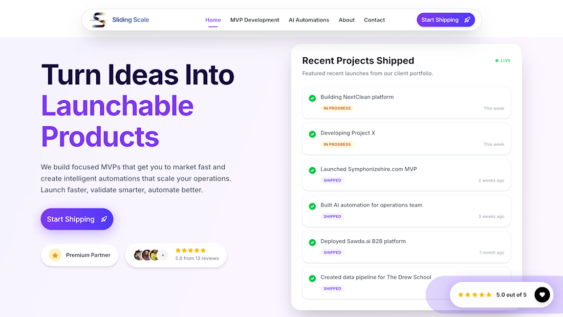
We built the website for Sliding Scale, a product-first development studio focused on MVPs and internal automations.
In a time where websites can be generated in minutes, the goal here was not just to ship fast, but to communicate the right message with clarity and intent.
The focus was on positioning:
1. Real user testimonials instead of generic social proof
2. Clear articulation of what we do and what we don’t do
3. Strong emphasis on product thinking over service execution
We designed and structured the website to reflect how we actually work; starting from problem understanding, reducing scope, and building only what truly matters.


The network for creativity
Join 1.25M professional creatives like you
Connect with clients, get discovered, and run your business 100% commission-free
Creatives on Contra have earned over $150M and we are just getting started

Challenges
View all


Related posts


Some updates on EnduroSat's website worth showing.


Amazing work!


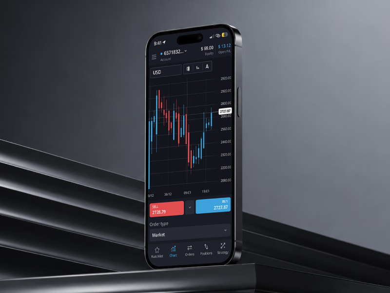
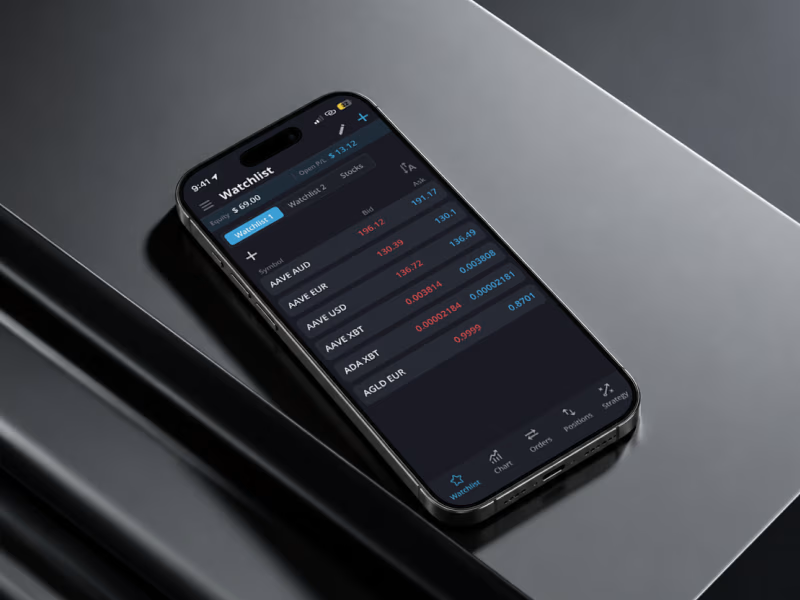
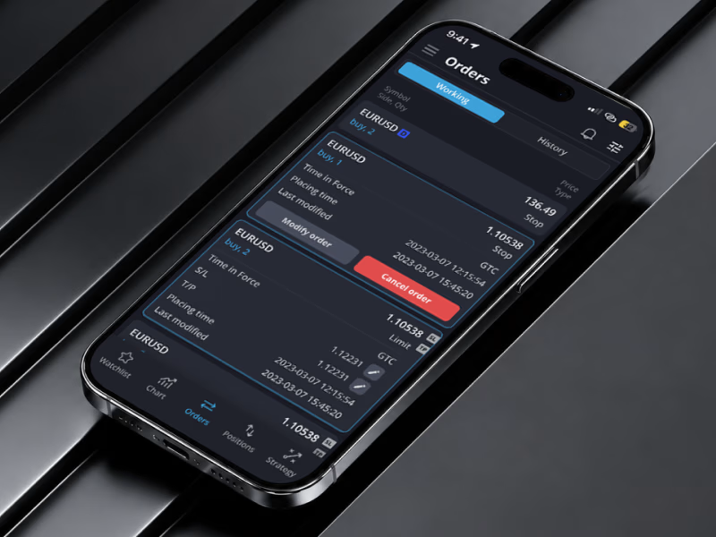
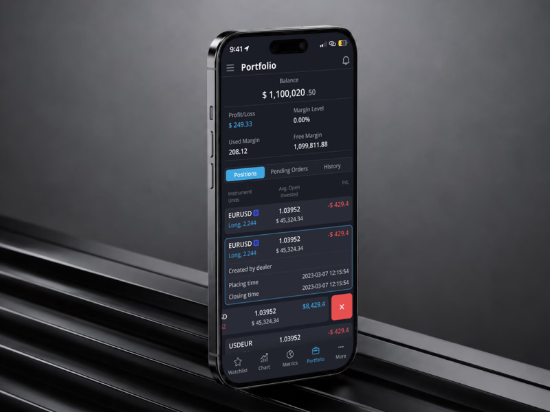
T-Platform, a unified trading app for crypto, stocks and forex.
Three markets, three apps, no way to see real exposure. We put all of it into one dark workspace: real-time charts, order execution, positions and history in a single view.
Full case study here: https://www.behance.net/gallery/255562509/T-Platform-Crypto-Stock-Trading-UXUI-Mobile



Same offer, completely different perception. Good design changes how much trust your business commands in seconds.
Here is what changed the game in this recent website refresh:
• Better Typography: Modern fonts that give the headline real authority.
• Clearer Hierarchy: Guides the eye directly to the offer and next step.
• More Breathing Room: Clean whitespace that lets key messages stand out.
• Stronger Social Proof: Client stats and partner logos placed front and center.
When your site looks like an industry leader, people treat you like one.
If your website does not match the actual quality of your work, let us fix that. Check out my Contra portfolio or shoot me a direct message to chat.
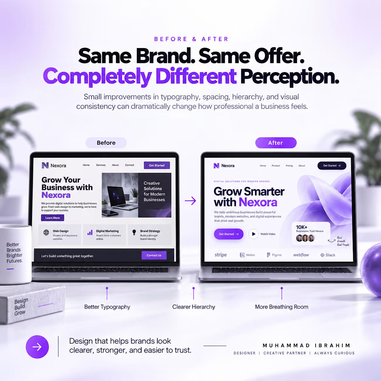

Strong before/after storytelling—your typography and breathing-room callouts make the redesign value immediately legible. The contrast between the two screens gives the whole refresh a convincing sense of momentum.