The network for creativity
Join 1.25M professional creatives like you
Connect with clients, get discovered, and run your business 100% commission-free
Creatives on Contra have earned over $150M and we are just getting started
Back to feedPost
What a site audit reveals that a business owner rarely expects?
Most business owners who request a site review come in expecting feedback on design. What the audit actually reveals is usually something else entirely.
The design is rarely the primary problem. What comes up more often is that the site is structured around how the business thinks about itself rather than how a buyer thinks about their problem.
Services are named using internal language the business uses internally but that a prospective client would never search for. The most important information is buried below content that felt important at the time the site was built but no longer reflects how the business works.
A few things that come up consistently. Contact forms with too many required fields that reduce the number of people who complete them. About pages that read like a resume rather than a reason to trust someone. Home pages that lead with the business name and a tagline instead of a clear statement of what the business does and who it serves.
None of these are obvious from the inside. When you have looked at your own site enough times, you stop seeing it the way a first-time visitor does. That distance is what an independent review restores.
The most common response I hear after walking someone through findings is that they knew something felt off, but couldn't name it. The audit names it and gives them a clear order of what to address first.
That clarity is usually worth more than the fix itself.


The line about clients knowing something felt off but not being able to name it really nails why audits are worth paying for. Do you have a go-to way of explaining that value before someone's actually seen the audit?

I share a sample finding from a past audit - enough to show how specific the report gets without it being your actual site. If you want to see what that looks like, send me a message.
The network for creativity
Join 1.25M professional creatives like you
Connect with clients, get discovered, and run your business 100% commission-free
Creatives on Contra have earned over $150M and we are just getting started



Related posts


What makes a website feel cohesive?
It’s not just the colors.
It’s not just the typography.
And it’s definitely not about making every section look the same.
A cohesive website is built when every visual decision feels like part of the same story, from typography and imagery to spacing, buttons, cards, and even the smallest details.
The goal isn’t repetition.
It’s creating a visual language that people recognize and remember.
That’s when a website starts to feel like a brand, not just a collection of sections.
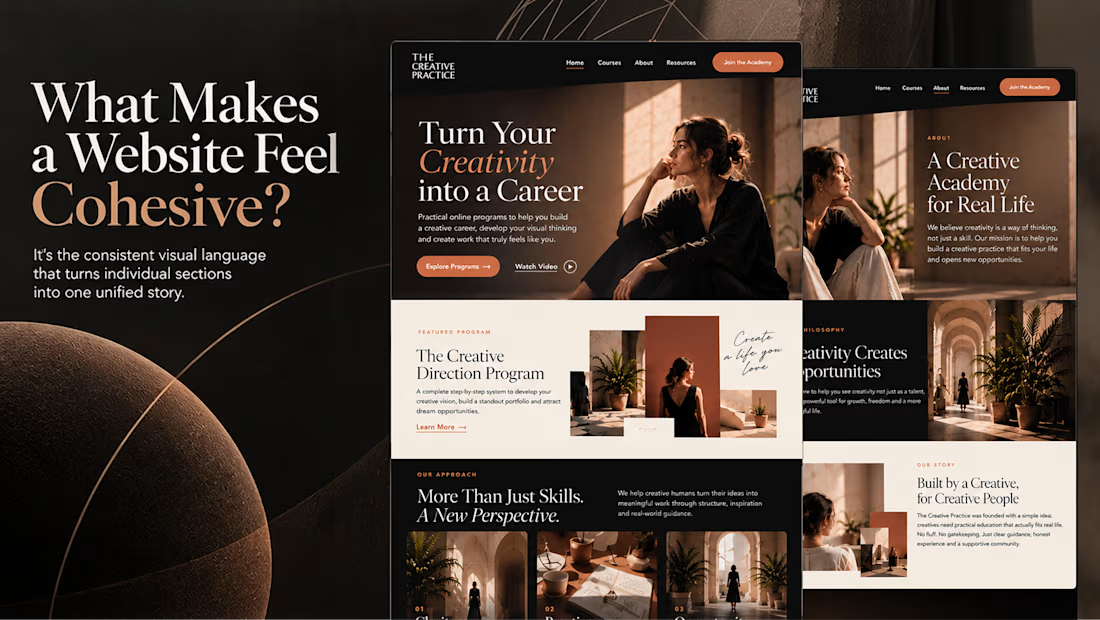

Well put, Serge. Consistent spacing, buttons and cards do more for that feeling than making sections match, and they are usually the first things to drift as a site grows.

Behind the wall: a homepage concept for Studio Cesare
I’m testing a new landing page for my studio, made with Brik.
A pixel-brick grid covers the screen. Move through it and the bricks fall away to reveal the person behind the work, mid-coffee, slightly off balance. Then the wall closes again.
It’s a small metaphor for how I approach next-generation branding: a strong system on the surface, with a real person and a real point of view underneath.
Exploring this for the studio site launch. Open to feedback, and to new projects 🤝🏼

This is amazing!!

Where should the lights end up?
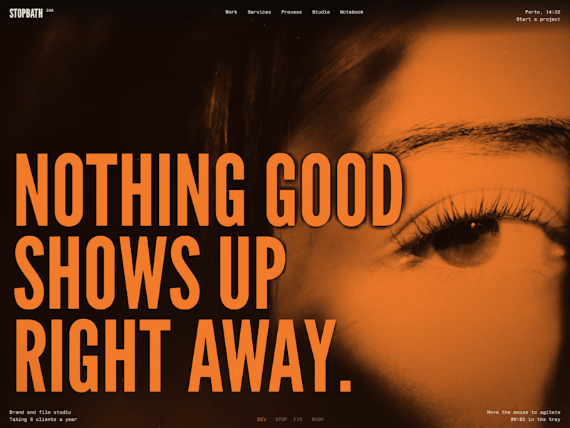
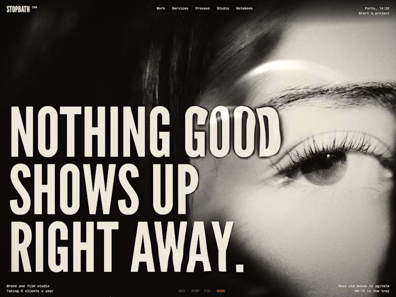
I'm building a Framer template that works like a darkroom. The photo comes up out of blank paper in a tray of liquid, shadows first, and the headline only appears once the print gets dark around it.
Right now the safelight stays on for about eight seconds, then the room lights come up and it turns into a black and white print. I keep going back and forth on that part.
Stay amber, or lights on?


2 voted
40%
3 voted
60%
5 votes
Closed