The network for creativity
Join 1.25M professional creatives like you
Connect with clients, get discovered, and run your business 100% commission-free
Creatives on Contra have earned over $150M and we are just getting started
Back to feedPost
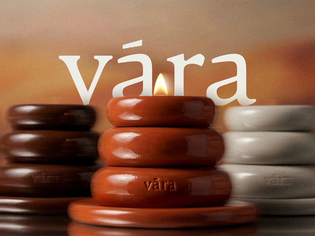
Would you recognize a candle brand without its logo?
That was the thinking behind VĀRA’s sculptural silhouette. The same stacked form carries through the ceramic vessel, brand symbol and tassel charm, giving the brand something recognizable beyond its name.
I’ve just published the full case study, from identity and packaging to art direction and web design.
Which detail would make you stop and look: the vessel, the packaging or the charm?
View full project

The attention to detail in Vara is absolutely top-notch.
I love the creativity behind the design, especially the use of different shapes, materials, and textures. Every element feels thoughtfully crafted, making the overall creation truly stand out.

Thank you so much! Really glad you noticed those details. We wanted every shape, material, and texture to feel intentional and work together as one cohesive experience. Means a lot that it came through!
The network for creativity
Join 1.25M professional creatives like you
Connect with clients, get discovered, and run your business 100% commission-free
Creatives on Contra have earned over $150M and we are just getting started





Related posts

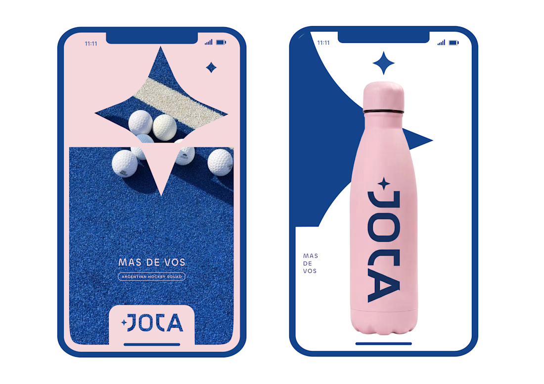
JOTA is an Argentine field hockey brand built for players who play with personality. The founder reached out to rethink how the brand shows up beyond the stick itself.


Wow project

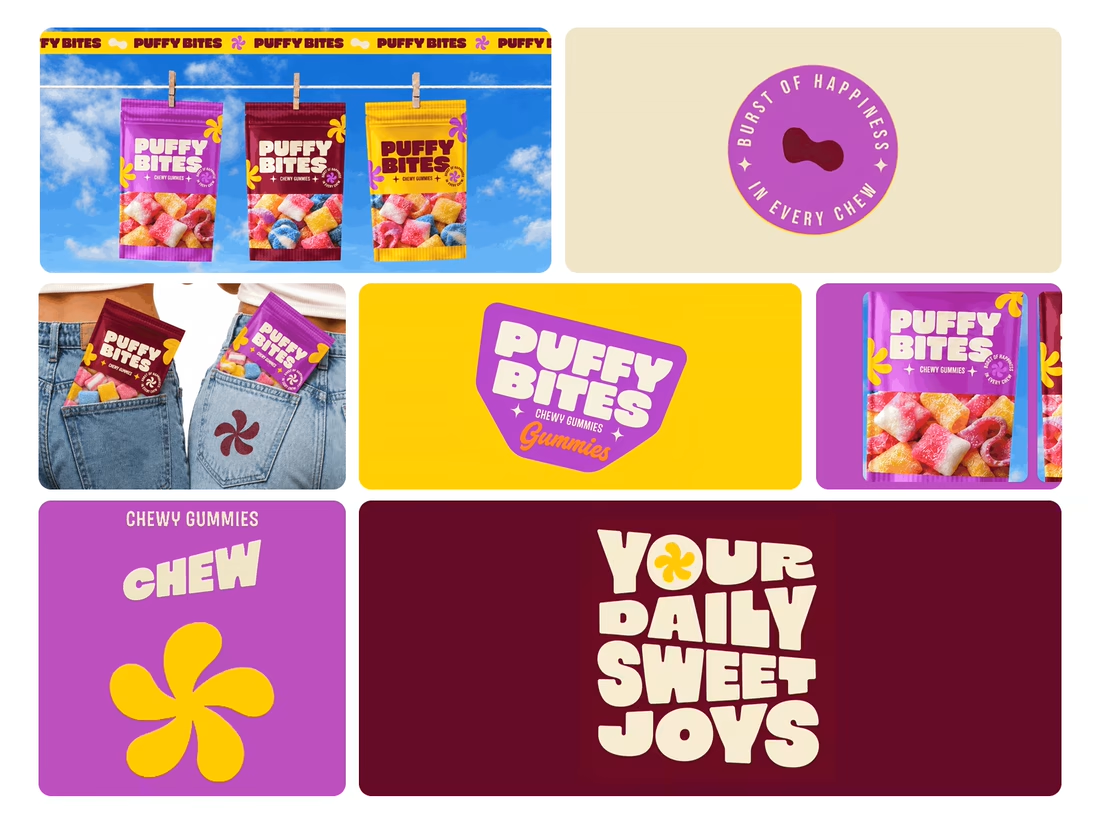
What makes a candy brand recognizable across every pack?
For Puffy Bites, I built the identity around rounded lettering, expressive symbols, and a palette of burgundy, purple, yellow, and cream.
The same visual language carries through pouch packaging, smaller wrappers, campaign imagery, and an animated brand showcase.
One design decision that ties it together: the packaging color changes, while the logo placement, product descriptor, and supporting graphics maintain a consistent structure.
I handled the full client project, from logo and visual identity to packaging and campaign applications.
Which colorway would catch your eye first—purple, burgundy, or yellow?
Explore the full Puffy Bites case study. If you’re developing a candy or snack brand, I’m available for branding and packaging projects.

Love it,
Great work
A fashion storefront needs to show the outfit and make its individual pieces easy to find.
For FORM, I paired a warm, editorial lookbook with clearly grouped product names, prices, and size choices.
Cream surfaces, charcoal typography, and consistent product cards connect the homepage with the desktop and mobile screen concepts.
One useful design principle from this project: give campaign imagery and shopping details their own readable zones. The collection can have a strong visual presence while the next product decision stays clear.
Explore the complete design case study:
https://contra.com/p/rNPRqooQ-form-fashion-e-commerce-website-design
When exploring a clothing collection, what helps you most: a styled outfit or an individual product grid?
Adorable