The network for creativity
Join 1.25M professional creatives like you
Connect with clients, get discovered, and run your business 100% commission-free
Creatives on Contra have earned over $150M and we are just getting started
Back to feedPost

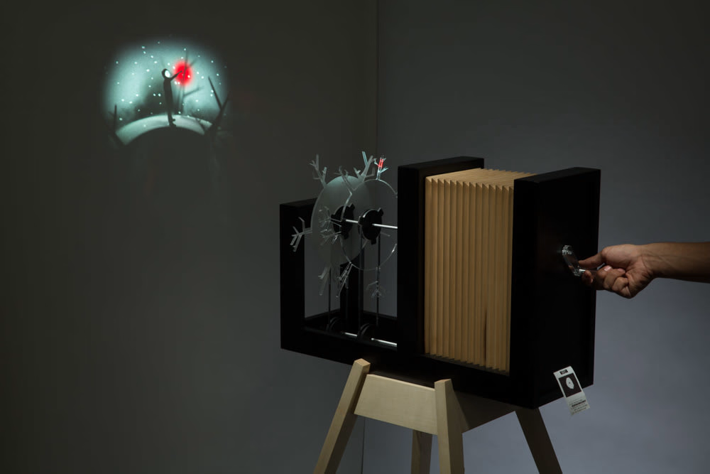
Penumbra - interactive storytelling machine


The network for creativity
Join 1.25M professional creatives like you
Connect with clients, get discovered, and run your business 100% commission-free
Creatives on Contra have earned over $150M and we are just getting started





Related posts

This reel for @afterluc was a chance to play a little more with the visual language we usually use for his content.
It’s a fun “get ready with me” piece that opens with a teleport effect and moves into a faster, more playful edit. Since Luc’s profile normally leans toward a cleaner and more minimalist aesthetic, I pushed the typography further here, using bolder text treatments and more expressive motion without losing the visual identity we’ve built around his content.
The goal was to make the edit feel energetic and entertaining while still polished, using pacing, text, sound and small visual moments to support his personality rather than overwhelm it.
I really enjoy projects like this because they show how a consistent visual identity doesn’t have to mean doing the same thing every time. Sometimes the right choice is knowing exactly where you can break the rules a little.
Role: Video Editing, Motion Design, Text Animation, Sound Design, Color & Visual Storytelling

The jump cut into the teleport with the bold yellow OUTFIT type feels snappy. Good fit for a get ready with me reel.

The future won't build itself... or will it on this AI era?
Few animations are as fun to animate as this one was. I had the pleasure of working on several case study animations for Juice Agency, and I couldn’t be happier with the result. It took real teamwork to get them exactly the way we wanted.
If you run a design studio or are a freelancer and still share your work as still images, let's chat!
We can make all your fantastic designs look even better. 🔥

Great work!

A three-card tarot spread where every face is unique procedural sigil-art, woven into one reading.
I built this project to test a three-card tarot spread where every face is unique procedural sigil-art, woven into one reading. The goal was simple: push interactive browser rendering using HTML5 Canvas and see how smoothly the system responds to direct user interaction.
WHAT I WAS TESTING:
I wanted to focus on two core engineering aspects:
Procedural generation of unique runic card sigils from mathematical formulas
Dynamic typography and card flipping choreography without heavy 3D frameworks
THE TECHNICAL SIDE:
The card faces render directly onto an HTML5 Canvas using polar coordinate trigonometric curves and procedural geometry. Every draw call is computed dynamically without image textures or external SVGs.
Everything runs in the browser using HTML5 Canvas, Procedural Sigil Geometry, Seeded Randomness. No plugins, no heavy dependencies, and no external tracking.
WHAT I LEARNED:
Balancing procedural symmetry with organic irregularity was the main hurdle. Pure mathematical curves looked too synthetic, so adding minor pseudo-random offsets gave the sigils their handcrafted appearance.
Finding the sweet spot between mathematical precision and tactile visual feedback took several iterations, but the end result runs consistently at 60 FPS.
TRY IT YOURSELF:
The live experiment is deployed on Netlify. You can open it in any modern browser, interact with the controls, and test the response times.
If you are working on similar 3D, physics, or creative web projects and want to collaborate, message me here on Contra.


cinematic💯 . Nice work😍