The network for creativity
Join 1.25M professional creatives like you
Connect with clients, get discovered, and run your business 100% commission-free
Creatives on Contra have earned over $150M and we are just getting started
Back to feedPost



The network for creativity
Join 1.25M professional creatives like you
Connect with clients, get discovered, and run your business 100% commission-free
Creatives on Contra have earned over $150M and we are just getting started








Related posts

The brief was simple. Show a new personalized news feature.
The obvious solution was to show a few clicks in the UI as you choose your topics. Clear, but not very interesting.
So I pulled that moment out of the interface first and turned it into a cloud of topics. You get the idea before you even see the product, then the video drops you back into the real UI and shows where it lives.
I really like these tiny decisions. The feature stays the same, but it feels easier to get and a lot more fun to watch.


Pulling the topic cloud outside the UI makes the feature instantly clearer.

Merge — SaaS Website Design That Makes Complex Products Feel Simple
For SaaS businesses, a website needs to communicate the product's value quickly, build credibility, and make the next step clear.
What makes this concept stand out?
Clear visual hierarchy — helps visitors understand the product without unnecessary complexity.
Product-led storytelling — keeps the focus on features, benefits, and user value.
Modern UI design — combines clean layouts, bold typography, and refined visual details.
Conversion-focused structure — creates a clear path from discovering the product to taking action.
Consistent user experience — brings every section together into one cohesive design.
The goal is simple: make the product easier to understand and the brand easier to trust.
Are you building a SaaS product or looking to improve your existing website? I can help you create a digital experience that aligns with your brand and business goals.
Available for SaaS website design, landing pages, and website redesign projects.


This concept has a really strong brand personality. The design feels distinctive enough to be memorable while still keeping the user experience clear and straightforward.

Green Energy ROI Calculator SaaS — UI/UX Design
A SaaS product concept focused on helping users evaluate the financial side of renewable energy investments through a clear, data-focused interface.
The design direction prioritises making important financial information easier to compare and interpret.
Design focus:
Energy investment and cost breakdowns
Potential savings and projected returns
ROI and payback period visualisation
Clear data hierarchy
Practical dashboard interactions
Designed for the intersection of clean-energy technology, financial analysis, and SaaS product experience.
Building a climate-tech or energy SaaS product?
Explore WaxyWeb at www.waxyweb.com
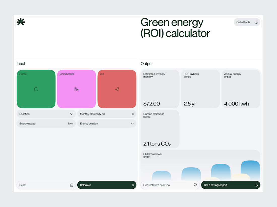

Clear hierarchy. I'd put the savings number even bigger, that's the one thing people screenshot and send to their boss.