The network for creativity
Join 1.25M professional creatives like you
Connect with clients, get discovered, and run your business 100% commission-free
Creatives on Contra have earned over $150M and we are just getting started
Back to feedPost

Real-time monitoring. Predictive alerts. Workflow automation.
A calm, distraction-free dashboard built for founders and fast growing SaaS teams.
#SaaS #Startup #BuildInPublic #Tech #Frontend #Founders #ProductDesign


The network for creativity
Join 1.25M professional creatives like you
Connect with clients, get discovered, and run your business 100% commission-free
Creatives on Contra have earned over $150M and we are just getting started






Related posts

Your dashboard shouldn't need a dashboard to explain it. 👀
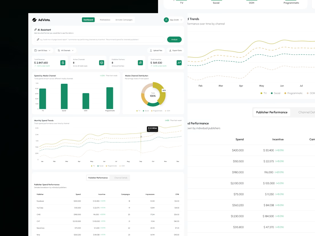
Meet AdVisa, an affiliate analytics concept built around clarity, clean charts, and smarter data exploration.
Here's the design breakdown. 🧵
#DashboardDesign #SaaSDesign #UIUX #DataVisualization
(1/5)
Less noise. More insights. 📊
I organized revenue, spending trends, and campaign metrics into a clean dashboard that makes important numbers easier to scan.
Because the best analytics experience helps you find answers, not just data.
(2/5)

I built my entire portfolio website with AI. This is what it feels like to use it.
In 77 seconds, I scroll through the homepage, open the Attack Map case study, and show how the gallery and hover states work. The last stop is the About page.
I design B2B SaaS and cybersecurity products. If you have a workflow that's hard to use or an idea you'd like to test in a working prototype, send me a message here on Contra.


Congrats on the new portfolio!


Ranking leads by urgency instead of by date is the right call for agents, Jinyu. I built reconnect reminders into my own lead app WorkPilot so this one caught my eye. How does Simply Home decide which lead is most urgent? Time since last contact or something like deal size?