The network for creativity
Join 1.25M professional creatives like you
Connect with clients, get discovered, and run your business 100% commission-free
Creatives on Contra have earned over $150M and we are just getting started
Back to feedPost





The network for creativity
Join 1.25M professional creatives like you
Connect with clients, get discovered, and run your business 100% commission-free
Creatives on Contra have earned over $150M and we are just getting started




Related posts

I've spent years obsessing over the stuff nobody notices on a website. Until it's missing.
AI can now build a whole site in an afternoon. I think that's great.
But it still can't decide what feels right.
I don't think AI is the problem. It just stops at "it works". The last part, the spacing, the type, the way things move when you scroll, still needs someone who cares about it.
That's the part I've always loved doing. So I made a small thing around it: you bring the site AI built, I finish it in Webflow.
It's called Verdikt https://verdikt.studio


Agreed. AI gets you a working layout fast, but spacing and type rhythm are where it still feels off. I'd add forms and mobile checks to that list too. What's the most common fix people bring you?

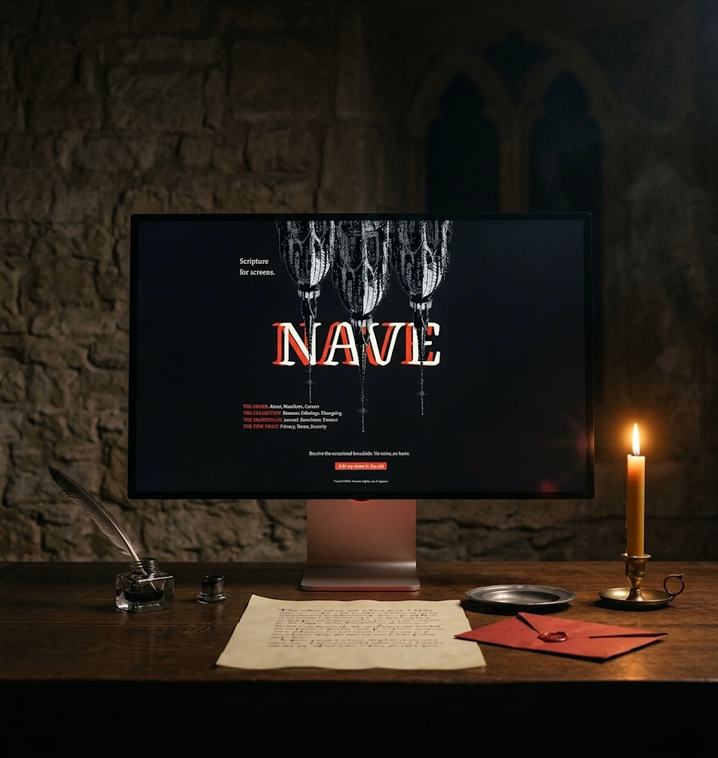
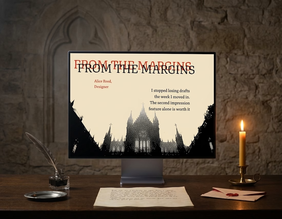
Nothing here is rushed.
Nothing here is dead.
Ink on vellum.
Light on glass.
Nave, out soon


Dope


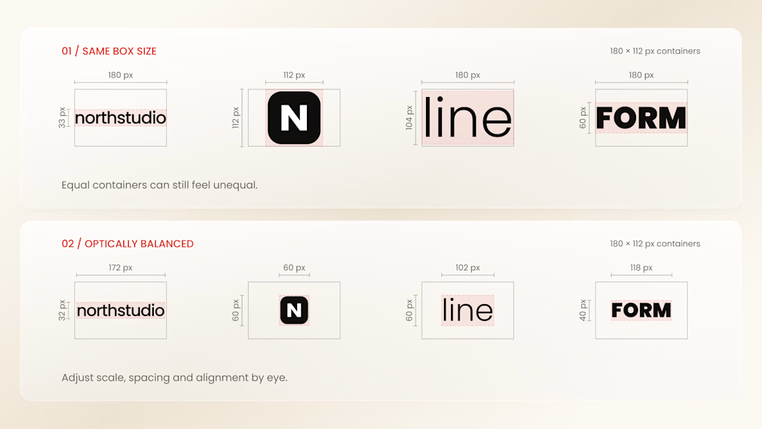
Why do logos look uneven even when they have the same size?
Every logo has a different shape, proportion, and visual weight. A wide wordmark can appear smaller than a compact symbol, while a bold logo may dominate a thinner one - even when their dimensions are technically identical.
That’s why logo sections shouldn’t be aligned by numbers alone.
Adjusting each logo optically, using a consistent visual area, balanced spacing, and a shared baseline helps every brand feel equally represented.
The goal isn’t to make every logo exactly the same size.
It’s to make them feel equally important.
Because visual consistency is based on perception, not just pixels.


Thanks for the information you shared