The network for creativity
Join 1.25M professional creatives like you
Connect with clients, get discovered, and run your business 100% commission-free
Creatives on Contra have earned over $150M and we are just getting started
Back to feedPost


Can't wait to start working on this brand soon!! 🥳
The network for creativity
Join 1.25M professional creatives like you
Connect with clients, get discovered, and run your business 100% commission-free
Creatives on Contra have earned over $150M and we are just getting started

Challenges
View all


Related posts

Recent brand showreel ✨
Identity and pitch deck for Infranova AI. Dark, bold, and a lot of purple.

Great 😍

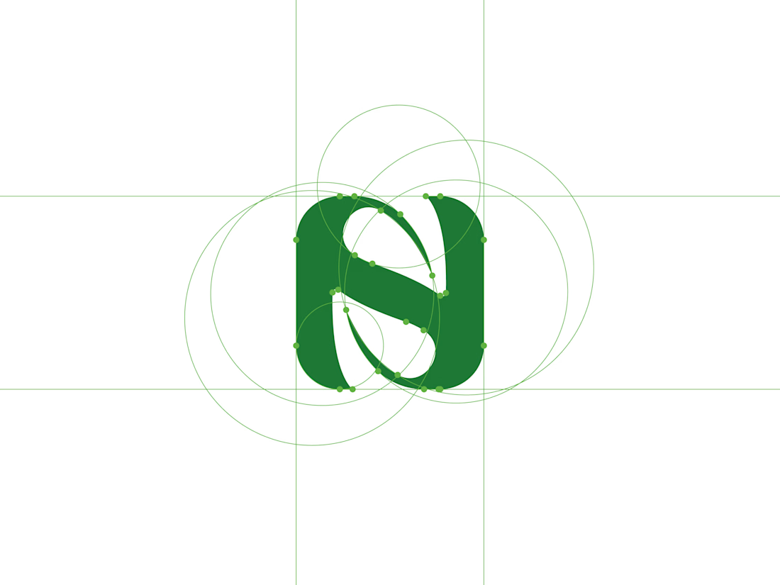
NOUREST — Nature-Led Brand Identity Design.
A brand about nature should feel natural at every touchpoint. 🌿
That's the idea behind NOUREST from its leaf-inspired monogram and green-led palette to packaging and brand materials.
One identity.
A consistent experience.
🏀 Full Design Showcase – Better View on Dribbble.
✅ https://dribbble.com/shots/27799268-NOUREST-Sustainable-Brand-Identity


Navin, a fintech brand built for a generation that doesn't do slow.
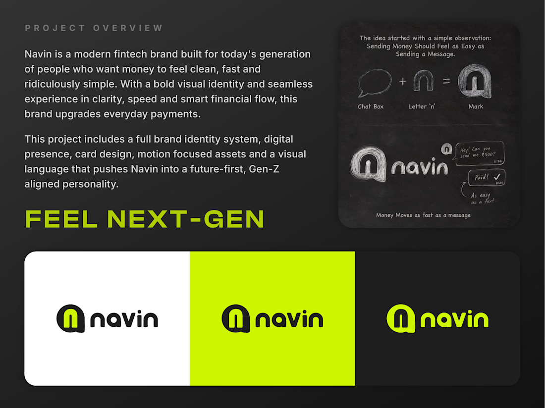
The idea was simple, money should move as easily as a message. So I built an entire identity around that thought instead of following the usual fintech playbook of safe colors and forgettable logos.
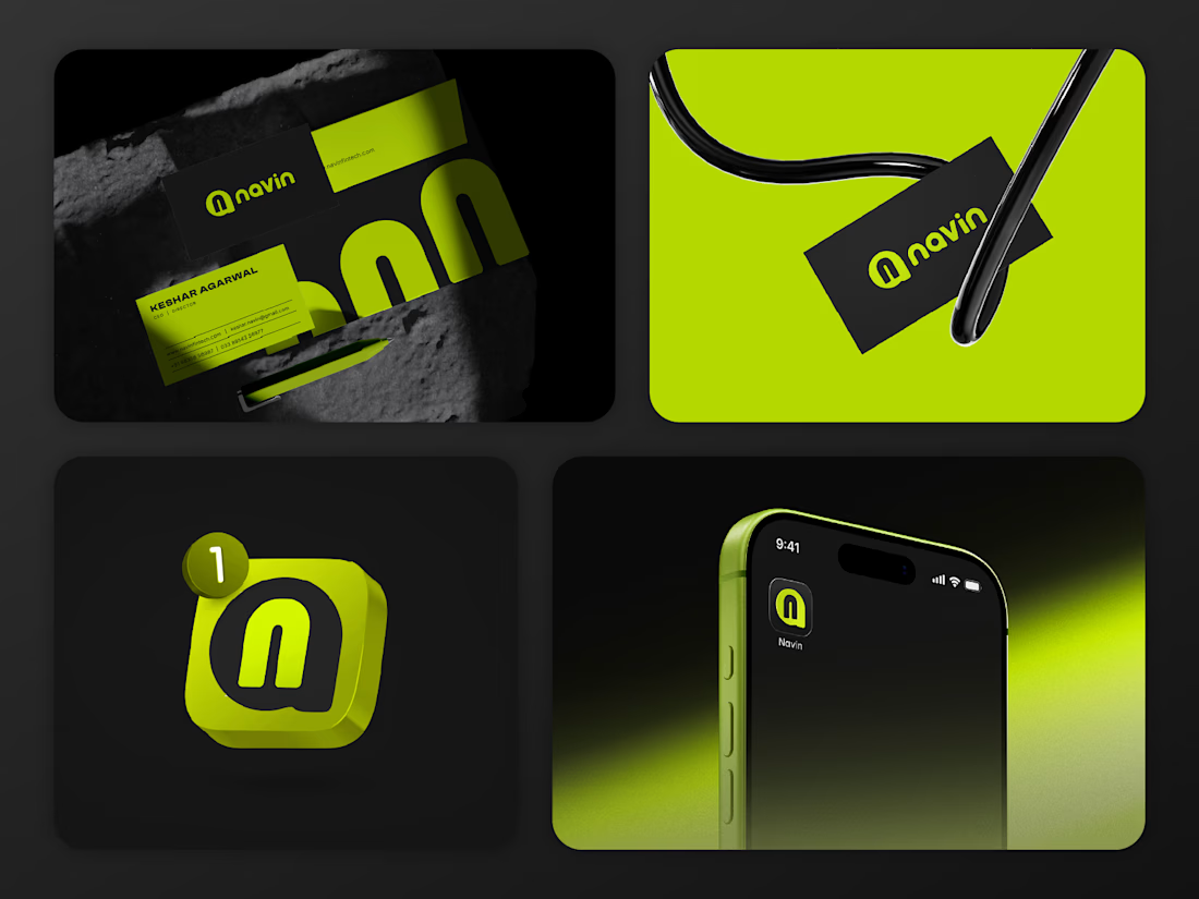
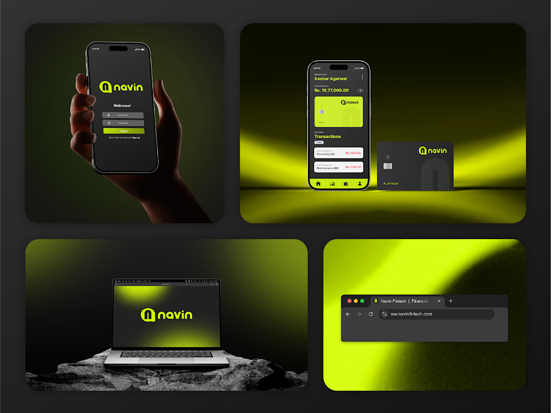
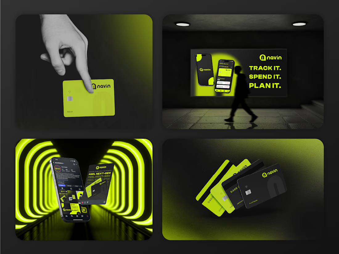
Navin feels fast, bold, and a little rebellious in the best way, electric lime against dark charcoal, a logomark that turns a chat bubble into the letter N and a visual language that speaks directly to people who expect everything in their life to just work without friction.
This wasn't about designing something trendy. It was about designing something that actually reflects how a younger, always online generation thinks about money, fast, visual, personal.
If you're building something that needs a bold, next gen identity, I'd love to work on it with you.