The network for creativity
Join 1.25M professional creatives like you
Connect with clients, get discovered, and run your business 100% commission-free
Creatives on Contra have earned over $150M and we are just getting started
Back to feedPost


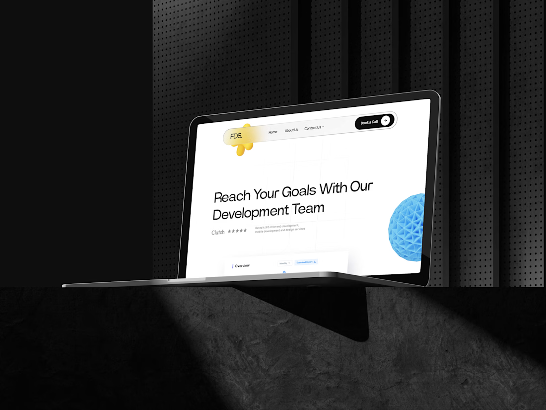
Fiore Digital Services (FDS) needed a digital home matching their technical caliber. I designed a three-page site using a "tech-noir" aesthetic—bold typography, 3D accents, and clean grids.
The Goal: Bridge the gap between technical authority and creative flair to drive "Book a Call" conversions.
Challenges: Delivering a premium UI on a tight timeline while balancing heavy 3D assets with visual breathing room to avoid clutter.
Solutions: Research shows 75% of users judge credibility via design, so I prioritized social proof and a frictionless contact flow. I used a modular grid to make complex services feel digestible.
Outcome: FDS now projects a top-tier image that justifies premium rates and shortens the sales cycle. I proved that simplicity is the ultimate sophistication when balancing speed with high-end quality.


The network for creativity
Join 1.25M professional creatives like you
Connect with clients, get discovered, and run your business 100% commission-free
Creatives on Contra have earned over $150M and we are just getting started




Related posts

Meriot Netherlands-based product designer portfolio
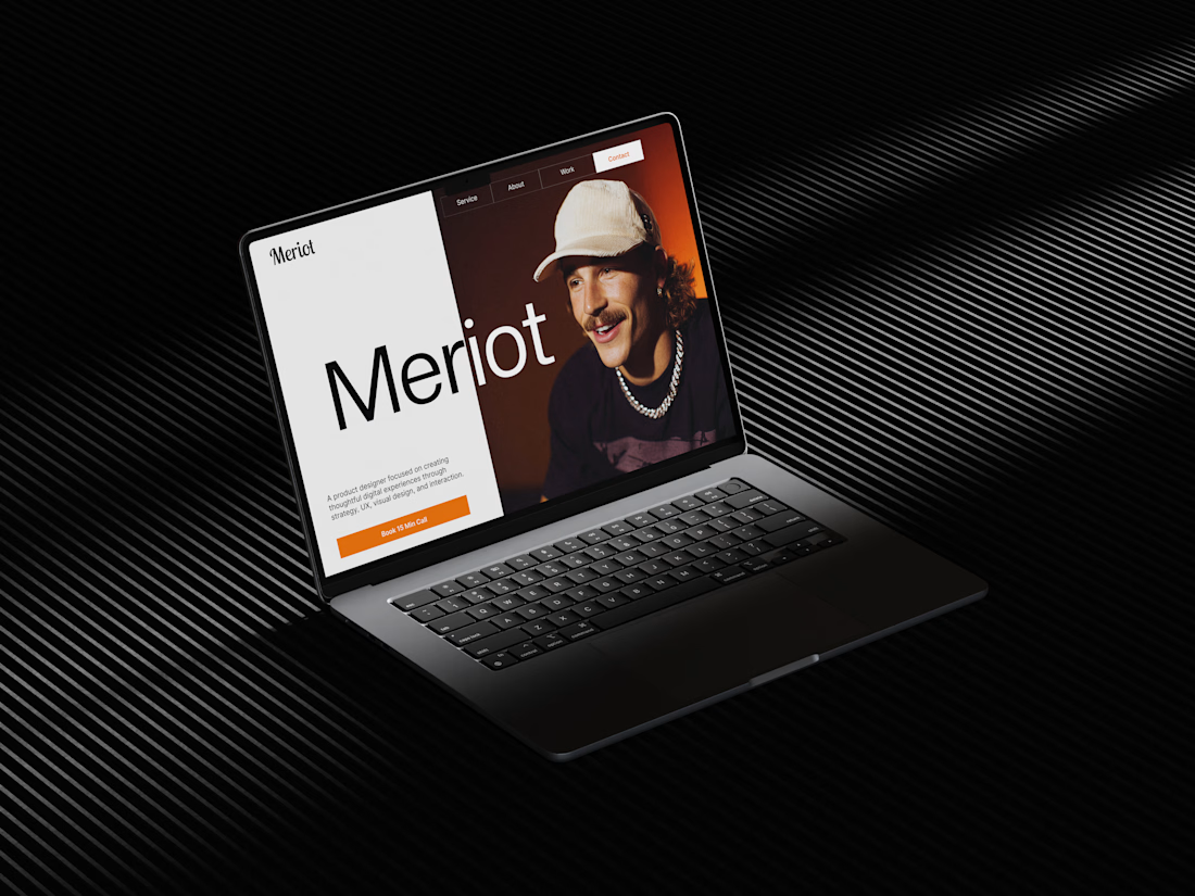
I explored a portfolio website for Meriot, a product designer based in the Netherlands who wanted a digital presence that felt more personal, editorial, and design-focused.
The challenge was to avoid the typical portfolio formula and create something that communicates personality within the first few seconds.
The direction
→ Bold editorial typography
→ Strong personal photography
→ Minimal black-and-white foundation
→ Warm orange accent for CTAs
→ Simple, structured navigation
→ Clear positioning as a product designer
→ A portfolio experience that feels like a personal brand
The idea was to make the website feel confident without being complicated.
Rather than leading with a long introduction, the hero immediately communicates who Meriot is, what he does, and where the visitor should go next.

Nice design broooo


Tash rendered in a custom holographic alphabet, built from patterned letterforms in Figma.
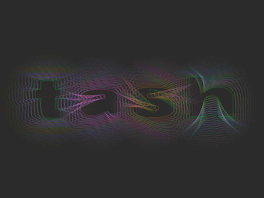

The holographic effect makes it really stand out.


