The network for creativity
Join 1.25M professional creatives like you
Connect with clients, get discovered, and run your business 100% commission-free
Creatives on Contra have earned over $150M and we are just getting started
Back to feedPost

Let's go back to the basics: what is an ISO standard, really?
After World War II, the delegations of 25 countries met in London to unite global industrial standards and create what would be known as the International Organization for Standardization, or ISO, the Greek word isos, meaning "equal".
Fast forward to this day, where this network encompasses over 176 national standards bodies, providing internationally recognized best practices across countless sectors and industries.
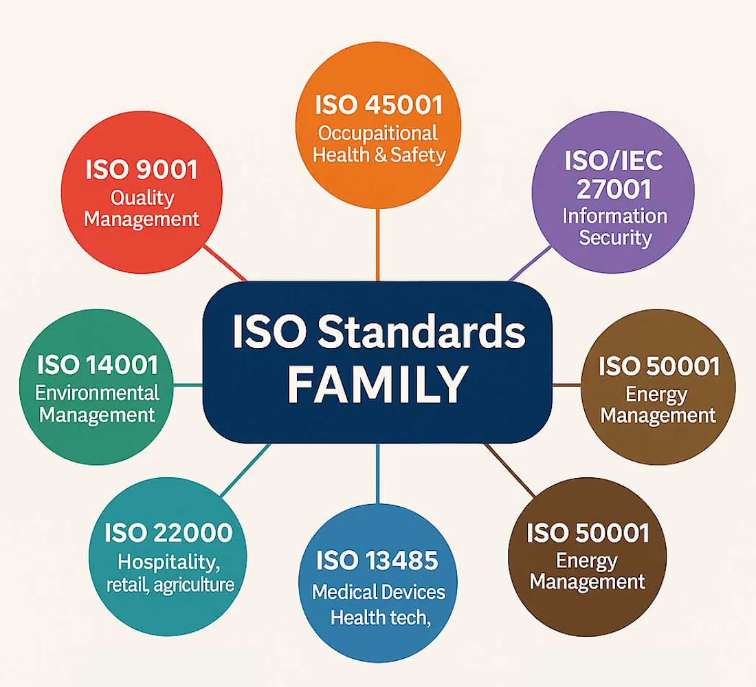
Many people associate ISO only with certifications, but ISO develops standards for far more than that. Its portfolio includes guidance on risk management, auditing, human resources reporting, and so on. Among the most widely adopted are the management system standards:
🔹 ISO 9001 — Quality Management
🔹 ISO 14001 — Environmental Management
🔹 ISO 45001 — Occupational Health & Safety Management
🔹 ISO 27001 — Information Security Management
Since the 2015 to 2022 revisions, all four share the same High-Level Structure HLS), which means the same core clauses and the same logic (context, leadership, planning, support, operation, evaluation, improvement). That's why organizations can build one Integrated Management System instead of maintaining separate ones.
But ISO certifications aren't a stamp of "perfect performance." It proves that an organization has a system to identify risks, meet requirements, and improve continuously.
Think of it like a driver's license; it proves you know the rules of the road and have demonstrated the ability to drive. It doesn't automatically make you a good driver
#ISO #QHSE #ISO9001 #ISO14001 #ISO45001 #ISO27001 #ManagementSystems
The network for creativity
Join 1.25M professional creatives like you
Connect with clients, get discovered, and run your business 100% commission-free
Creatives on Contra have earned over $150M and we are just getting started











Related posts


I COMPLETELY AGREE
100% Manual work is best for complete video production.

Manual work is always better than ai slop you can use ai for some clips but full video made with ai is unprofessional and a waste of money and resources

This applies to almost everything. Text, audio, video. I think the thing is that humans can detect effort and cultural nuance. If you're faking that, the impression is just "low value".



I designed and built the website for The IBT Group, a process transformation consultancy from Australia. 30 years in the field, 37 countries, more than 6,000 people trained, and clients like PepsiCo, Rolls-Royce and HSBC
They came with an AI-generated draft: one long page that took five minutes to read and showed every service at once. For a company that sells clear processes, the site did the opposite
The idea is structure cut out of chaos. The hero runs a film of frosted glass channels carved through rough stone that turn into a top-down process map, and the headline ends on "Purpose. Speed. Integrity." in an italic serif
Before that I tried a dark version with a dotted globe and a light one with a night city photo. Both looked like every other consulting site, and the second left me one thing to keep: the serif accent
On the live site Process Mining is a pinned block whose tabs switch as you scroll, the Lean Six Sigma belts run from White to Diamond, and each solution got its own page instead of a paragraph on the home page
Live site: theibtgroup.com

